
Color is the heartbeat of every quilt — the language through which fabric speaks emotion, energy, and depth. But behind every dazzling palette lies an often-overlooked design element that defines visual power: value contrast.
Value — the lightness or darkness of a color — determines how forms stand out or blend together. It shapes balance, guides the viewer’s eye, and breathes life into composition. Whether you work with bold solids or subtle gradients, understanding contrast is what transforms a quilt from beautiful to unforgettable.
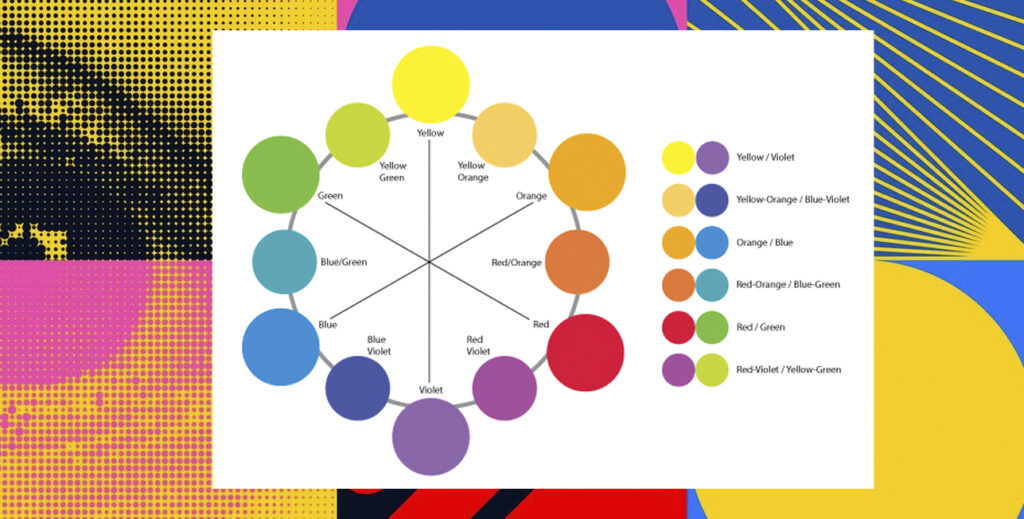
What Is Value (and Why It Matters)?
In art and design, value refers to how light or dark a color appears. Two fabrics can share the same hue — say, red — yet evoke completely different moods depending on their value. Light red feels airy and gentle; dark red feels grounded and intense.
In quilting, value is what helps your design achieve depth and clarity. When your values are too similar, your shapes flatten and the eye loses direction. When you balance light, medium, and dark tones thoughtfully, your quilt comes alive with dimension and rhythm.
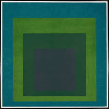
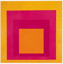
Artist and educator Josef Albers explored this phenomenon deeply in Interaction of Color (1963), demonstrating how adjacent colors can alter one another’s perceived value. His findings remind us that color relationships aren’t static — they change depending on context.
👉 Learn more about Albers’ studies at The Josef and Anni Albers Foundation.
The Science of Contrast
focus. Our brains are naturally drawn to areas of highest contrast. This is why, in both painting and quilting, artists use light-against-dark or dark-against-light to create emphasis and hierarchy.

A simple way to check your values:
- Adjust by swapping fabrics or adding accents to create balance.
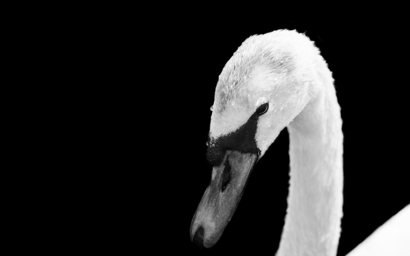
- Photograph your fabric layout and convert it to black and white.
- Notice which areas blend and which stand out.
Contrast is also emotional. High contrast evokes drama and excitement, while low contrast conveys calm and subtlety. The beauty of quilting lies in your ability to compose emotion through value — to orchestrate the viewer’s gaze and feelings with light and dark. For more on the science of color perception, see Color Matters – The Psychology of Color.
Using Contrast to Strengthen Composition
Contrast is one of the foundational principles of design, alongside balance, rhythm, and unity. When used intentionally, it brings clarity and energy to your quilt. Here’s how:
• Establish a clear value structure
Start by selecting three to five fabrics spanning light, medium, and dark values. Use a grayscale filter on your phone to verify separation.
- Play with dominance
Decide whether light or dark will dominate your design. A mostly dark quilt with a few bright accents feels grounded and mysterious; a light quilt with dark focal points feels open and dynamic.
• Contrast shape and scale
Combine large and small pieces, organic and geometric forms. Visual contrast in scale reinforces contrast in value.
• Introduce rest
Even bold designs need quiet areas. Spaces of low contrast allow the eye to rest and the high-contrast sections to shine.
These concepts come alive in my on-demand class “The Power of Color Composition”, where I guide students to master balance and contrast through exercises in hue, value, and saturation.
Emotional Contrast: Storytelling Through Value
Every quilt tells a story, and contrast is one of your most expressive narrative tools.
- High contrast suggests strength, tension, or celebration — think fireworks in a night sky.
- Low contrast evokes serenity, nostalgia, or quiet reflection — like fog softening a landscape.
By adjusting contrast, you guide your audience’s emotional journey through your quilt. Value becomes more than design; it becomes voice.
Artist and author Albers (1963) emphasized that “color deceives continually” — meaning what we perceive depends on its surroundings. When you embrace that complexity, you transform fabric selection from mechanical choice to emotional storytelling.
Practical Exercises for Quilters
Try these hands-on exercises to sharpen your value perception:
- The Black & White Test: Take a photo of your fabric arrangement in grayscale. Identify which fabrics merge; adjust until you have clear separation.
- Monochrome Challenge: Make a mini quilt using one hue in light, medium, and dark values. This isolates value from hue to strengthen visual awareness.
- Contrast Mapping: On your design wall, arrange shapes from darkest to lightest. Notice where your eye naturally travels — that’s the path of visual flow.
- Complementary Push: Use colors opposite on the color wheel (like blue/orange) but vary their values for tension and harmony.
These practices train your eye to see beyond color into structure — the secret language of composition.
The Balance of Light and Shadow
In every great quilt, contrast acts like light in a painting — guiding, emphasizing, and connecting. Too little, and the design feels flat; too much, and it becomes chaotic. The art lies in balance.
When you start to see contrast not just as visual but as emotional architecture, your compositions deepen. You begin to notice how small value shifts can change meaning entirely — how a single dark curve can ground a sea of light.
Contrast, in essence, is life itself: a dialogue between light and dark, movement and stillness, joy and contemplation.
Mastering value is mastering visibility — it’s how you make your art sing. The magic of quilting lies not only in color choice but in the relationships between tones. When you understand contrast, you move from decoration to design, from making to composing.
Every piece of fabric holds potential, but it’s the dialogue between values that gives your quilt its heartbeat.
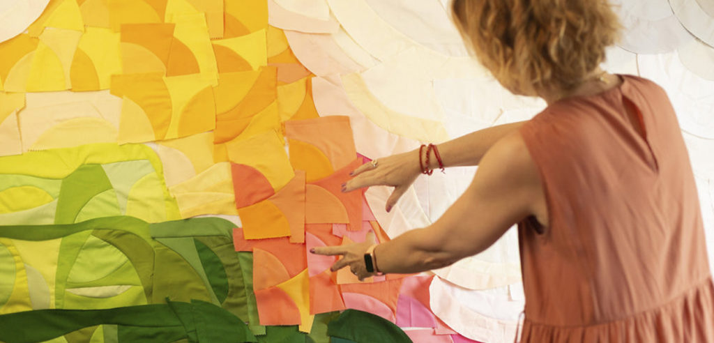
So, the next time you stand before your design wall, step back. Squint your eyes. Feel the rhythm of light and dark.
That’s where the real story begins.