
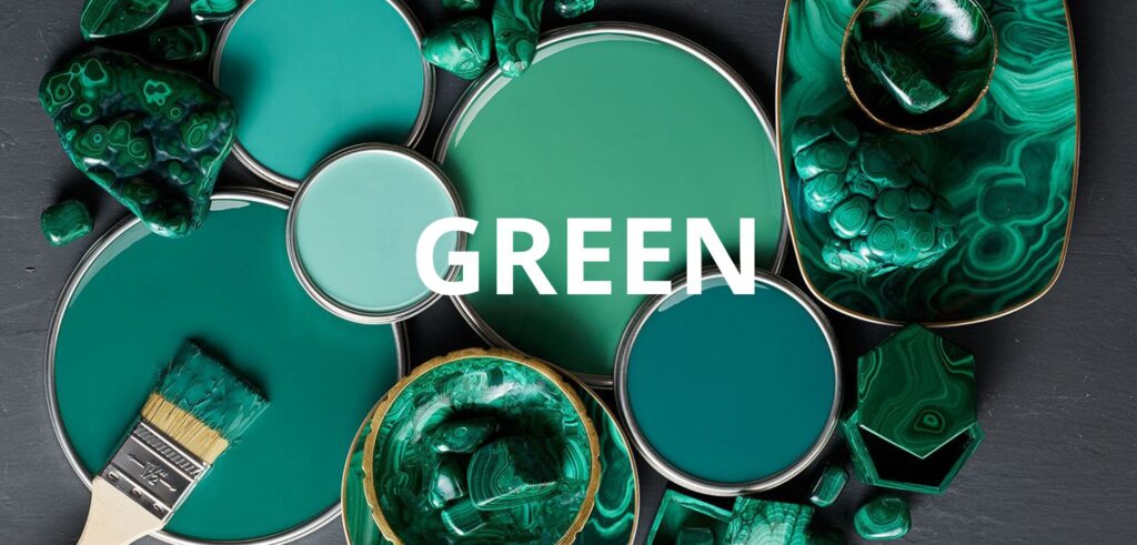
Green is the color of pause.
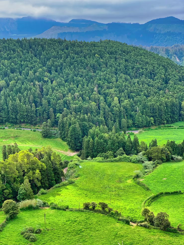
It sits quietly between warm and cool, between expansion and rest. It rarely demands attention, yet it holds everything together. In nature, green is abundance — leaves, forests, growth, moss, shade. In art, green becomes a powerful stabilizer: a color that allows others to breathe.
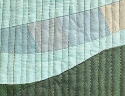
In textile art and quilting, green plays a unique role. It is grounding without being heavy, calm without being distant. When used intentionally, green creates balance, continuity, and emotional depth — acting as both structure and atmosphere.
Green as a Mediator Color
Green is formed by the union of blue and yellow — cool and warm. This dual nature gives it a rare ability: to mediate.
Unlike red or blue, which clearly advance or recede, green adapts. It can move forward when warmed with yellow or fall back when cooled with blue. This makes green one of the most versatile colors in composition.
Color theorist Johannes Itten described green as a color of equilibrium — neither active nor passive, but balanced (The Art of Color, 1961) — making it a vital tool for quilters who think in relationships rather than absolutes.
Green and the Illusion of Stability
In design, some colors anchor without dominating. Green does this effortlessly.
- Large areas of green can:
- create visual rest
- calm intense palettes
- unify disparate colors
- stabilize busy compositions
This is why green is so often present in landscapes — not as the focal point, but as the field that supports everything else. In textile work, green can function the same way: a foundation that allows contrast and movement to exist without chaos.
According to Rudolf Arnheim, visual stability is not about symmetry, but about perceived balance (Art and Visual Perception, 1974). Green contributes to this perception almost instinctively.

The Emotional Language of Green
Green is deeply psychological.
It is associated with:
- growth and renewal
- safety and shelter
- healing and calm
- continuity and life
Unlike dramatic colors that announce emotion, green sustains it. It creates an emotional environment rather than a moment.
Research on color psychology indicates that exposure to green can reduce visual stress and promote a sense of balance and harmony.


Green in My Own Work
Green has been a recurring presence across my quilts, not as decoration, but as a structural and emotional anchor.
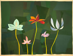
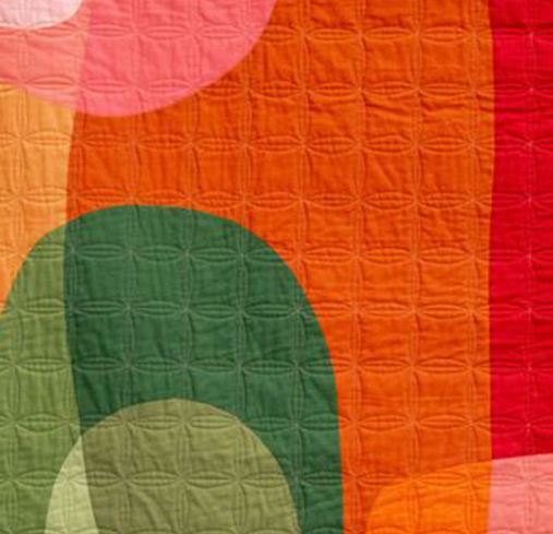
In Ginkgo Memoir, green functions as a living structure. It evokes growth, continuity, and the quiet persistence of time. The layered green tones act as connective tissue between shapes, allowing the composition to breathe while carrying a strong sense of place and remembrance. Green becomes landscape, memory, and pause — a space where the eye can rest and wander at the same time.
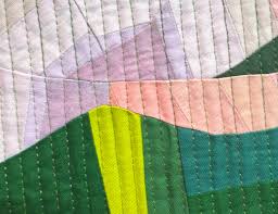
In Seeds of Freedom, green takes on a more symbolic role. It represents regeneration, hope, and the idea of life pushing forward despite constraint. Here, green supports contrast and movement, grounding the composition while allowing other colors to emerge with strength and intention. It holds the work together emotionally, even as the visual language speaks of resilience and change.
In both quilts, green is not passive. It is structural, emotional, and deeply tied to the meaning of the piece. It becomes a carrier of experience — a color that sustains rather than dominates, and that allows complexity to exist without noise.
Green in Relationship, Not Isolation
Green is rarely at its best alone. Its strength lies in relationship. Paired with warm colors, green can cool intensity without dulling it. Paired with cool colors, it can soften distance and add warmth. With neutrals, it becomes organic and grounded.
Subtle shifts — olive, chartreuse, emerald, or forest green — introduce complexity without competing for attention. These variations allow green to create movement within calm, which is especially powerful in abstract and improvisational quilts.
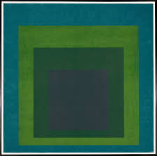
This relational behavior echoes Josef Albers’ central idea: color is never fixed; it is always altered by its neighbors (Interaction of Color, 1963).

When Green Becomes the Structure
Green does not always have to be background. When pushed darker or intensified, it can become architectural — defining edges, guiding movement, anchoring form.
Deep greens can replace black for grounding without heaviness. Lighter greens can replace neutrals while keeping warmth and life.
Used this way, green becomes invisible structure — felt more than noticed. It supports composition without calling attention to itself, which is one of its greatest strengths.
Green is not a passive color. It is a stabilizer, a mediator, and a quiet force.
In textile art, green creates balance without rigidity, emotion without drama, and depth without excess. It allows quilts to breathe, to rest, and to hold space for complexity.
When used with intention, green becomes more than color — it becomes environment, memory, and life itself.