
Color theory is a vital tool for quilters, helping transform fabric into stunning works of art. By understanding the principles of color and leveraging swatches, quilters can craft designs that are harmonious, striking, or mood-evoking. Whether you’re a seasoned quilter or a beginner, this guide explores how color theory and swatches can elevate your quilting projects.

1. Solid Fabric Swatches: A Quilter’s Best Friend
Solid fabrics are an essential building block for creating cohesive and visually appealing quilts. They provide a reliable foundation for experimenting with different color schemes and allow patterns and designs to shine. A few standout options make it easy for quilters to work with solid swatches effectively.
Robert Kaufman Kona Solids are a must-have for any quilter’s toolkit. With an extensive array of colors, these solids enable you to find the exact hue needed for your project. Their swatch cards are particularly useful, allowing you to see and compare shades in real life—an invaluable resource when shopping online or planning your quilt design.
For a luxurious feel, Art Gallery Pure Solids are a perfect choice. Known for their soft texture and modern color palette, these fabrics bring a touch of elegance to your projects. While formal swatch cards aren’t provided, many quilters create their own by cutting small fabric pieces for reference, ensuring a cohesive design.


Another popular choice is Moda Bella Solids, celebrated for their versatility and vibrant selection. With a rich variety of shades, Bella Solids make it easy to find complementary colors or the perfect pop of contrast for your quilt.
2. Analogous Color Swatches: Harmonious and Calming
Analogous colors are those that sit next to each other on the color wheel, and they create an effortlessly harmonious look. Using analogous color swatches in quilting is a great way to design projects that evoke calmness, balance, and unity.
For a soothing nature-inspired quilt, consider pairing blue, blue-green, and green. These colors mimic the hues of forests, lakes, and oceans, making them perfect for tranquil designs. Another excellent option is the warm combination of red, red-orange, and orange, which brings energy and vibrancy to your project. This palette is ideal for bold, statement quilts that draw attention while maintaining harmony.
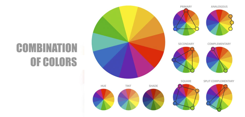
3. Complementary Color Swatches: Bold and Striking
Complementary colors, which lie opposite each other on the color wheel, offer a powerful way to create contrast and drama in quilting. These high-contrast combinations are perfect for designs that demand attention.
A classic example is blue and orange, a pairing that provides a lively and energetic feel. Incorporating this palette into your quilt can create an exciting focal point without overwhelming the overall design. Similarly, purple and yellow offer a striking balance between modern elegance and bold creativity. By leveraging these contrasting colors, you can craft quilts that stand out while maintaining visual harmony.


4. Monochromatic Swatches: Sophisticated Simplicity
Monochromatic schemes focus on variations of a single color, exploring its shades, tints, and tones to achieve a sophisticated and cohesive design. This approach is excellent for creating quilts that are understated yet impactful.
A timeless choice is shades of blue, ranging from deep navy to pale sky blue. This palette brings versatility and serenity to any design, making it a favorite for quilters who prefer classic aesthetics. Another elegant option is tints of pink, which combine soft blush hues with deeper rose tones. This combination creates a delicate, romantic feel, perfect for heirloom or decorative quilts.

5. Seasonal Color Swatches: Capture the Mood
Seasons are a wonderful source of inspiration for quilt designs, offering distinct color palettes that evoke the essence of the time of year. Seasonal color swatches allow you to infuse your projects with personality and atmosphere.
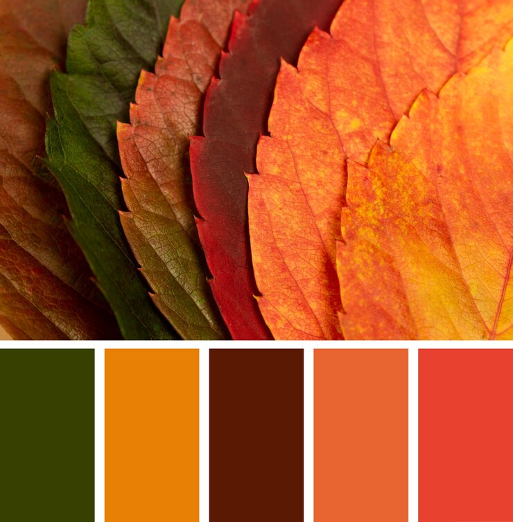
For spring, pastel tones like mint green, soft pink, and lavender capture the freshness and renewal of the season. These gentle hues create a light and airy feel, ideal for floral or whimsical designs. Autumn-inspired quilts can draw from rich oranges, golden yellows, and deep reds, reflecting the warmth and coziness of fall. This palette is perfect for quilts that evoke comfort and nostalgia.
6. Custom Magnetic Swatches: Experiment with Ease
Creating custom magnetic swatches is a game-changing strategy for quilters who love to experiment. This method allows you to test different combinations and layouts before committing to a design.
To make custom swatches, cut small pieces of fabric and attach magnets to the back. Arrange and rearrange them on a magnetic board to test various palettes and layouts. This technique is especially helpful for planning complex quilt designs, enabling you to visualize how colors interact and ensuring your final product achieves the desired effect.
7. Inspiration from Nature and Photos

Nature and photography are invaluable resources for discovering unique color combinations. Drawing from the natural world or cherished images can help you craft palettes that feel fresh and personal.
Tools like Coolors.co and Adobe Color make it easy to extract color schemes from photos. Upload an image of a landscape, a flower garden, or even a sunset, and these tools will generate a palette that you can match to fabric swatches. Using these custom palettes ensures your quilt reflects your inspiration while maintaining color harmony.
8. Pre-Designed Fabric Collections: Ready-Made Palettes
For quilters who want a head start, pre-designed fabric collections offer curated palettes that simplify the planning process. Designers carefully select harmonious colors, saving you time and effort.
These collections are particularly useful for beginners or those unsure of how to combine colors effectively. By using pre-designed sets, you can confidently create quilts with professional-level color schemes.
9. Balancing Warm and Cool Color Swatches
Balancing warm and cool tones is a great way to add depth and interest to your quilt. Warm colors, such as reds, yellows, and oranges, infuse your design with energy and vibrancy. Cool colors, like blues, greens, and purples, bring a sense of calm and balance.
Using a mix of both can create dynamic and visually engaging quilts. For example, pairing a warm orange with a cool teal can result in a striking yet harmonious design that draws the eye without feeling overwhelming.

10. Experiment with Value and Contrast
The interplay of light and dark values within a color scheme is critical for creating depth and dimension in quilting. Experimenting with value allows you to emphasize certain areas of your design while creating subtle transitions elsewhere.
High-contrast combinations, such as pairing light blue with dark navy, add drama and focus to your quilt. On the other hand, using similar values within a monochromatic palette creates a more blended, understated look. Both approaches can be effective depending on the mood and impact you want your quilt to convey.
Why Color Theory Matters in Quilting
Understanding and applying color theory is key to crafting quilts that are visually stunning and emotionally resonant. Swatches—whether solid, custom-made, or pre-designed—allow you to explore and refine your vision, ensuring your designs are cohesive and captivating.
Start experimenting with color theory today, and watch your quilts come to life with harmony, contrast, and creativity. Visit Carolina Oneto for more quilting tips, tools, and inspiration to elevate your craft.