
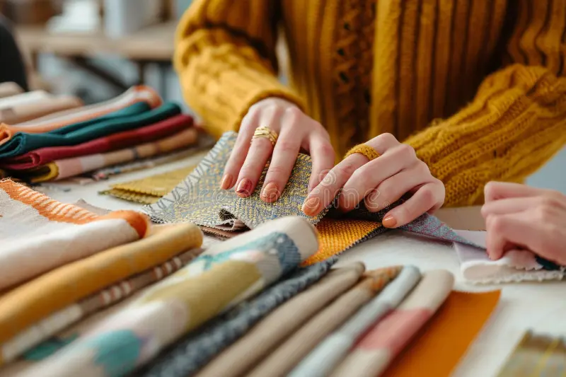
Before I cut a single piece of fabric, I work with color the same way a painter works with paint.
For me, fabric is not just material — it is pigment, atmosphere, and emotion. A quilt begins long before the sewing machine turns on; it begins with choosing, limiting, and arranging color.
Building a color palette is not about finding the “right” fabrics. It’s about creating relationships — between light and dark, warm and cool, calm and tension. When fabric is treated as paint, quilting becomes an act of composition rather than assembly.
Thinking Like a Painter
Painters rarely use every color available to them. They work within a restricted palette, allowing subtle shifts and contrasts to do the expressive work. Quilting benefits from the same approach.
When I select fabrics, I’m not asking: “Do these fabrics match?”
Instead, I ask: “How do these colors speak to each other?”
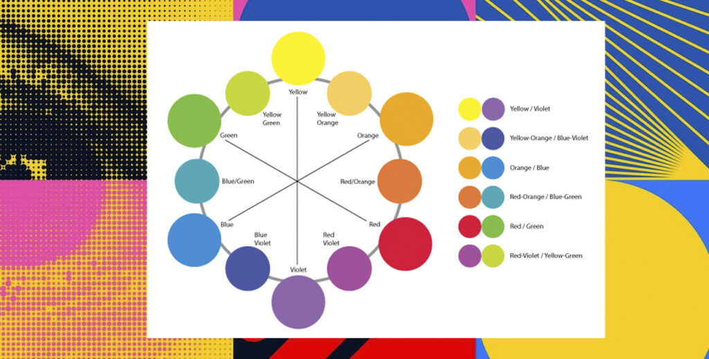
This shift changes everything. It moves quilting away from decoration and toward intentional design. Artist and color theorist Josef Albers emphasized that color is never seen in isolation — its behavior depends entirely on context (Interaction of Color, 1963). The same red can feel loud or quiet depending on what surrounds it. Fabric behaves exactly the same way.

Limiting Color to Create Freedom
One of the most powerful (and counterintuitive) creative strategies is limitation. When you reduce your palette, you increase clarity.
I often begin with:
- One contrasting or accent color
- One dominant color family
- One supporting color
Within that structure, I allow for variation in:
- value (light to dark)
- saturation (muted to intense)
- temperature (warm to cool)
This creates depth without chaos.
This idea aligns with what Johannes Itten described as color harmony — balance achieved not through abundance, but through controlled contrast (The Art of Color, 1961).
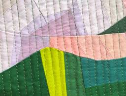
Value Before Hue
One of the most common struggles I see in quilts is not color choice — it’s value confusion. Two fabrics can be different colors but share the same value. When that happens, shapes disappear and composition flattens.
When building a palette, I always consider:
- dark values that anchor the composition
- light fabrics that create air and space
- medium values that support transitions
A simple and powerful tool is to photograph your palette in black and white. If everything blends, the quilt will too.
This principle comes directly from visual perception research. Rudolf Arnheim explains that our eyes read structure through contrast, not color alone (Art and Visual Perception, 1974).
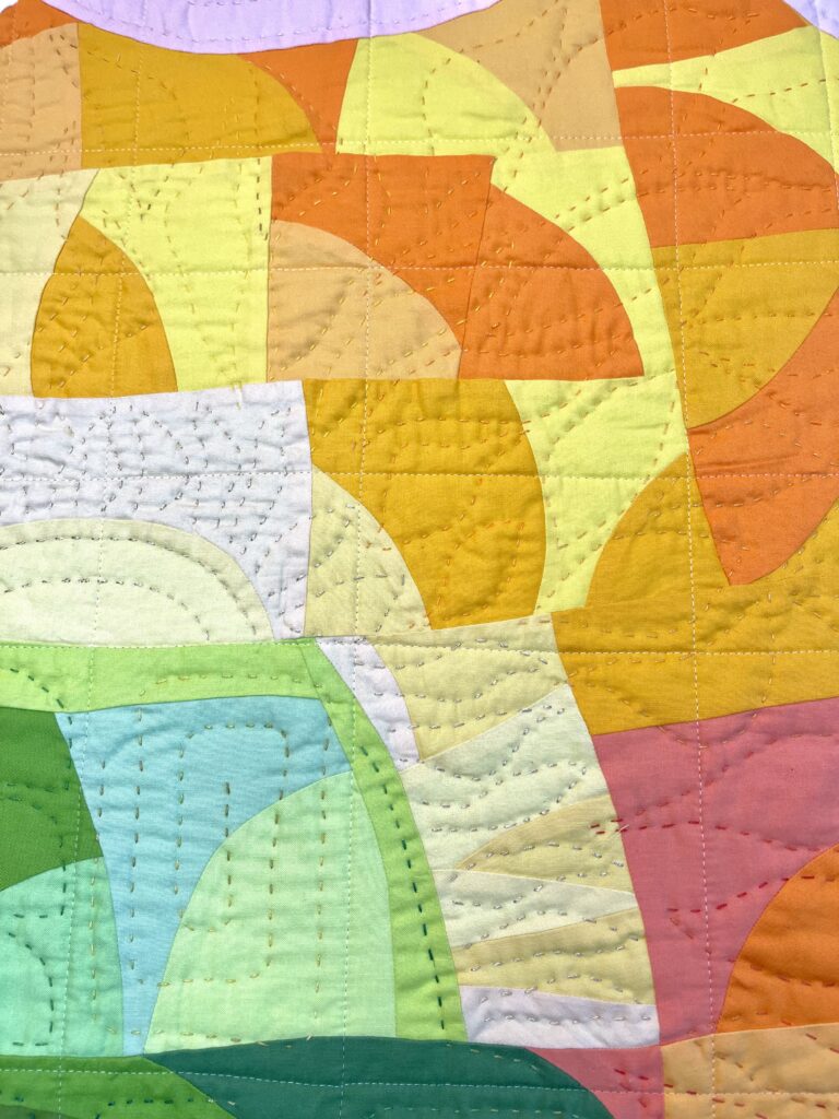
Color as Emotion, Not Decoration
Color carries memory, mood, and energy. A palette is never neutral.
- Warm palettes often feel expansive, energetic, or intimate.
- Cool palettes feel reflective, distant, or calm.
- High contrast feels bold and assertive.
- Low contrast feels quiet and contemplative.


When I build a palette, I ask: “What do I want this quilt to feel like?”
Not: “What colors should I use?”
This is where fabric truly becomes paint — a medium for emotional storytelling, not just surface beauty. You can see this approach throughout my body of work and in my color-focused courses, where color is treated as a compositional system rather than a decorative choice.
🔗Carolina Oneto – Color & Composition Workshops
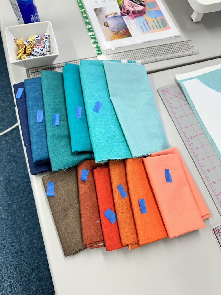
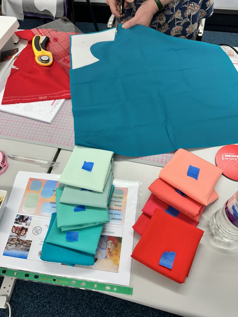
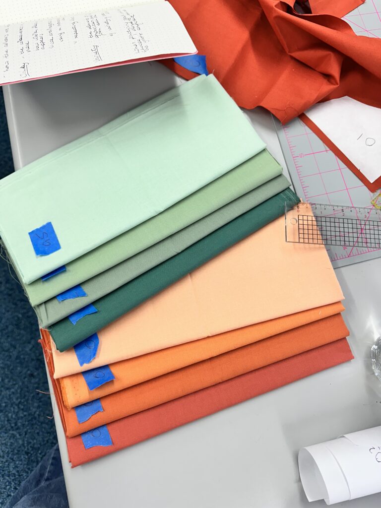
Organizing Fabric Like a Palette
Once fabrics are selected, I organize them visually — just as a painter arranges colors on a palette.
I group by:
- value (from light to dark)
- temperature
- intensity
Seeing fabrics laid out this way immediately reveals:
- missing transitions
- gaps in value
- too many competing accents

This step often saves fabric, time, and frustration later. It’s an engineering mindset applied to art — clarity before execution.
The Tate Museum describes this as “visual economy”: reducing complexity to strengthen meaning.
🔗 reference: Tate – Elements of Art: Colour
Letting the Palette Evolve
A palette is a starting point, not a prison.
As the quilt grows, color relationships shift. A fabric that felt perfect at the beginning may become too strong later. Another may suddenly become essential. Working this way requires attentiveness — listening to the quilt as it evolves. This is where intuition enters, supported by structure.
The palette evolves, but the logic remains.
When fabric is treated as paint, quilting becomes a language of intention. A thoughtful palette creates harmony, movement, and emotional depth — long before a single seam is sewn.
Color is not something we add at the end. It is the foundation upon which everything else rests.
By building palettes with care, limitation, and awareness, we move from choosing fabrics to composing visual experiences — quilts that speak clearly, confidently, and with feeling.