Red has long been a captivating color in the world of art and quilting, embodying a rich tapestry of meanings and emotions. As you explore quilt design with red, you’ll uncover its psychological meaning , which often includes passion, energy, and warmth, making it a powerful choice for creative expression. This vibrant hue also carries a deep cultural significance, representing everything from luck and prosperity in some cultures to love and courage in others. In this post, we’ll explore the emotions expressed by red and how its use in art can transform a piece by
adding layers of depth and narrative. Whether you’re an artist, quilter, or simply fascinated by the power of color symbolism, understanding the role of red can enhance your creative projects and inspire your next artistic endeavor.

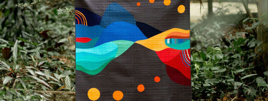
The Power of Red in Quilting
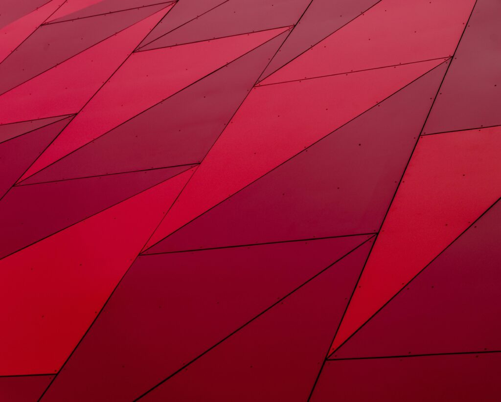
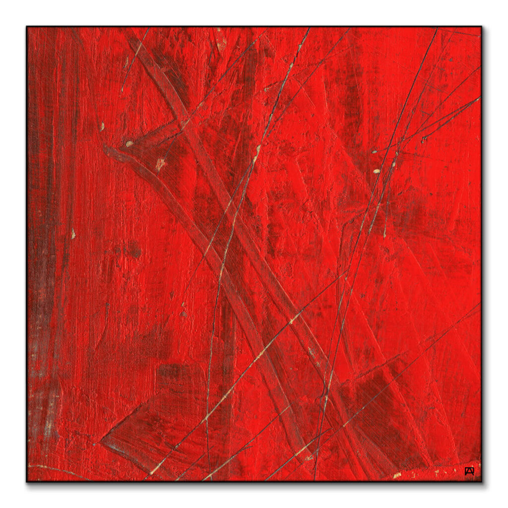
Red is a bold and striking color that can transform any quilt design. Let’s explore how this vibrant hue impacts quilt aesthetics, symbolism, and emotional expression.
Red’s Impact on Quilt Design
Red can dramatically change the look and feel of a quilt. Its vibrant nature draws the eye and creates focal points within a design.
When used as a primary color, red can make a quilt feel warm, energetic, and passionate. It’s often paired with complementary colors like green or blue to create striking contrasts. In traditional quilt patterns, red is frequently used in star blocks, hearts, and floral motifs. These elements stand out against neutral backgrounds, adding depth and interest to the overall design.
Modern quilters might use red in abstract patterns or as part of a color gradient. The versatility of red allows it to work in both classic and contemporary quilt styles.
Color Symbolism in Quilting
Color symbolism plays a significant role in quilting, with red carrying powerful meanings that can enhance a quilt’s narrative and emotional impact.
In Western cultures, red often symbolizes love, passion, and courage. Quilts featuring red hearts or roses might be created as gifts for loved ones or to commemorate special occasions like weddings or anniversaries. Some quilters use red to represent strength and resilience. For example, red ribbon quilts are often made to raise awareness for HIV/AIDS or heart disease.
In Native American quilting traditions, red can symbolize life, health, and success. These quilts might incorporate red in traditional patterns or as part of storytelling designs.
Emotions Expressed by Red
Red is a color that evokes strong emotional responses, making it a powerful tool for quilters looking to convey specific feelings through their work.
Passion and love are perhaps the most common emotions associated with red. Quilts featuring red as a dominant color might be created to express deep affection or romantic love. Red can also represent anger or danger. In some art quilts, red might be used to convey themes of conflict, struggle, or warning.
Excitement and energy are other emotions tied to red. Quilts with bold red patterns or accents can feel lively and invigorating, perfect for spaces where you want to create a sense of enthusiasm.

Psychological Meaning of Red
The psychological impact of red is profound and multifaceted. This section delves into how red affects our mood and how artists harness its emotional power.
Red’s Influence on Mood
Red has a strong psychological influence on human mood and behavior, making it a powerful tool in art and design.
Studies have shown that exposure to red can increase heart rate and blood pressure, creating a sense of excitement or urgency. This physiological response can translate into feelings of energy and motivation. In social contexts, red is often associated with confidence and assertiveness. Wearing red or being surrounded by red objects can boost self-assurance and create an impression of authority.
However, red can also trigger stress or aggression in certain situations. Its intense nature can be overwhelming if used excessively, potentially leading to feelings of anxiety or irritation.
The impact of red on mood can vary depending on personal experiences and cultural background. While some may find red energizing and positive, others might perceive it as aggressive or threatening.
How Artists Use Red Emotionally
Artists have long recognized the emotional power of red and use it strategically to evoke specific feelings in their work.
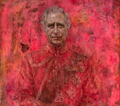
In portraiture, red is often used to convey passion, strength, or intensity. A subject dressed in red or placed against a red background can appear more dynamic and commanding.
Abstract artists might use red to create a sense of movement or tension within a composition. The eye is naturally drawn to red elements, allowing artists to guide the viewer’s attention and create emotional focal points.
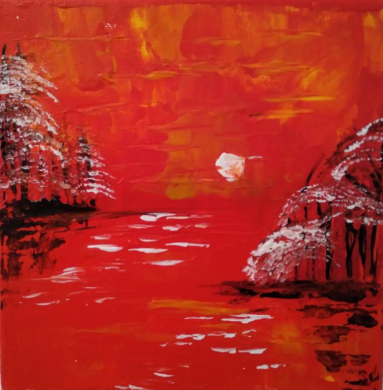
In landscape painting, red can be used to add warmth and vibrancy. A red sunset or autumn foliage can evoke feelings of nostalgia or the passage of time. Conceptual artists often employ red to symbolize powerful emotions or ideas. Red might represent love, anger, revolution, or danger, depending on the context and the artist’s intention.
Cultural Significance of Red
Red holds diverse meanings across different cultures, influencing its use in traditional arts and crafts worldwide.
Red in Different Cultures
- In Chinese culture, red symbolizes good luck, prosperity, and happiness. It’s the traditional color for weddings and is often used in celebrations and festivals. Chinese art frequently features red as a dominant color to invoke these positive associations.
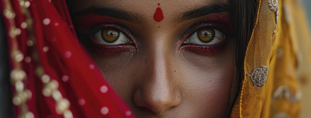
- In Indian culture, red is associated with purity, fertility, and sensuality. It’s a popular color for bridal wear and is used in religious ceremonies. Indian art often incorporates rich shades of red to represent these cultural values.
- Western cultures often associate red with love and passion, but also with danger and warning. This duality is reflected in Western art, where red can represent both positive and negative emotions or concepts.
- In Japanese art, red is a prominent color in traditional woodblock prints. It’s used to create striking contrasts and to symbolize energy and vitality. The famous “The Great Wave off Kanagawa” by Hokusai features a bold red Mount Fuji against a blue sea.
- Native American art often incorporates red to represent the earth, blood, and life force. In traditional pottery and textiles, red ochre is a common pigment used to create designs with spiritual significance.
- In European medieval art, red was a symbol of divinity and was often used to depict Christ and the Virgin Mary. The expense and rarity of red pigments made it a color reserved for the most important figures in religious paintings.
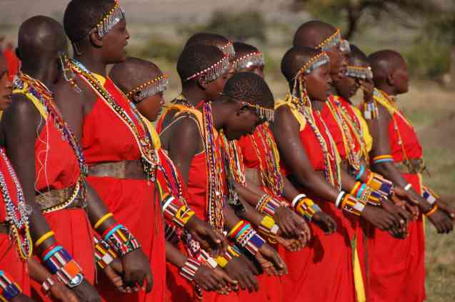
- n some African cultures, red symbolizes life and health. It’s used in traditional clothing and art to represent these important cultural values. The color can represent blood, life, and spiritual power, depending on the specific tribe and context.
The meaning of red can also change within a culture over time. For example, in medieval Europe, red was associated with nobility and power, while today it might be more commonly linked to love or danger.

Red in Art Throughout History
Red has been a central color in art for millennia, from ancient cave paintings to contemporary masterpieces. This section explores its historical significance and impact on artistic expression.
Vincent van Gogh’s “The Night Café” uses intense red to create a sense of unease and tension. The red walls and floor dominate the composition, reflecting the artist’s turbulent emotions.
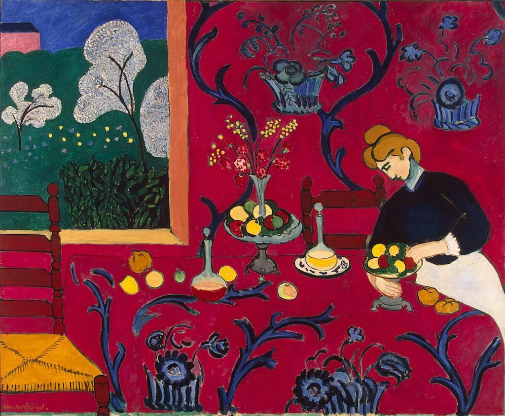
Henri Matisse’s “The Dessert: Harmony in Red” showcases the artist’s love for bold color. The overwhelming presence of red creates a sense of warmth and intimacy in the domestic scene.
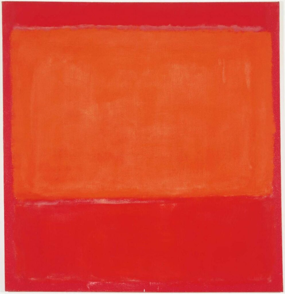
Mark Rothko’s “Orange and Red on Red” demonstrates the emotional power of color fields. The large blocks of red evoke a range of feelings, from passion to melancholy.
Frida Kahlo’s self-portraits often feature red clothing or backgrounds. In “Self-Portrait with Thorn Necklace and Hummingbird,” the red backdrop intensifies the painting’s emotional impact.
These artworks demonstrate how red can be used to convey a wide range of emotions and concepts, from love and passion to danger and intensity.
Inspiring Creativity with Red
Red’s bold nature can spark creativity and add excitement to any quilt design. Let’s explore some practical tips for incorporating this vibrant color into your quilting projects.
Tips for Using Red in Quilts
Incorporating red into your quilt designs can add energy and visual interest. Here are some tips to help you use red effectively:
- Start small: If you’re new to using red, begin by incorporating it as an accent color in your quilt. This could be through small red elements or borders.
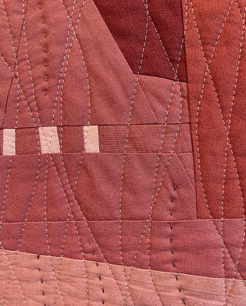
- Consider different shades: Red comes in many variations, from bright cherry to deep burgundy. Experiment with different shades to find the right tone for your project.
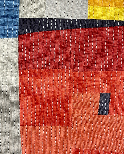
- Balance with neutrals: Pairing red with neutral colors like white, gray, or beige can help it stand out without overwhelming the design.
- Use red for emphasis: Place red elements strategically to draw attention to specific parts of your quilt design.
- Explore color combinations: Red works well with many colors. Try pairing it with complementary green for high contrast, or with analogous oranges and purples for a harmonious look.
Remember, the key is to experiment and find what works best for your unique style and vision.
Red as a Focal Point in Design
Red’s bold nature makes it an excellent choice for creating focal points in quilt designs.
In traditional quilt patterns, red is often used in central star blocks or as a border to frame the entire design. This draws the eye and gives the quilt a clear center of interest.
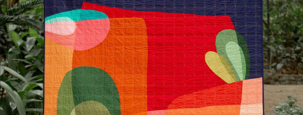
Modern quilters might use a single red shape or line to create contrast against a neutral background. This minimalist approach can be very striking and contemporary.
Red can also be used to highlight specific elements within a pictorial quilt. For example, a red flower in a garden scene or a red roof on a house can immediately draw the viewer’s attention.
When using red as a focal point, it’s important to balance it with other colors to avoid overwhelming the design. Surrounding red elements with cooler or more neutral tones can help them stand out without dominating the entire quilt.