
Choosing colors in a quilt can make or break your finished piece. The right color palette can convey emotions, provide contrast, and create balance. Though there are many factors to consider when choosing the perfect fabric colors for your quilt, the analogous color palette is one of the most attractive options you could select. We’ll explain this color palette in greater detail, including why you should consider using it for your next quilting project.
Understanding Analogous Color Palettes
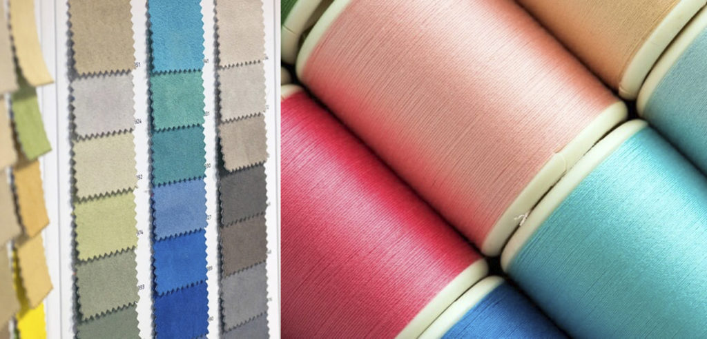
Color theory has particular guidelines and principles that detail how colors work together and how they can be used effectively in art and design. An essential element of color theory is the color wheel, as it’s a visual representation of the relationships between colors. For quilters, the color wheel is a helpful tool for picking out a palette of colors that work well together.
What is an analogous color palette? On the color wheel, an analogous color palette is comprised of a group of colors directly next to each other. For example, yellow, orange-yellow, and orange would be considered an analogous color palette, as they share similar undertones, creating a sense of harmony and unity. In your quilt, you’ll likely want to choose three to five colors in the palette.
The Visual Effect of Analogous Color Palettes
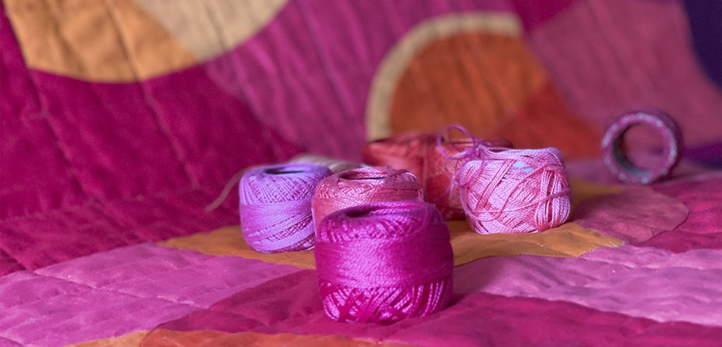
An analogous color palette is considered visually appealing because it’s often found in nature. For instance, when you take in a beautiful sunset, you’ll likely notice several different colors next to each other on the color wheel, like red, orange, and yellow. The overall effect of this color scheme is generally harmonious and soothing, making it a great guide for you to pick out a perfectly balanced color palette for your next quilting project.
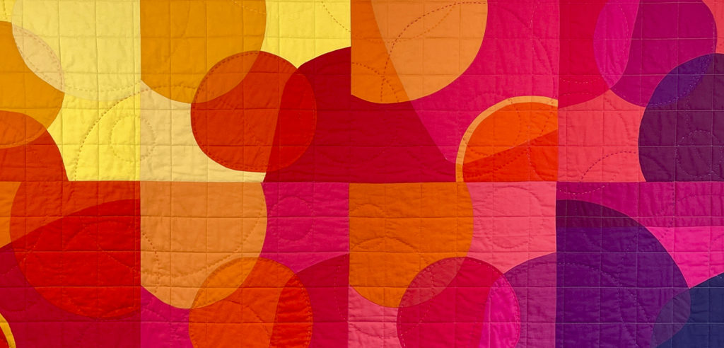
In general, there are several benefits to using an analogous color palette for your quilt. For starters, the colors blend together well to create unity throughout the quilt. You’ll also find that this palette is versatile enough for various designs and patterns. However, even though analogous color palettes work well with a variety of different quilt styles, it’s particularly effective for traditional designs.
Tips for Working With an Analogous Color Palette
Even though an analogous color palette contains complementary colors, you can still create contrast and depth in your quilt by playing with value. Consider including colors with contrasting values for drama or creative expression. You could also consider small spots of accent colors to draw attention to specific elements of your quilt.
Though color theory can seem confusing at first, understanding how colors interact with each other can help you choose the right palette for your quilt. Analogous color palettes are a visually captivating choice, particularly when value is also taken into consideration in the fabric choices. For those who want to learn more about color theory, we offer several courses on color that can help you master quilt color palettes.