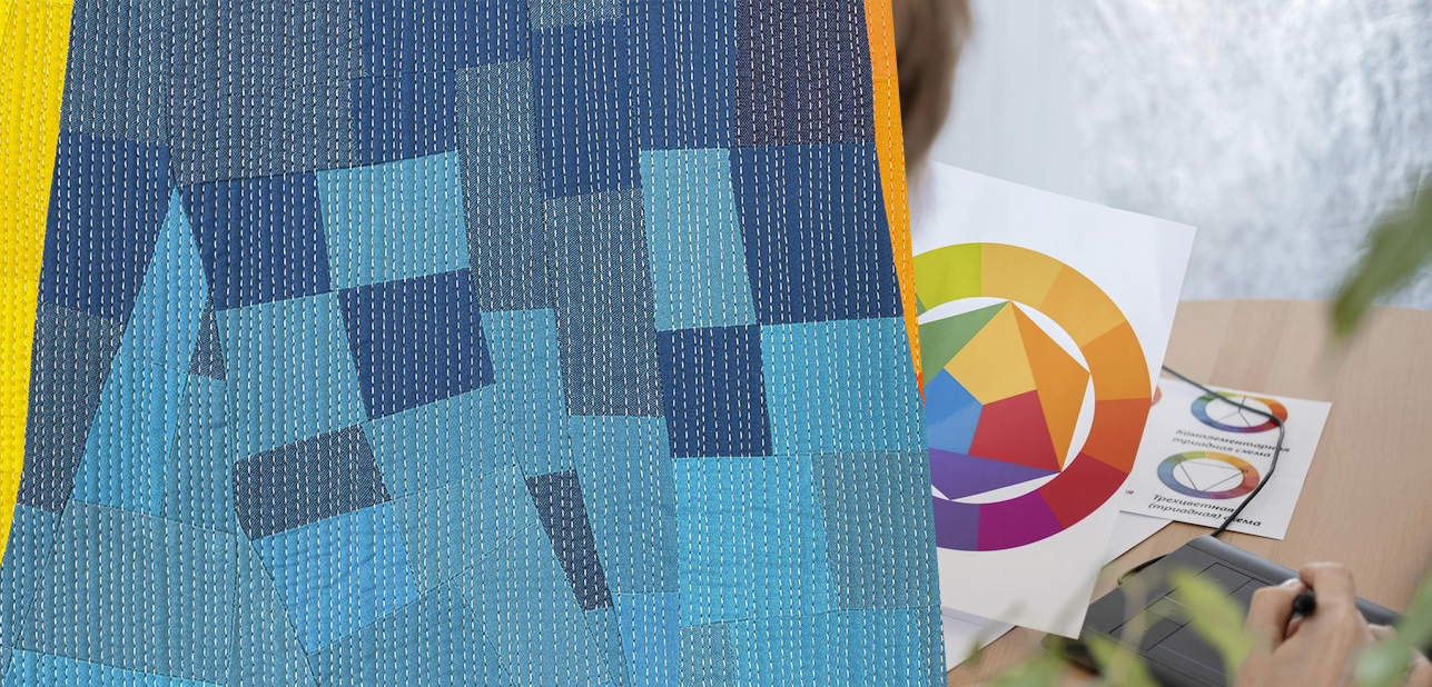
As quilters, we love fabric, patterns, and the rhythm of our sewing machines. But sometimes, a finished quilt feels underwhelming. It needs that extra something to make it shine. That’s where understanding contrast comes in. It’s the secret to making a quilt visually stunning.
Contrast in quilting is something every quilter should keep in mind, and this post explores how to use it. We’ll look at value, color, and print to make a beautiful quilt.
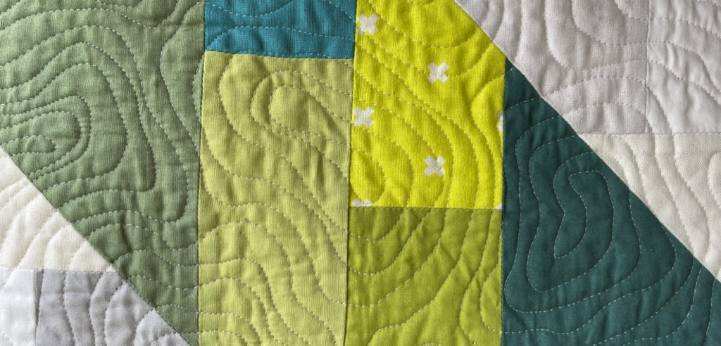
Harnessing the Power of Contrast in Quilting
Contrast is more than just light versus dark. It’s a design tool. It’s like spice, adding flavor to your quilt design. Too little makes it bland, while too much is overwhelming. Finding the right balance through contrast fabrics can make a masterpiece.
Value: The Foundation of Contrast
Value describes how light or dark a color is, regardless of its hue. It’s what our eyes see first. Value establishes depth and dimension. Imagine a black and white photo of a quilt; the gray shades are its values.


High contrast—very light and dark fabrics—makes quilt patterns stand out. Your whole quilt doesn’t need high contrast, though. A mostly light quilt with dark accents can create a calming effect.
Medium-value fabrics can sometimes look muddy. However, they add subtle interest, especially for intricate backgrounds.
Color: Adding Vibrancy and Interest
Color brings quilts to life, guiding the eye. Color contrast, such as light blue and dark blue, creates visual excitement.
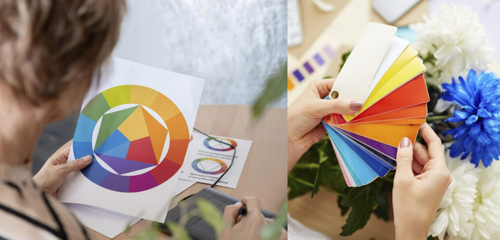
Remember the color wheel? Complementary colors (opposites, like blue and orange) offer strong contrast colors. Analogous colors (adjacent, like blue, green, teal) are harmonious. However, these benefit from varied prints or values to avoid a muddy look.
When I’m choosing fabrics, I like to keep a color wheel handy. It’s helpful to create stunning color quilts, whether you’re working on a block quilt, sampler quilt, or table runner.
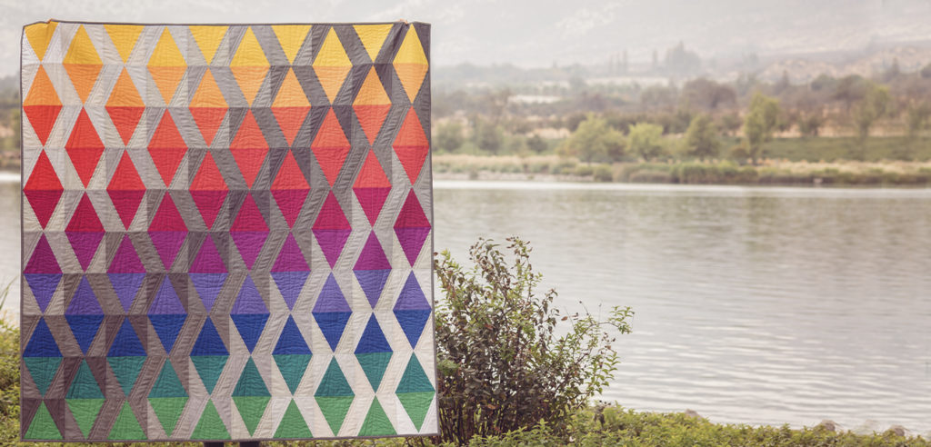
Print: Playing with Scale and Design
Print size matters in quilting. Beginners often hesitate to mix prints. But mixing prints adds so much to your quilt designs.
Combining small, medium, and large-scale prints keeps a quilt from being monotonous. Picture a tiny floral for a small block next to a large geometric for the sashing.
Play with print “intensity,” too. Mix busy, multicolored prints with simpler ones. This makes the quilt interesting and offers great contrast.


Pulling It All Together: Combining Value, Color, and Print
The most striking quilts combine contrast in value, color, and print. Don’t be afraid of scrap quilts. A scrappy quilt combines diverse elements for exciting results.
Consider medium blues and oranges (complementary colors). Look for light, dark, and medium value options. Include an array of prints, such as geometrics and various-sized florals.
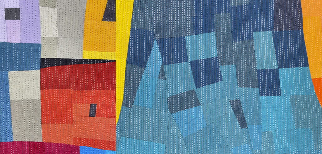
Add something unexpected from your stash. This creates contrast today with high contrast fabrics while maintaining balance among light fabrics and medium fabrics. You can also experiment with how print looks with medium light and medium dark fabrics, achieving just the right medium contrast.
Variety keeps the quilt design fresh, showing off contrast between lights, mediums, and darks. Larger prints generally look best in larger areas. Remember, contrast refers to the differences between the elements in your designs, helping create truly beautiful quilts. This can apply whether you’re using Rifle Paper Co. fabrics or creating high contrast scrap quilts. Don’t forget about Riley Blake Designs when you want beautiful, unique fabrics for your quilt patterns.
Color Theory and the Power of Contrast
Color theory helps explain contrast further. Tint, tone, and shade are important. Tint is a pure color plus white (pink is a tint of red).
Shade is a pure color plus black, creating depth. Tone is a pure color plus gray (like dusty teal), great for subtle background elements.
Background Fabric
Background fabric plays a crucial role in contrast. To highlight certain designs, consider the color relationship and apply the earlier principles.
Using black create contrast can emphasize other colors. Light colors also create a unique sense of contrast in a design, so consider them along with high contrast fabrics.
Immerse Yourself In Contrast And Color
Contrast in quilting is a powerful design tool, not a complex rule. It brings quilts to life, creating movement and visual interest. Focus on value, color, and print, no matter the quilt block, quilt blocks, block quilt, or color quilts that you use.
Don’t overthink it. Embrace contrast fabrics and create quilts you love. If you’re looking for a good place to start, check out our patterns.


