Are you an improv quilter who is looking for some tips on how to choose the perfect color palette for your next project? If so, you’re in luck! Color theory is a great way to get creative with color and select the perfect color palette for your project. In this blog post, we’ll explore some color tricks for choosing your next project color palette. We’ll look at how you can use color theory to create an exciting color palette that will make your quilt stand out. So let’s get started!
The Gamut Method
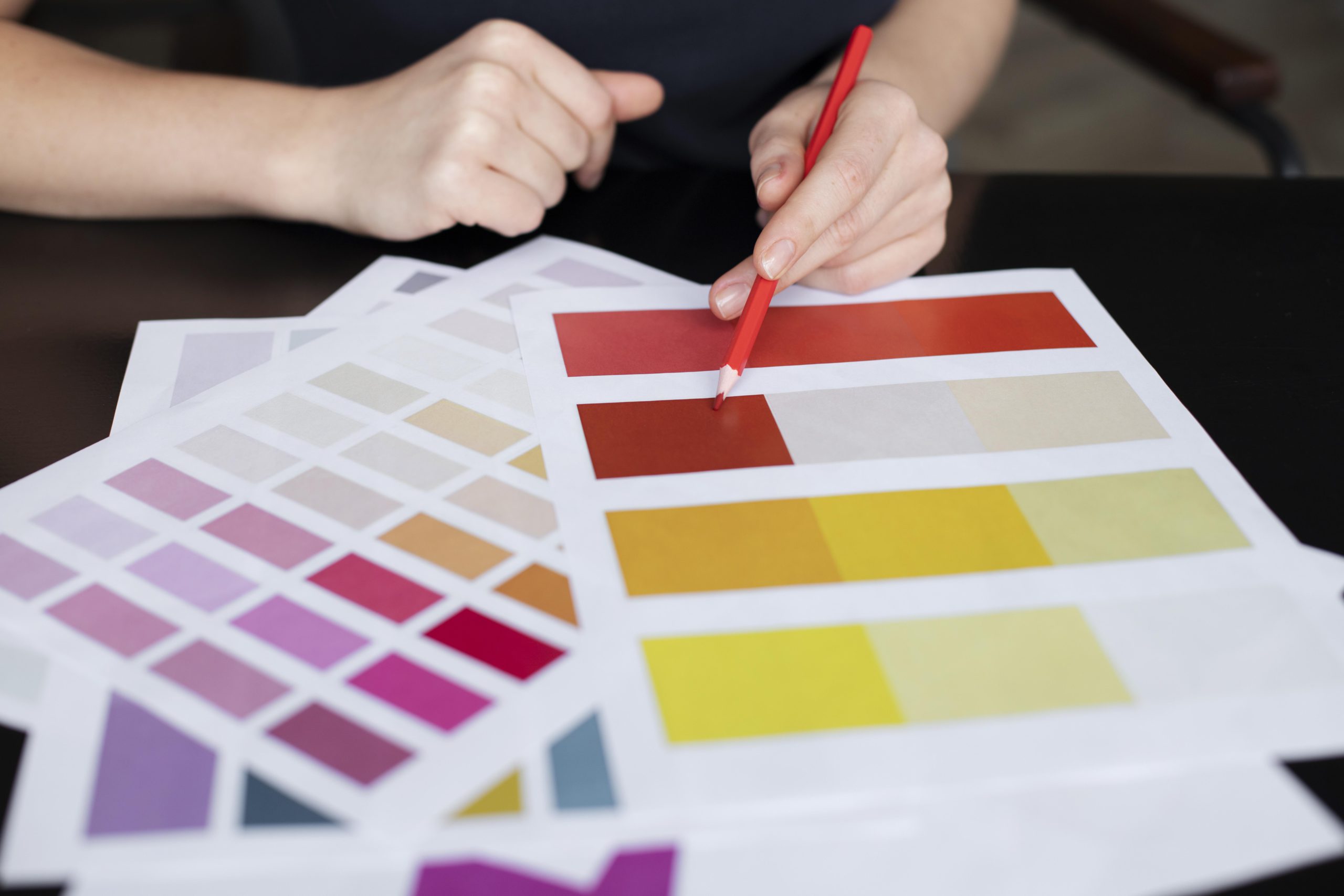
This is a method that is pioneered by artist James Gurney. Instead of utilizing the color wheel to base your colors in the traditional sense, you pick three areas on your color wheel that you define as your primary colors, subjective primaries. Most artists that utilize this color method only pick three colors and draw a triangle between the three points. The colors that lie within the triangle, or gamut, are your choices for your secondary and tertiary colors. The benefits of this method include being able to work with a smaller, tighter color palette. This is a unique way of improvising your colors quickly.
Developing and Modifying a Go-To Color Palette
A go-to color palette is something that you like. You choose the traditional primary, secondary, and tertiary colors that you want to work with, as well as the values, hues, and saturations that are beautiful to you. You know these colors well and they are things that you quickly can put together to make beautiful shapes, transparencies, and other designs. Here are some ideas for taking your go-to color palette a little bit further:
– Try an experiment where you invert your color palette. Pick the secondary colors that you typically build with and build a new color palette around them.
– Play with your saturation and hue values, pushing your color values as close to black and white as possible.
– Develop a couple of variants of your color profile that you pull freely from.
Look at Paintings, the Natural World, and Buildings for Color
If you are having trouble deciding on a color palette for your next quilt, try looking at paintings, the natural world, and buildings for inspiration. Artistic masterpieces can provide a wealth of ideas when it comes to color schemes. Whether you are interested in a traditional look or something more modern, there are endless possibilities to explore.

Many famous paintings are notable for their use of color. They often showcase colors that work well together, such as blues and greens in impressionist paintings, or bold reds and yellows in pop art. The next time you visit an art museum or gallery, pay attention to the color schemes in the works on display. You may even be able to find a color palette that resonates with you.
Another great source of color inspiration is nature. The natural world is full of beautiful colors, from the blues of the ocean to the greens of the forest. Take a walk outdoors and look for colors that catch your eye. Take pictures or make sketches of what you see to use as reference for your quilt color palette. The changing seasons offer a wonderful opportunity to explore different color palettes throughout the year.
Lastly, buildings are another source of color inspiration. Take a stroll through your city or town and pay attention to the colors of the buildings around you. Notice how the colors of the buildings interact with one another. You might find a combination of colors that you would have never thought to put together in a quilt. Architecture can also offer unique shapes and lines to incorporate into your design.

By looking at paintings, nature, and buildings for color inspiration, you can expand your creativity and come up with unique and interesting color palettes for your quilting projects. Remember, don’t be afraid to experiment with color and try something new.
Limit Yourself to the Number of Colors, Saturations, and Hues in a Color Palette

When it comes to choosing colors for your next quilt project, it’s important to keep things simple and cohesive. Limiting yourself to a certain number of colors, saturations, and hues can help you freely choose colors without getting overwhelmed or making your project appear chaotic.
Start by deciding how many colors you want to use in your quilt. This could be anywhere from two to eight, depending on the complexity of your design. Once you’ve determined the number of colors, think about the different saturations and hues you want to include. Saturations refer to the intensity of a color, while hues refer to the color family it belongs to (such as red, blue, or yellow).
By limiting yourself to a certain number of colors, saturations, and hues, you can create a more unified and balanced color palette. It’s easier to ensure that your colors work well together when you have a defined framework to work within.
Of course, you don’t have to stick strictly to this framework. It’s okay to play around with different saturations and hues within your chosen color palette. But by setting some initial guidelines, you can have more creative freedom without risking a jarring clash of colors.
In summary, when choosing colors for your next quilt project, consider limiting yourself to a certain number of colors, saturations, and hues. This will help you create a cohesive and balanced color palette that will make your quilt project shine.


