
History of Color Transparency
For centuries, artists have used color transparency for effect in their artwork. In fact, the ancient Egyptians used color transparency in many of their hieroglyphs, dating back to 1600 B.C. The artists during this long ago period probably wanted to portray the silk, cotton, and precious metals worn by their pharaohs in their court. Let’s take a look at some of the ways artists have captured color transparency throughout history.
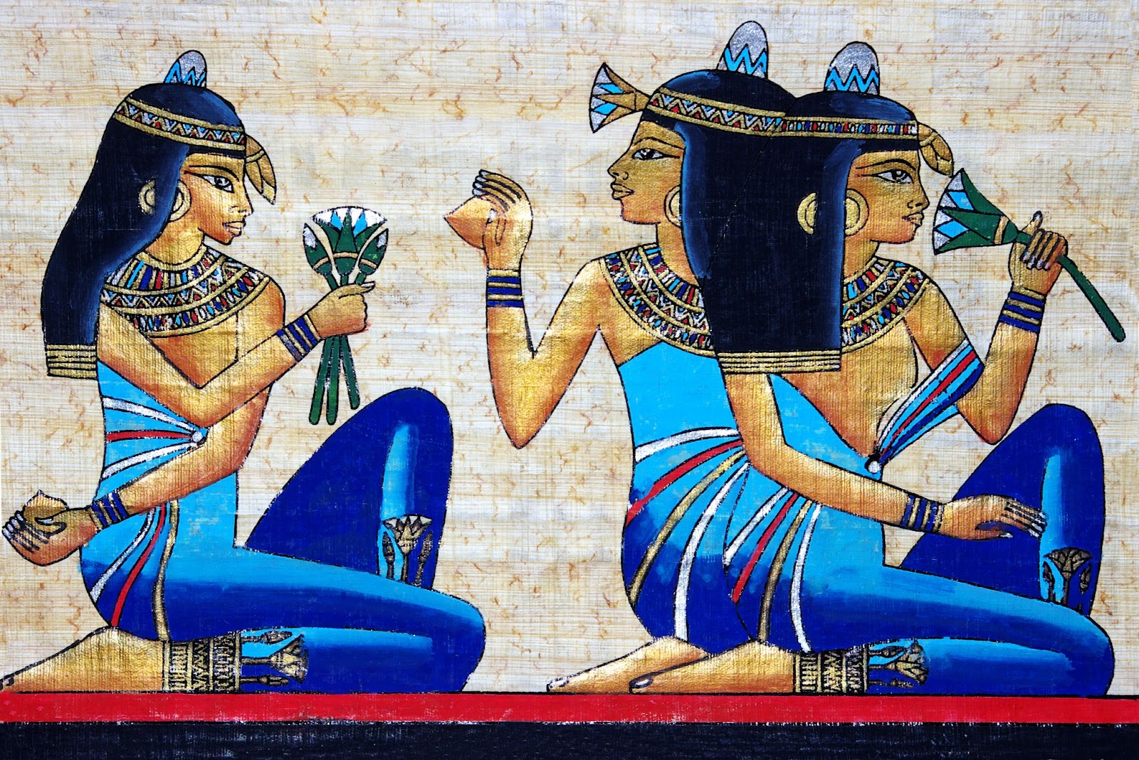
Transparent Colors Over An Opaque Color (Examples From Ancient Egypt)
This is a color technique where a dark base is used and lighter, more transparent colors are used. For example, if you were to apply a dark base with several different lighter layers, the eye will tend to see the lighter colors. Consider the Egyptian papyrus provided below. In the dark blue on the women’s clothes, the artist likely used a dark blue base and applied lighter, more transparent colors on top. The result is the lighter blue that we see in the clothes. For this effect to be useful, the transparent colors used over the opaque base must be opaque.
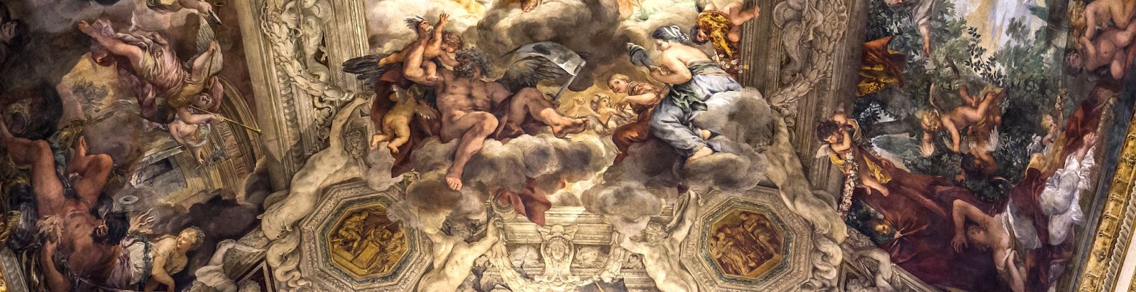
Transparent Colors Over a Dark Base (Example From a Fresco In Rome)
Another way to achieve transparency in art is to use transparent colors over a dark base. With this technique, the dark base absorbs much of the light, leading to a duller, less vibrant color. In the example shown below, the tones in the skin and surrounding architecture use a lighter cream color over a darker background to give the painting its color.
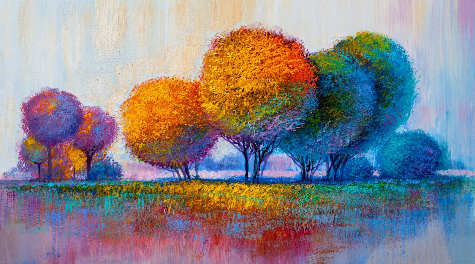
Transparent Colors Over a White Base
White is a unique color. It is both reflective and absorbing. Let’s say that an artist used a magenta/yellow mixture in the top layers. The light that hits the surface will result in an orange color. Consider the modern artwork below. We can see that white is used as a primary background color throughout the painting. However, we can see that there are areas of more vibrant color such as the orange. Here, the artist used a parent of yellows, reds, and other colors over a white background to give the resulting hue to the picture where the tree and the surrounding ground have an orange/yellowish look.
How Can I Learn Transparency and Color Theory For My Quiltmaking?
If you want to learn more about transparency and color theory to practice in your own quiltmaking, you should consider taking the curves and transparencies course. This is a great course because you can learn about color theory and some organic shapes techniques to create unique patterns and color effects in your quilts.
Another good place to learn about transparent quilts is through a book by Weeks Ringle called Transparency Quilts: 10 Modern Projects – Keys for Success in Fabric Selection.