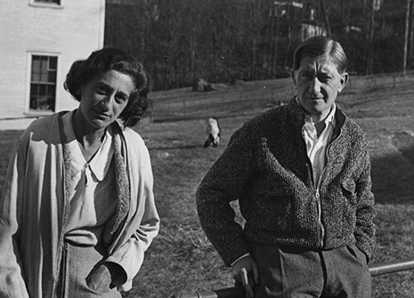
Josef Albers was an important artist and educator who lived from 1888 to 1976. His art encompassed virtually every medium, including photography, printmaking, and murals, but is best known as an abstract painter and theorist. He taught at the Bauhaus school, Black Mountain College, and even headed up the design department at Yale University. Let’s take a look at Josef Albers and his approach to design and color theory.
Josef Albers left Germany to flee Nazi persecution during the Second World War. After he emigrated to the United States, he made a name for himself as a teacher, with students who made later names for themselves.
His Contributions To Color Theory
As a color theorist, Josef Albers made some assertions that color was best studied through experience. He characterized color as being passive, deceiving, and unstable. However, after enough experimentation, an artist (or quilter for that matter), can learn to predict the behavior of color through experience. In his teachings at Black Mountain College, which were later perfected at Yale, he showed that if you put a certain color next to another, and another color after that, you could expect certain results.
One of Albers most striking works is Homage to the Square. In this series of paintings, he explores the contrast of both colors and perceptions. One of the paintings from this series, Homage to the Square: Apparition, is viewable online and physically at the Gugenheim. This painting shows four different squares: green, blue, gray, and yellow. One of the interesting aspects of this painting is that all of these colors are closely related in how they translate into one another through the experience of the painting.
From an artistic point of view, Josef Albers left an open book for the artist. His teachings on the perception and experience of color were the basis of a potential color wheel left to the intention of the creator.
What Is Explored In Interaction of Color
Some of Albers work is viewable on Bukowskis. In Homage to the Square: Wet and Dry, different shades of red are explored. Different shades of red are used, with transparency effects, to create a brighter shade of red as perception is focused to the center of the painting. For the viewer, they might experience the transition to the brighter red differently.
Translating Personal Experience of Color From Paintings to Your Improvisational Quilting
When Josef Albers started his Homage to the Square series in 1949, one of his quotes was:
“Every perception of color is an illusion.. ..we do not see colors as they really are. In our perception they alter one another.
As you explore color further in your quilting practice, you will work with different colors to learn how colors play off of each other. Over time, as you quilt more, you will be able to predict the interplay of colors based upon your own experience.


