
Energy, Warmth, and Transformation in Textile Art
Orange is the color of movement. It sits between red and yellow — between intensity and light — carrying the heat of one and the optimism of the other. Orange rarely stays still. It advances, vibrates, and expands into space, bringing warmth and immediacy wherever it appears.
In textile art, orange has a unique presence. It can energize a composition, activate surrounding colors, and introduce emotional urgency. When used with intention, orange becomes a force of transformation — a color that signals change, vitality, and life in motion.
Orange as a Transitional Color
Orange is born from transition. It is neither as aggressive as red nor as luminous as yellow, but it holds qualities of both. This makes it a powerful connector in composition.
In quilts and textile work, orange often functions as a bridge:
- between warm and cool palettes
- between light and dark values
- between calm and intensity
Color theorist Johannes Itten described orange as an active, expanding color — one that radiates outward and draws attention without the sharpness of red (The Art of Color, 1961). This expansive quality makes orange ideal for guiding the viewer’s eye through a composition.
The Spatial Energy of Orange
Orange is a color that advances. It comes forward visually, creating proximity and presence.
In textile art, this spatial behavior allows orange to:
- establish focal areas
- introduce rhythm and pulse
- bring depth to otherwise flat surfaces
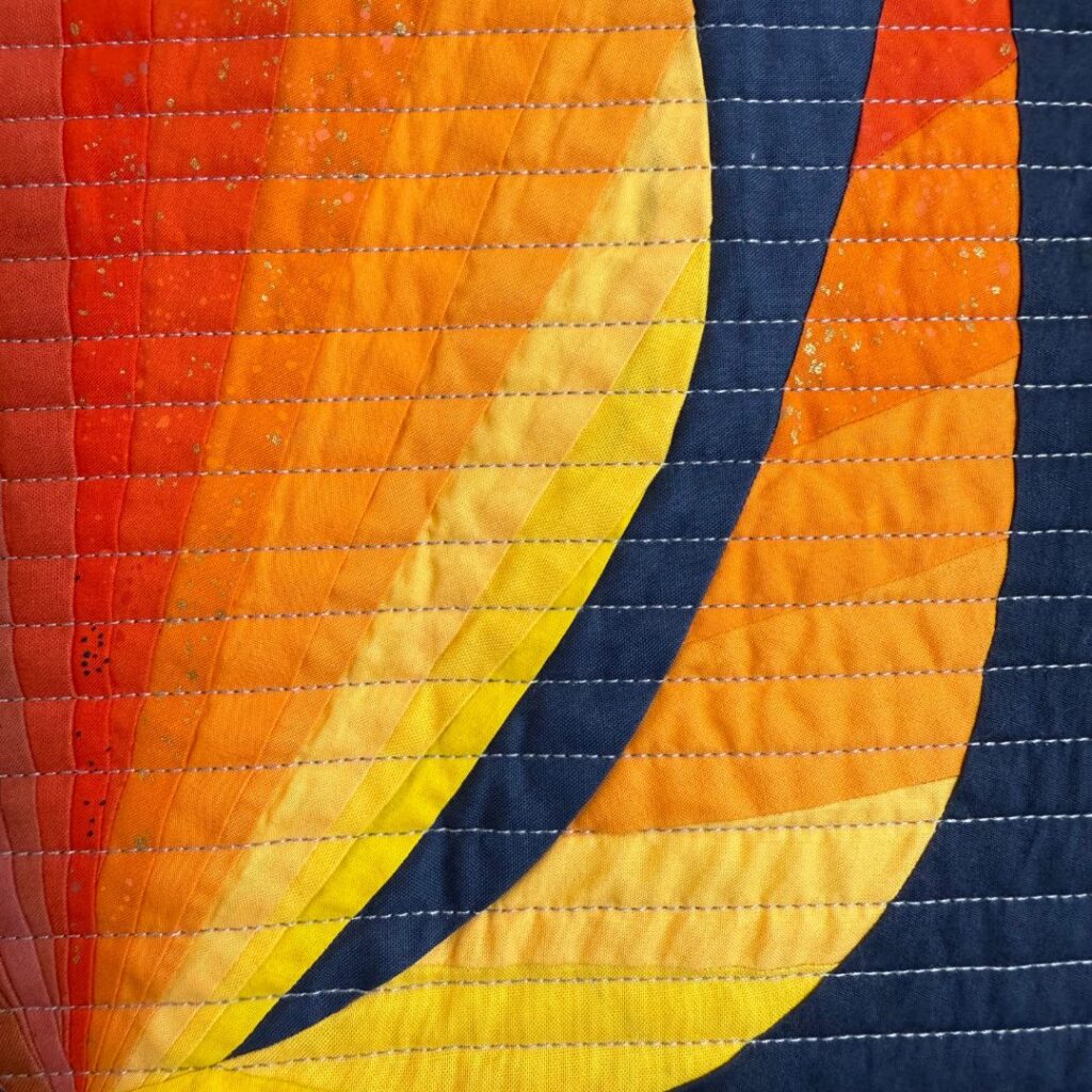
Even small amounts of orange can shift the balance of a quilt. Against cool backgrounds, orange appears brighter and more intense. Against other warm tones, it adds vibration and warmth.
According to Rudolf Arnheim, our perception of space is strongly influenced by color intensity and temperature (Art and Visual Perception, 1974). Orange, with its high visibility and warmth, naturally claims space and attention.
The Emotional Language of Orange
Orange is emotionally charged.
It is often associated with:
- vitality and enthusiasm
- warmth and connection
- creativity and play
- transition and transformation
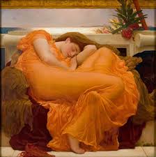
Unlike red, which can feel urgent or confrontational, orange communicates openness. It invites engagement rather than demands it. In textile art, this makes orange especially effective in works that explore movement, growth, or emotional shift.
Color psychology research notes that orange stimulates energy and optimism, making it a color that encourages interaction and emotional warmth.
Orange in Relationship, Not Isolation
Orange rarely works alone. Its strength lies in relationship.
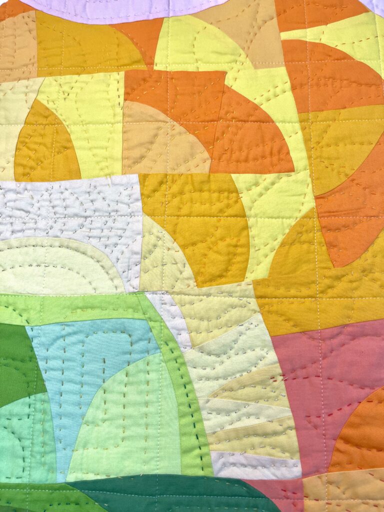
- Paired with cool colors, orange intensifies contrast and movement.
- Paired with neutrals, it brings life and warmth.
- Paired with other warm tones, it creates vibration and density.
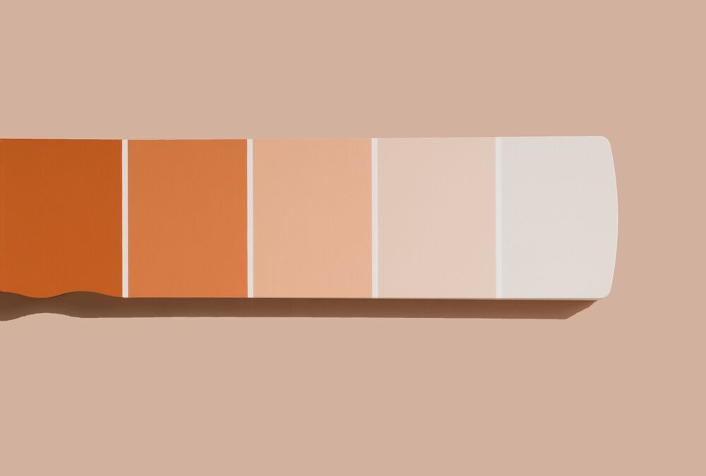
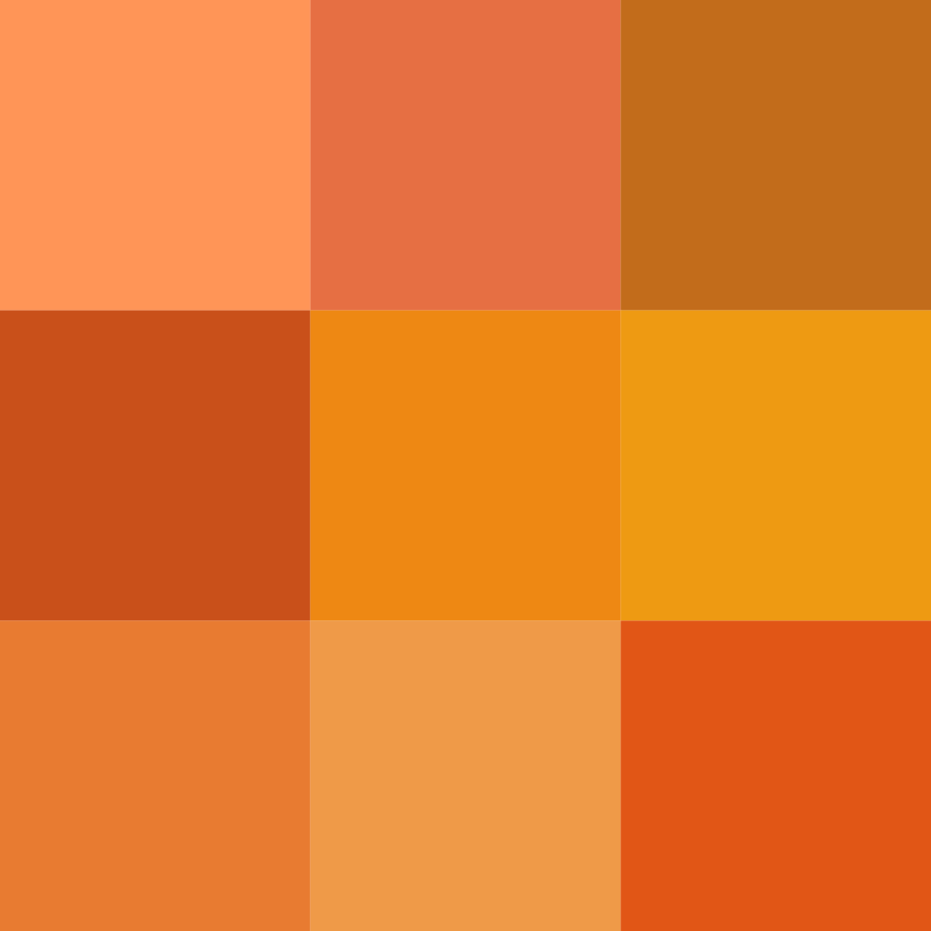
Subtle variations — rust, coral, burnt orange, peach — allow orange to shift from bold to contemplative. These nuanced oranges are especially effective in textile art, where fabric texture softens intensity and adds depth.
This relational behavior reflects Josef Albers’ core insight: color is never static; it is continually altered by its neighbors (Interaction of Color, 1963).
Orange as a Carrier of Light and Heat
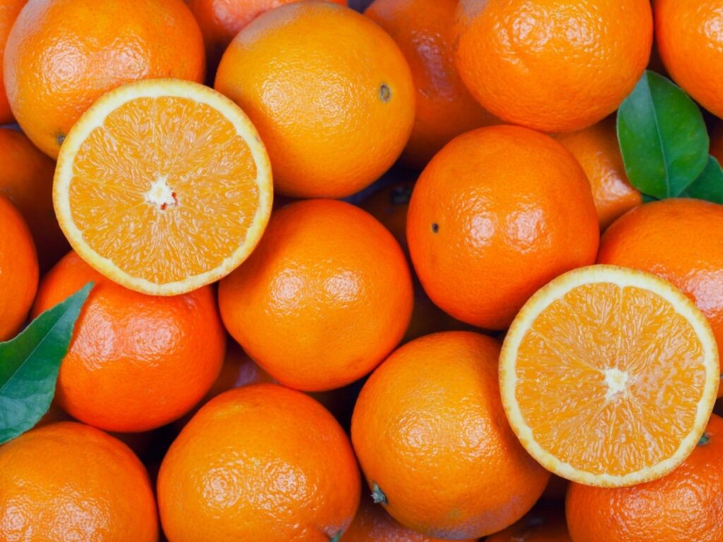
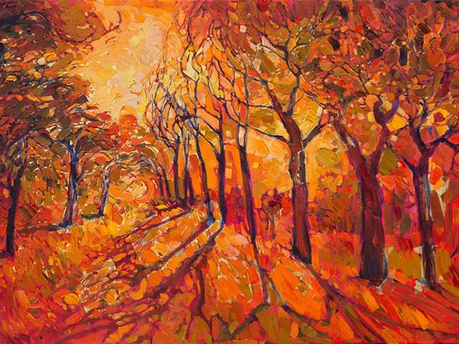
Orange is inseparable from light. It recalls sunset, fire, clay, autumn leaves — moments when warmth and change coexist.
In textile art, orange often acts as a light source within the composition. It suggests heat without harshness and illumination without glare. When layered thoughtfully, orange can feel internal — as if glowing from within the fabric rather than sitting on the surface. This quality makes orange especially powerful in abstract work, where light and emotion must be conveyed without representation.
The Tate Museum describes warm colors like orange as essential tools for creating emotional atmosphere and spatial engagement in abstract art.
When Orange Becomes the Structure
Orange is often thought of as an accent, but it can also function structurally. Deeper oranges can anchor a composition without the heaviness of red or brown. Muted oranges can replace neutrals, adding warmth while maintaining balance. Used strategically, orange can define edges, establish rhythm, and guide movement across a quilt.
When orange becomes structure rather than decoration, it brings confidence and clarity to the work.
Orange is not a secondary color. It is a color of passage — between intensity and light, stillness and movement.
In textile art, orange introduces energy, warmth, and transformation. It activates space, carries emotion, and invites the viewer into the work. When used with intention, orange becomes more than color — it becomes momentum.
Orange reminds us that art does not need to be quiet to be thoughtful. Sometimes, it needs to glow.