The Psychology of Color
Colors make our surroundings more beautiful. However, few individuals know that colors are
more complex than tints and tones. In reality, color is a means of communication. Different hues
can elicit particular emotions in our brains, which impact our thoughts and feelings daily.
What exactly is the psychology of color? The idea of color psychology is a branch of color
theory that has gained popularity and assigns psychological and emotional meanings to colors.
Some of these meanings are simply cultural, while others are universal because of the way they
impact the brain.
Sometimes color might mean many different things to you. For example, the color yellow may
be perceived as cowardice in Western cultures, while in Japan, it symbolizes courage. Personal
experiences also play a factor in color perception. A particular color may remind you of a
negative experience you subconsciously associate with that color. It is also valid on the opposite
spectrum with a positive experience. Below are the most common symbols associated with
individual colors.
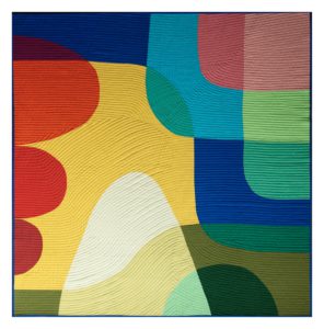
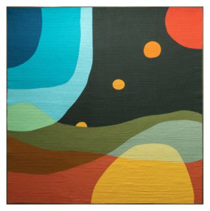
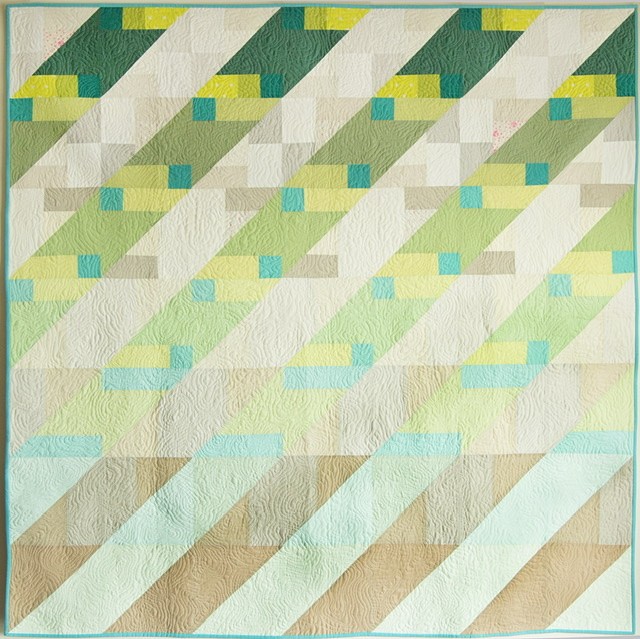
Find out what each color symbolizes and how they can work together harmoniously. In modern
quilting, color choice can make all the difference.
The Significance of Color
Every day, we are surrounded by color. Understanding the psychological effects of color will
help you make the most of this information. Surround yourself with hues that will improve your
outlook, conduct, and daily activities. Why? Because, when appropriately used, color may
genuinely enhance your way of life.
What role do colors play in our moods? Even though how people see color might vary, some
impacts are universal. Warm colors are those in the red region of the spectrum that can have a
yellow foundation, such as fiery red and red-orange. These warm hues may make people feel
everything from warmth and comfort to hatred and rage. Reds are classified as cold hues and
can also have a blue undertone. Examples include burgundy, ruby, raspberry, and deep cherry.
Although they can also evoke gravity and dignity, these hues are frequently considered calming.
Understanding the symbolism of colors can help you choose a palette that reflects the message
you wish to convey and which colors may be an appropriate choice for a specific occasion.
How Colors Are Typically Perceived
Red
Red is stimulating. It stirs up our feelings and inspires us to act. It denotes a spirit of exploration
and leadership abilities, encouraging aspiration and tenacity. Red ignites our physical life
energy because it is the color of activity.
Pink
Pink is a color that stands for empathy, nurturing, and love. It has to do with unwavering love,
comprehension, and the giving and receiving of care. Pink, a mixture of the colors red and
white, possesses the need for action of red and the opportunity for achievement and
understanding provided by white.
Orange
In contrast to the bodily reaction of red or the conceptual response from yellow, orange is
associated with our “gut reaction” or instincts. Orange provides emotional fortitude through
trying circumstances. Orange’s psychological effects on us are upbeat and happy, reviving our
spirits.
Brown
Brown is a sober, earthy color that denotes stability, structure, and support. Brown takes its
responsibilities seriously regarding the defense and upkeep of the family unit and does so with a
strong feeling of duty and responsibility.
Yellow
Yellow is a symbol of learned knowledge. The color stimulates our cerebral capabilities,
fostering mental agility and perception, and resonates with the left, or logic, side of the brain.
Yellow’s color psychology is uplifting and enlightening due to its being the lightest color in the
spectrum. It offers hope, happiness, cheer, and pleasure.
Green
Green is associated with harmony and balance. According to color psychology, it is the supreme
stabilizer of the heart and the emotions, bringing the connection between the head and the
heart. Green is the color of growth, spring, renewal, and rebirth, according to the meaning
colors. It replenishes and regenerates spent energy.
Blue
This color symbolizes commitment, honesty, duty, and trust. It is sincere, quiet, restrained, and
dislikes to cause a scene or attract attention. According to color psychology, blue represents
dependability and responsibility. This hue exudes inner security and assurance.
Turquoise
The color turquoise facilitates communication between the spoken word and the heart. It gives
off the impression of being a cheerful, upbeat color. According to color psychology, turquoise
balances and stabilizes emotions by healing and controlling them.
Purple
Purple inspires lofty ideas and is associated with creativity and spirituality. It can be original and
distinctive or immature and illogical. Purple connotes quality, fantasy, imagination, money, and
even royalty. This tone heightens people’s appreciation of beauty and influences how they
respond to more original ideas.
Indigo
Indigo is a third-eye-opening color that is associated with perception and intuition. It encourages
intense focus during periods of reflection and meditation, assisting you in reaching higher states
of consciousness. Instead of relying on gut instinct, it uses intuition. A dark midnight blue, indigo
combines deep blue and violet and possesses the qualities of both hues.
Gray
Gray is a color that doesn’t evoke any feelings. It is the fence-sitter because it is impassive,
unbiased, neutral, and undecided. Gray is the color of compromise from the standpoint of color
psychology because it lies between the non-colors of black and white. Gray becomes more
dramatic and enigmatic the closer it goes to black.
Silver
Silver has a feminine energy that is fluid, emotive, sensitive, and enigmatic. It is associated with
the moon and the ebb and flow of the tides. It has calming, cleansing effects. According to color
psychology, it denotes a period of introspection and a shift in course by illuminating the route
ahead.
Gold
Gold is the color of triumph, accomplishment, and achievement. The psychology of this color
suggests opulence, material wealth, and extravagance since it is linked to abundance and
prosperity, luxury and quality, prestige and sophistication, value, and elegance.
White
White is the color of perfection because it is color at its purest and most complete. White has
psychological connotations of innocence, wholeness, purity, and completion. White is the color
associated with fresh starts and, in a sense, starting again according to color psychology.
Black
Black is associated with the unknown, the mysterious, and the hidden. Therefore it lends an air
of mystery. It keeps things sealed away from the outside world. According to color psychology,
this color offers a defense against external emotional stress.
All color is absorbed in black, and there is no light.
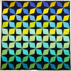
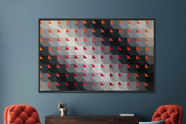
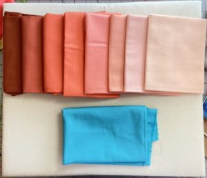
Color Harmonies
There are endless possibilities when creating a color palette in modern quilting. The color wheel
is split between warm and cool colors. Warm colors remind us of summer days in the heat,
while cool colors remind us of the cooler months. There are five ways to use colors in harmony.
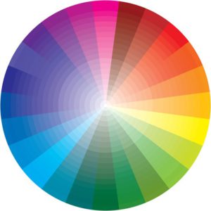
Complimentary
Colors are opposite each other on the color wheel.
Analogous
Groups of three colors are next to each other on the color wheel.
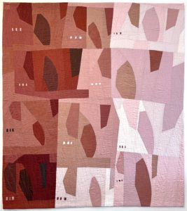
Monochromatic
A color scheme that contains several shades, tones, and tints of one color.
Triadic
Three colors are in equilateral position on the color wheel, like a triangle.
Split Complementary
One dominant color and two complementary, a more narrow triangle
Tetradic
Four colors are divided evenly on the color wheel. (Can be an X pattern or a square)
Using one of these color harmonies when choosing your colors for your next modern quilting
project will ensure balance that is pleasing to the eye. It is wise to follow an 80:20 ratio when
combining colors so as not to overwhelm the final design.
Final Reflections on Color Psychology
In the world we live in, color is really essential. Thinkers’ opinions, behaviors, and reactions can
all be affected by color. It can make your eyes feel better or worse, boost your blood pressure,
or make you feel less hungry. The appropriate use of color can potentially reduce energy use.
Color is a potent tool for communication that cannot be replaced.
Imagine what a better quilter you can become with a better understanding of color and how they
harmonize with each other?
What is exciting is that the color wheel is just the beginning! Even though color psychology is
significant, it is not the only factor that influences the creation of a masterpiece. Remember
there is no such thing as improper use of color. Experiment with hues and tones until you
discover a harmonious color combination. Don’t restrict yourself based on color psychology
because creativity is valued. Consider it a technique to kick-start the color scheme for your
upcoming modern quilting project.
Explore other models of creating color palettes when choosing the colors for your modern
quilting design. When quilting and experimenting with color value, we frequently consider adding
or removing specific components to achieve the desired colors. You can come up with a
different color scheme than you might have in the past.
There are workshops about color theory available to learn more about creating your palette and
incorporate that knowledge into modern quilting. Try creative and colorful improv pieces to make
your quilt stand out!