
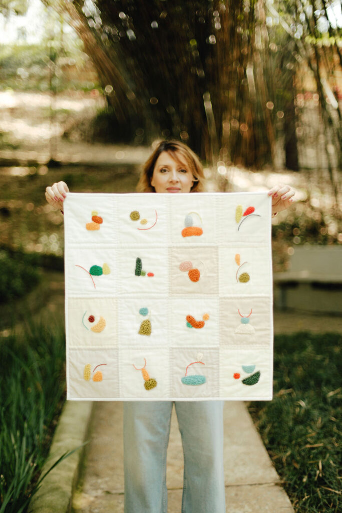
Figure-ground is one of the most important — and often misunderstood — concepts in quilt composition.
In simple terms:
- Figure = the dominant visual element (what we perceive as the subject).
- Ground = the background or supporting space.
But in strong design, figure and ground are not accidental. They are intentional, structured, and perceptually controlled.

Understanding figure-ground in quilt design allows you to create:
- Clear focal points
- Strong negative space
- Visual depth
- Dynamic ambiguity
- Balanced composition
This concept comes directly from Gestalt psychology, a theory of visual perception developed in the early 20th century.
Gestalt Theory: The Foundation of Figure-Ground
Gestalt psychology emerged in Germany in the early 1900s, with key theorists including:
- Max Wertheimer
- Kurt Koffka
- Wolfgang Köhler
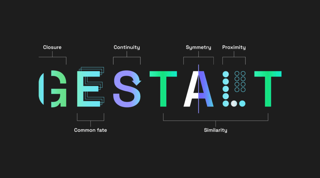
Gestalt theory proposes that humans perceive visual elements as organized wholes rather than isolated parts.
Interpretation should be supported by observation — not speculation.
One of its central principles is figure-ground organization — the idea that our brains instinctively separate what we see into:
- A background (ground)
- A dominant object (figure)
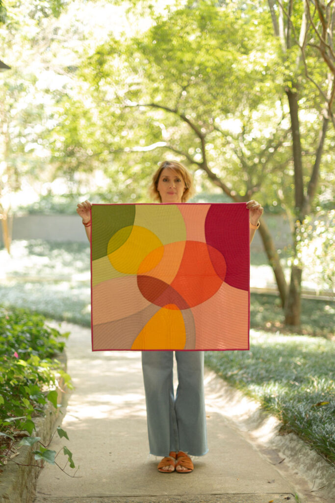
Why Figure-Ground Matters in Modern Quilting
Modern quilting frequently uses:
- Strong negative space
- Bold shapes
- High contrast color
- Minimalist compositions

All of these rely heavily on figure-ground clarity.
If figure and ground are not clearly differentiated, a quilt may feel:
- Overwhelming
- Visually confusing
- Flat
- Unresolved
On the other hand, controlled ambiguity — where figure and ground intentionally compete — can create sophisticated visual tension.
How the Brain Decides What Is Figure
Gestalt theory identifies several factors that influence figure-ground perception.
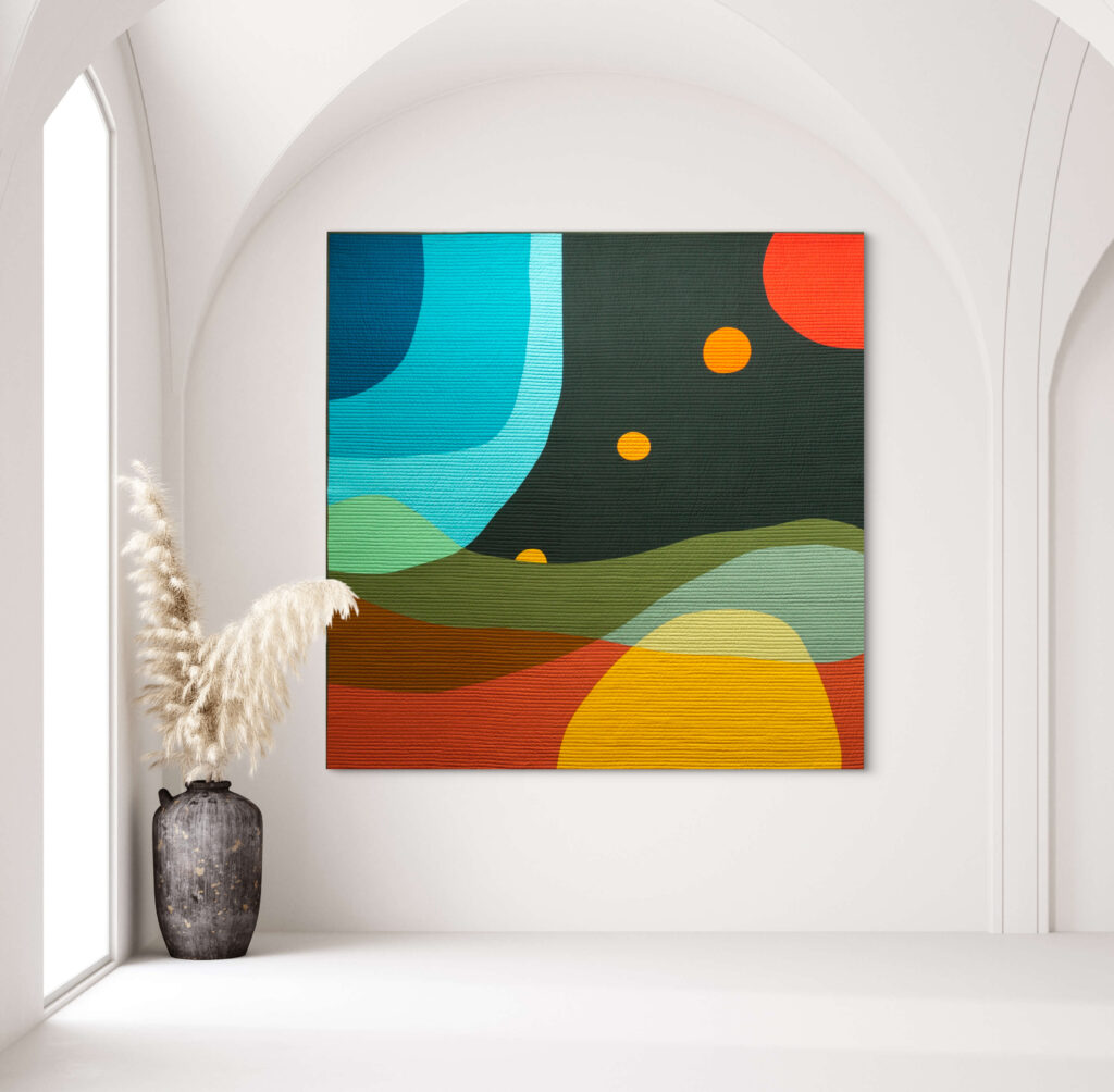
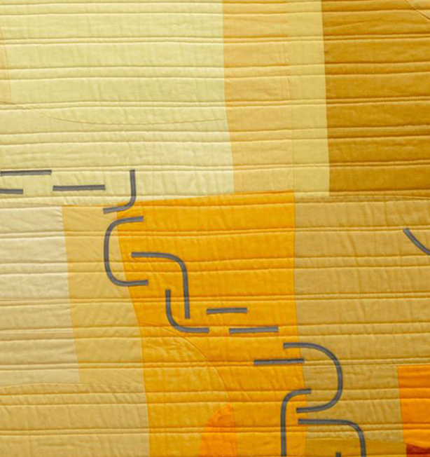
Contrast (Especially Value Contrast)
The strongest tool in quilt design is value contrast.
High contrast → clear separation
Low contrast → merging or flattening
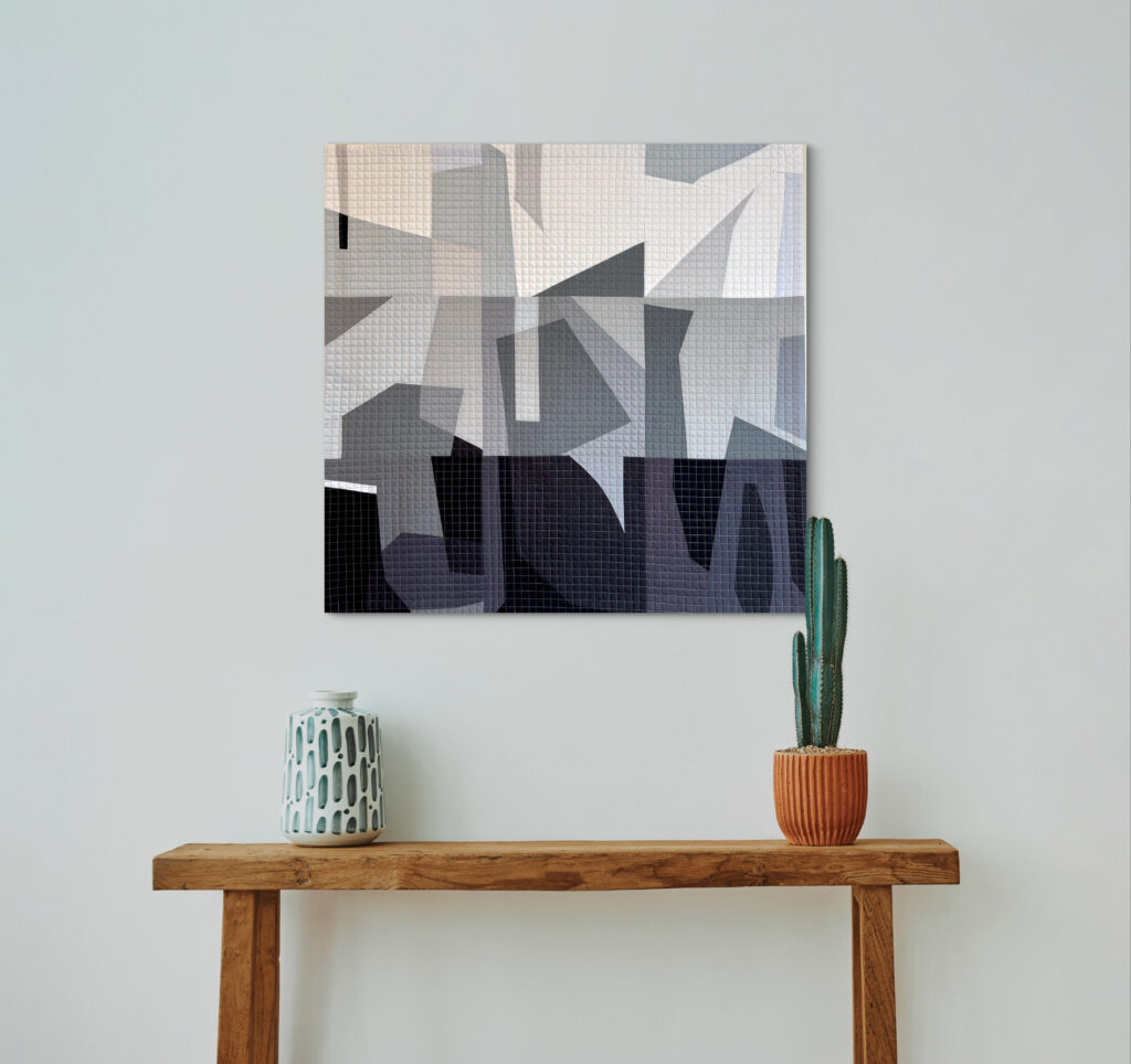
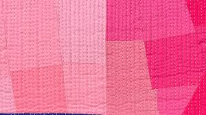
If your focal shape and background share similar value, the figure may dissolve into the ground.
This is why converting a quilt photo to grayscale is such a powerful diagnostic tool.
Size and Area
Smaller shapes are often perceived as figure. Larger surrounding areas tend to become ground.
This is particularly important when working with:
- Asymmetrical balance
- Large negative space
- Minimalist layouts
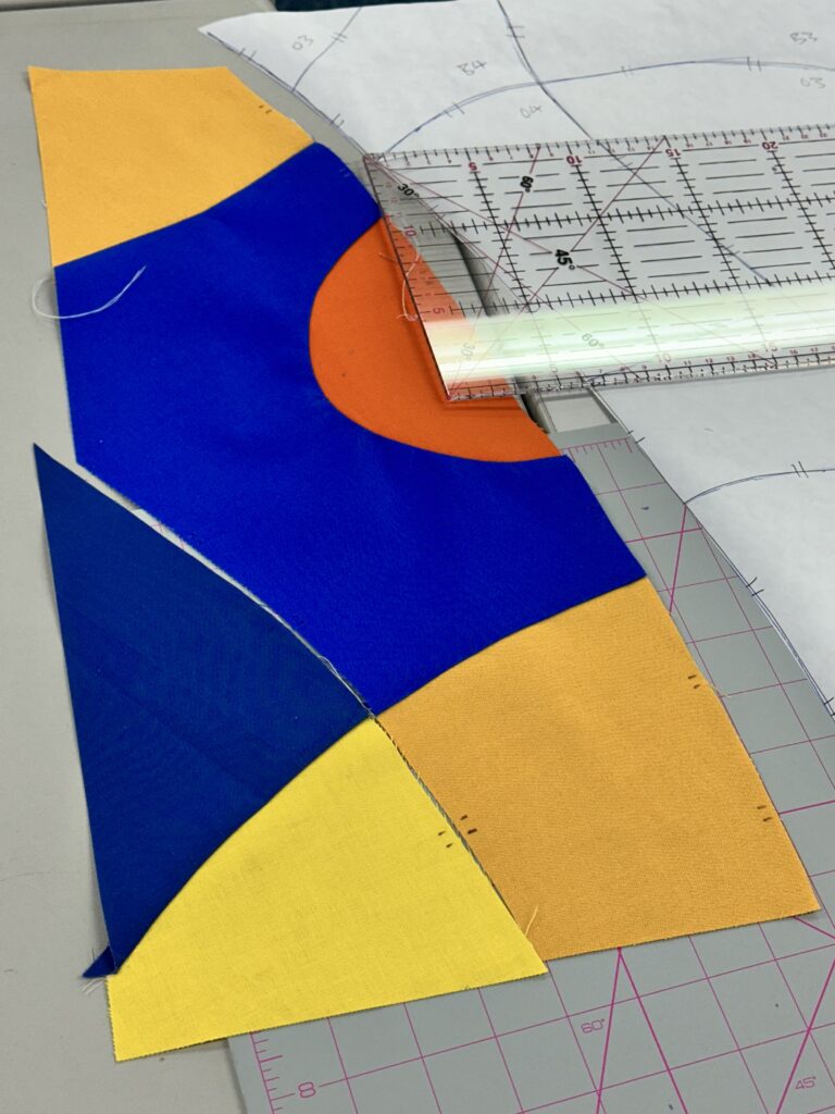
Edge Definition
Sharp, clearly defined edges reinforce figure status.
Soft edges or low contrast edges blur figure-ground separation.
Curved piecing with high value contrast strengthens clarity.
Low contrast curves create subtle transitions.
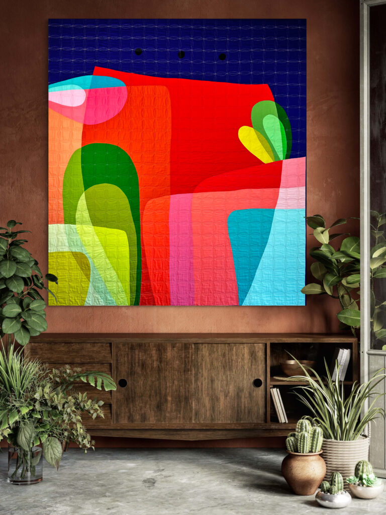
Enclosure
Shapes that are enclosed by a boundary tend to read as figure.
This is why appliqué and bold organic shapes often feel dominant — they are clearly bounded.
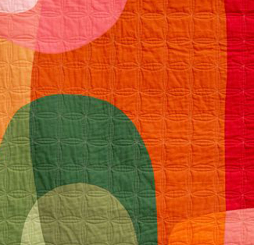
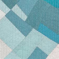
Ambiguous Figure-Ground: Advanced Composition
One of the most interesting uses of figure-ground in quilt design is ambiguity. In some quilts, what first appears as background may shift into figure.
This perceptual reversal is common in graphic design and is often demonstrated by the Rubin Vase illusion.
In quilting, you can create figure-ground ambiguity by:
- Using similar values
- Repeating shapes in both figure and ground
- Using complementary colors of equal intensity
- Allowing shapes to “float” in negative space
Ambiguity creates movement and visual engagement. The viewer’s eye shifts between interpretations.
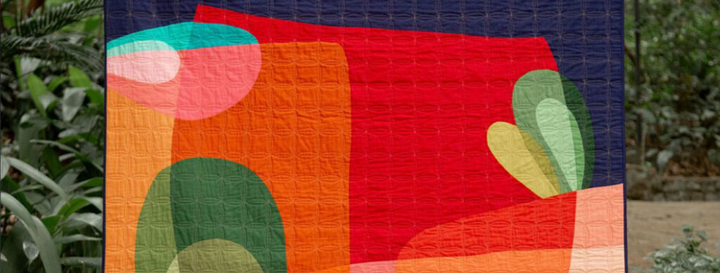
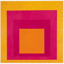
Figure-Ground and Color Theory
Color interacts with figure-ground in powerful ways.
According to Josef Albers in Interaction of Color, color perception is relational. A color may appear darker, lighter, warmer, or cooler depending on surrounding colors.
This means:
- A violet shape on white reads clearly as figure.
- The same violet on navy may lose dominance.
- A medium-value shape on medium-value ground may collapse visually.
Value remains more important than hue in establishing figure-ground clarity.
Common Figure-Ground Problems in Quilting
- Low value contrast between figure and background
- Too many competing focal points
- Inconsistent edge definition
- Overly busy background competing with the subject
- Saturation imbalance
If a quilt “doesn’t feel right,” figure-ground confusion is often the cause.
How to Strengthen Figure-Ground in Your Quilt
Step 1: Convert to Black & White
Remove color and evaluate value contrast.
Step 2: Squint Test
Blur your vision slightly — what dominates?
Step 3: Isolate the Focal Shape
Does it still read clearly from a distance?
Step 4: Simplify
Reduce background complexity if necessary.
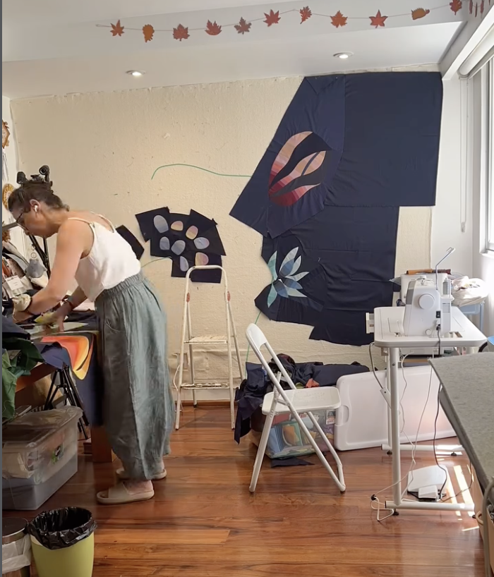
How I Teach Figure-Ground in My Workshops
In my Elements & Principles of Design workshops, we explore figure-ground through:
- Cropping exercises
- Black-and-white value studies
- Saturation contrast experiments
- Design wall rearrangement
Students often discover that their “background” is unintentionally competing with their “figure.”
When figure-ground becomes intentional, compositions gain strength immediately. Understanding Gestalt theory gives language to what many quilters intuitively sense but cannot articulate.


Why Figure-Ground Is Foundational in Contemporary Quilts
Modern quilts frequently rely on:
- Clean geometry
- Organic bold shapes
- Expansive negative space
- Graphic clarity
All of these demand figure-ground awareness. Without it, minimal design can feel empty. With it, minimal design feels powerful.
Figure-ground is not just a design term.
It is a perceptual principle rooted in Gestalt psychology.
When you understand how the brain organizes visual information, you gain control over:
- Focus
- Depth
- Hierarchy
- Balance
- Visual tension