")
There is a color in your stash right now that you have never used. Maybe you bought it years ago in a moment of boldness that quickly passed. Maybe someone gave it to you and you accepted it politely while already planning to give it away. Maybe you see it every time you open your drawers and move past it without quite knowing why.
You probably already know which color it is. It might be orange — raw, electric, uncompromising. Or acid yellow, or certain shades of red, or that particular magenta that feels like it belongs to someone else’s work, not yours. Or perhaps it is brown, which feels unglamorous. Or lime green, which feels aggressive. Or a deep purple that seems to announce itself too loudly.
Every quilter has one. And almost every quilter has a story about why they don’t use it. This article is about examining that story — and then, very gently, questioning whether it is actually true.
Why We Avoid Certain Colors
Color avoidance is not random. It follows predictable patterns that are rooted in psychology, personal history, and the quiet but powerful pressure of what we think we are ‘supposed’ to like.
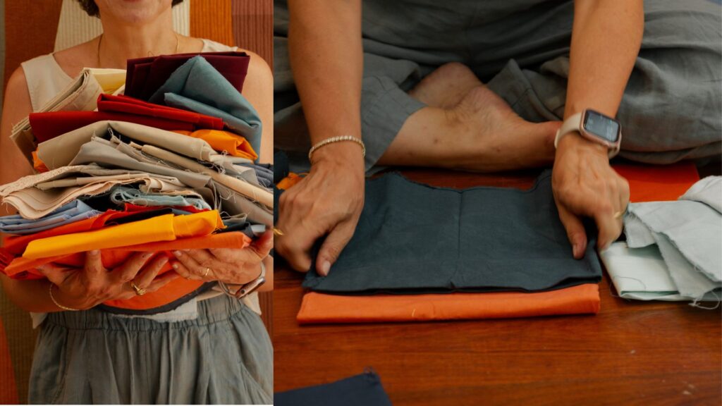
The most common reason quilters avoid a color is simple: they don’t think they can make it work. They have a story — often formed early, often from a single failed attempt or a half-remembered critique — that this color is difficult, or that it clashes with everything, or that it is ‘not their style.’ Lack of confidence in the fabric pull process can lead to ignoring whole sections of your stash. And so the avoided color stays in the drawer, untouched and underestimated.
The second reason is identity. Over time, quilters develop a signature palette — a set of colors that feels like home, that reads as distinctly ‘theirs.’ This is a beautiful thing. But we get into color ruts, going back to the same few colors over and over. The avoided color sits outside the identity we have constructed, and reaching for it feels like a betrayal of who we are as makers.
The third reason is aesthetic inheritance. The colors we are drawn to and the colors we avoid are not entirely our own choices — they are shaped by the taste of the era we learned to quilt in, the teachers who influenced us, the shows and magazines we absorbed. Some colors carry cultural baggage. Orange, for instance, is intensely polarizing in Western contexts — loved fiercely by some quilters, avoided completely by others who absorbed an unexamined belief that it is garish or cheap. The same is true for neon, for certain shades of brown, for magenta.
None of these stories are facts. They are habits. And habits can be examined.
The Anxiety Is the Signal
I have been teaching color for many years, and I have noticed something consistent: the color that makes a student most anxious is almost always the color that, once introduced, transforms their work.
This is not a coincidence. The anxiety itself is a signal — not that the color is wrong, but that it matters. We do not feel anxious about colors that are irrelevant to us. We feel anxious about colors that we sense have power, colors that we secretly know would change something if we allowed them in. The avoidance is a form of respect, even if we have been framing it as rejection.
As artists, the only way to grow and develop and deepen our craft is by challenging ourselves to move out of our comfort zone sometimes. That discomfort is not the enemy. It is the friction that generates growth. It is in these moments — when you lean into the discomfort rather than away from it — that true growth happens.
The question is not whether the color is right for you. The question is whether you have genuinely tried — or whether you have just decided, from a safe distance, that it would not work.
What Actually Happens When You Try It
My own story with this is very specific, and I want to share it because I think it will sound familiar.
For a long time, I did not use brown. I moved past it in the shop, left it untouched in my stash, and told myself it was not part of my language. It felt heavy. Unglamorous. Too close to mud.
Then at some point I decided to give it a real chance — not one brown, but many browns, explored deliberately. And what I discovered changed how I see color permanently.
Brown is not one thing. Depending on its undertone, a brown can read as a very dark orange, or a deep warm red, or a rich dark yellow. It carries all of those warm hue families inside it, compressed and grounded. And what it does to a composition is extraordinary: it adds weight. It adds contrast. It brings a warmth that black simply cannot provide because black is cold and final, where brown is alive and resonant.
Now I often reach for brown instead of black when I need to anchor a composition. The effect is completely different — less hard, more complex, warmer in a way that reverberates through every other color it touches. The undertones of each brown I use interact with the surrounding fabrics in subtle and endlessly interesting ways. A dark amber brown will pull the oranges and yellows forward. A deep reddish brown will deepen and intensify any cool color next to it. A brown that leans toward olive will ground greens and muted tones in a way nothing else can.
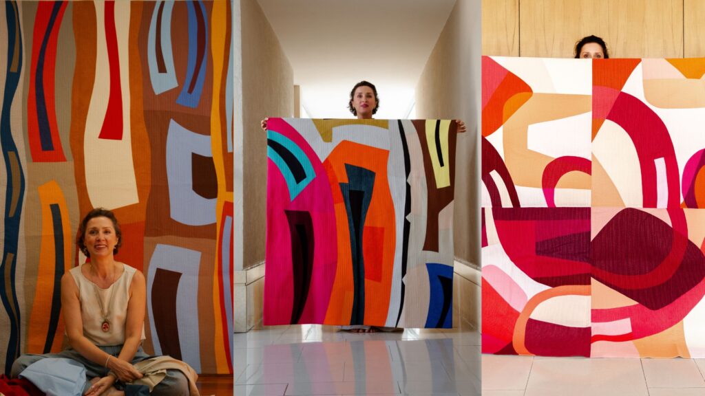
I love working with browns now. And I can show you exactly what I mean through some of my own quilts.
Brown in My Work
The three quilts in my The Space Between series — The Space Between 1, The Space Between 2, and The Space Between 3 — each show brown working in a different register.
In The Space Between 3, warm golden browns and deep chocolate browns form two of the main vertical color bands across the composition. They anchor the oranges and blues that move through the surface, preventing the brighter colors from floating away from each other. Without that brown, the composition would have energy but no gravity.
In The Space Between 2, a single warm brown stripe appears on the right side of the composition, paired with yellow. It is surrounded by very saturated, bold color — magenta, orange, deep navy. And yet that quiet strip of brown does something no other color could do in that spot: it grounds everything. It gives the eye a place to rest and, in doing so, makes the intensity of the surrounding colors even more legible.
In The Space Between 1, the deep burgundy-brown forms the heaviest value in the entire composition, anchoring a swirling landscape of reds, pinks, and oranges. Here brown reads almost like a very dark red — which is exactly what it is. It gives weight to the bottom of the composition and makes the lighter, more vibrant pinks and crimsons feel as though they are rising from something solid.
In Riomaggiore, from my Imaginary Places series, brown appears as the warm amber cliffs on the left side of the composition, rising against a field of blues. It also appears as the small dark brown rectangles that serve as windows in the little buildings at the bottom. In both cases, brown is doing the work of the earth — grounding the composition in something physical and warm against the expansiveness of sky and water. A black would have been harsher, more digital. The brown feels like land.
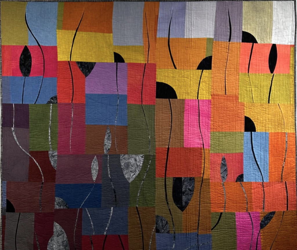
In The Shadow Within, brown moves through the background blocks in multiple temperatures — from warm terracotta-brown to deep chocolate — holding together a vibrant composition full of strong, assertive colors. The browns here are the quiet infrastructure. Without them, the yellows, oranges, reds, and blues would compete. With them, the composition has a structure that allows all those colors to coexist.
In Candles, brown is not one of the colors — it is the color. The entire palette moves through a range of beige, taupe, dusty rose, warm gray, and dark chocolate, with hits of mustard yellow. This quilt was possible precisely because I had learned to love the full range of brown and to see all its undertones as distinct, expressive hues. If I had made this quilt in the period when I avoided brown, it simply would not exist.
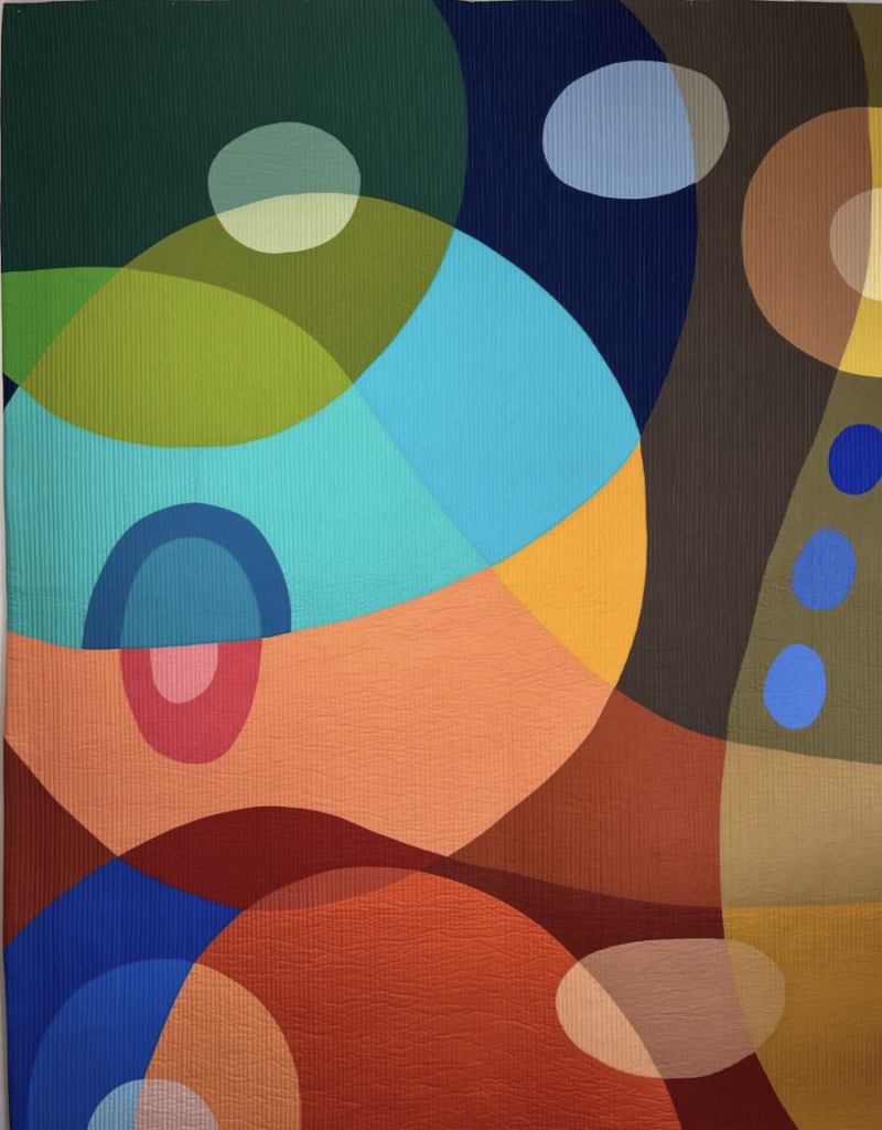
And in Colored Bubble No. 4, part of my Curves and Transparencies series, a large deep brown area occupies the right side of the composition — a warm, dark presence that creates shadow and depth. It is the reason the vivid teals, greens, oranges, and blues on the left side glow with such intensity. The brown is doing exactly what I described earlier: it is the deep warm dark that makes everything else more itself.
The Color Is Not the Problem. The Context Is.
Here is something that color theory teaches us very clearly: there are no inherently bad colors. There are only colors in the wrong context, at the wrong scale, or in the wrong relationship with their neighbors.
Orange placed at full saturation against a warm red background will indeed feel aggressive and unresolved — the colors compete rather than converse. But orange placed in a cool blue-gray composition, or used at low saturation in a warm neutral palette, or deployed as a single sharp accent in an otherwise restrained design, becomes something entirely different. It becomes the pulse of the whole piece.
This is the insight that changes everything for quilters who are afraid of a color: the problem was never the color itself. The problem was the context in which they were imagining it. Understanding how colors interact gives you confidence to step beyond your comfort zone and build richer, more varied palettes that still feel like you.
Think of how we worked through this idea in the articles on orange and on yellow on this blog. Orange, introduced with intention into a composition, energizes the surrounding colors and introduces emotional urgency. Yellow, in the right context, glows. The same principle applies to whatever color you are most afraid of: the color itself is not the issue. Your relationship with it is.
A Practical Experiment
Here is what I ask my students to do — and what I am asking you to do too.
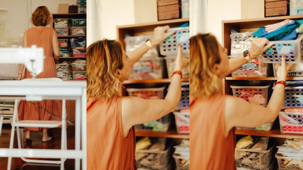
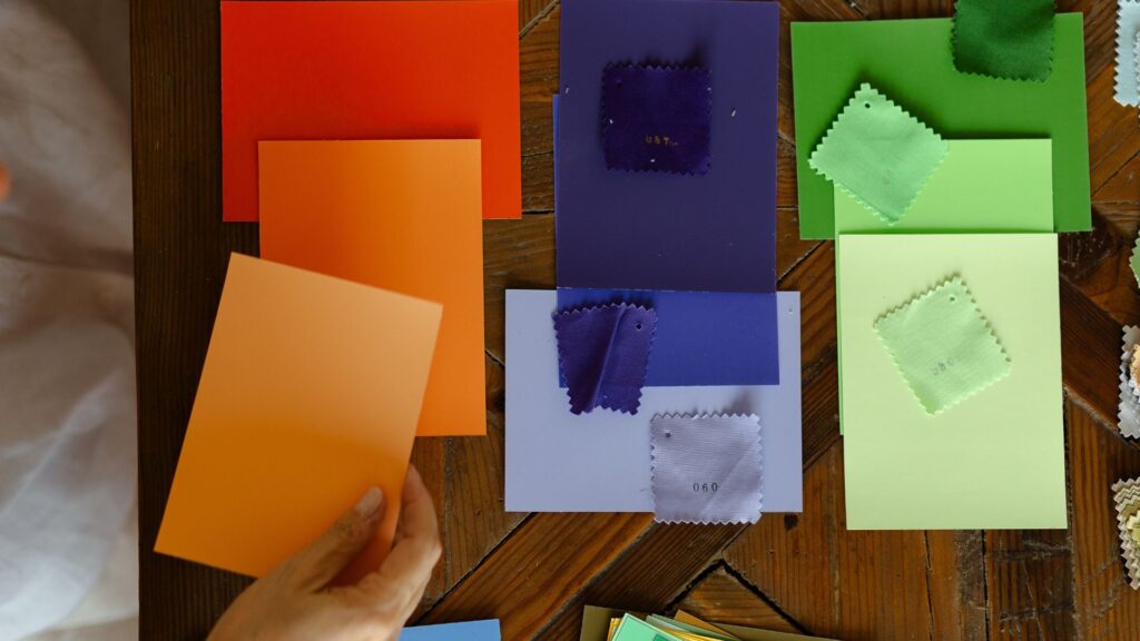
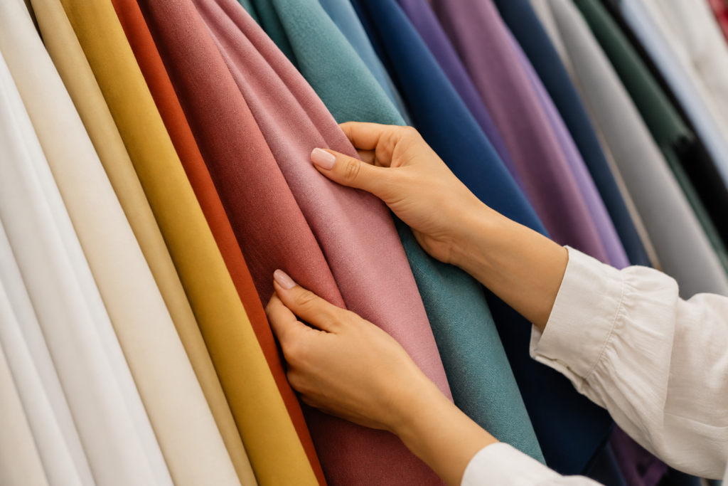
Go to your stash right now and pull out the color you avoid most. Put it on your design wall or lay it flat on a table. Do not plan anything yet. Just look at it.
Then, one by one, place other colors next to it. Start with colors that feel safe — your neutrals, your favorite blues or creams, whatever anchor colors you reach for habitually. Notice what the avoided color does to them. Does it warm them? Cool them? Make them more themselves?
Then try some unexpected combinations. Put the avoided color next to its complement. Put it next to a near-neutral. Put it next to a color that feels equally bold. Vary the scale — a small swatch versus a large one changes everything.
You are not committing to a quilt. You are simply looking. Just swatching color can be healing — the process is the mechanics of building confidence. You are training your eye to see this color as a design tool rather than a threat.
What you will almost certainly find is that the color does not behave the way your story told you it would. It has more range than you gave it credit for. In some combinations it will still feel wrong — and that is useful information. But in others it will surprise you.
Permission to Be Changed by It
There is a deeper reason why we avoid certain colors that I want to address directly. It is not just about aesthetics or composition. It is about identity.
When we have worked hard to build a recognizable creative voice — and every committed quilter does, whether consciously or not — introducing a new color can feel like a threat to that voice. What if using orange means I am no longer the person who makes those cool, restrained compositions? What if yellow changes what my work is?
This fear is understandable. But it misunderstands how creative identity works. Your voice is not the palette you have been using. Your voice is the way you see, the way you arrange, the way you make decisions about value and relationship and movement. Those things will not change because you introduced a new color. They will simply find new expression through it.
The most distinctive artists — in quilting and in any medium — are not those who found their signature palette and never deviated from it. They are those who were willing, again and again, to be surprised by what they could do. By showing versatility and a willingness to take risks, you can attract new aspects of your own work that you never knew existed.
Whatever your feared color is, it has been waiting for you.
Not to ruin your work. Not to cancel your signature palette. Not to prove that you were right to avoid it all along. It has been waiting to show you something — about itself, about the colors you already love, about the compositions you have not yet made.
The only way to find out what that is, is to pick it up.
I know this from experience — and I also know it from what is still ahead of me. My next challenge is purple. It is the color I have the most resistance to right now, the one that feels most foreign to my eye and my hand. I can feel, even as I write this, the same story forming that I once told about brown: it’s not for me, it doesn’t fit, it clashes with my way of seeing. And I know that story well enough by now to be suspicious of it.
So purple is coming. Not because I love it yet — I don’t. But because the work of a quilter who takes color seriously is never finished. There is always another color waiting at the edge of what you know, ready to show you something you have not yet seen.
So go and get yours. Put it on the wall. Give it a chance.
You might be surprised at what it has to say.