Color is one of the most exciting and intimidating parts of quilting. As a beginner, it’s easy to feel overwhelmed when selecting fabrics. Do these colors “go together”? Will my quilt feel too loud? Too dull? The good news is that with just a few basics of color theory in quilting, you can approach color with more confidence and joy.
This guide will help you understand how different colors affect mood, how to use the color wheel to build harmonious combinations, and how to apply those ideas to your quilting practice.
Why Color Matters in Quilting
Color does more than make your quilt pretty—it sets the tone. A palette of soft pastels might evoke calm or nostalgia, while bold primary colors create energy and vibrancy. Your fabric choices communicate emotion, even before the viewer notices the pattern or stitching. That’s the heart of color theory in quilting: combining emotional intuition with a bit of science to create something truly impactful.
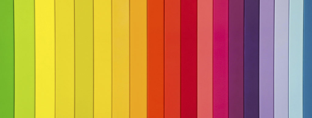
Understanding the Color Wheel
The color wheel is a tool that organizes hues in a way that shows how they relate to each other. At its simplest, it includes:
- Primary colors: Red, yellow, and blue
- Secondary colors: Orange, green, and purple (made by mixing primaries)
- Tertiary colors: Red-orange, yellow-green, and others formed by blending a primary with a secondary
Using the wheel, you can create tried-and-true color combinations:

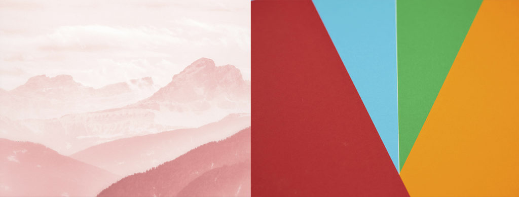
- Complementary colors are opposite each other on the wheel (like blue and orange). These high-contrast pairings can add visual drama to a quilt.
- Analogous colors sit side-by-side on the wheel (like red, orange, and yellow). They offer harmony and flow, ideal for softer, cohesive designs.
- Monochromatic schemes use tints and shades of one color. You might combine sky blue, denim, and navy for a striking effect that’s still unified.
- Triadic palettes use three evenly spaced hues (like red, yellow, and blue) for a balanced yet bold design.
Using these color relationships helps you avoid clashing combinations and brings intention to your fabric choices.
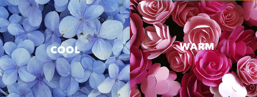
Warm vs. Cool Colors
Colors are also divided into warm (reds, oranges, yellows) and cool (blues, greens, purples) tones. Warm colors feel energetic and cozy, often coming forward in a quilt design. Cool colors feel calm and tend to recede, creating depth and serenity.
Want your quilt to feel fresh and airy? Lean into cool tones. Looking for something bold or nostalgic? Warm tones will serve you well. Mixing both can create contrast and movement, but make sure one group takes the lead to keep your palette focused.
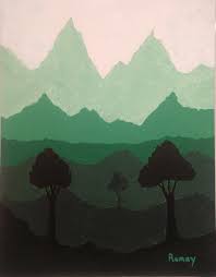
The Power of Value
Value refers to how light or dark a color is, regardless of the hue. For example, pale yellow and deep mustard are different in value, but still yellow.
In quilting, value contrast is what makes your pattern stand out. A quilt made from all mid-value fabrics can look flat, even if the colors are beautiful. Aim to include a mix of:
- Lights (ivory, soft pink, pale blue)
- Mediums (true red, teal, grassy green)
- Darks (navy, forest green, charcoal)


Tip: Snap a black-and-white photo of your fabric pull to check value contrast. If everything looks the same shade of gray, you may need to add a lighter or darker fabric to boost visual interest.
Practical Tips for Building Your Color Palette
Choosing colors doesn’t have to be guesswork. Try these beginner-friendly steps:
- Start with a focus fabric – Choose a multicolor print you love, and pull coordinating solids or blenders from it.
- Use the rule of three – Limit yourself to three main colors (plus neutrals) to keep your palette simple and cohesive.
- Include neutrals – Whites, creams, grays, or blacks can help balance bold colors and give the eye a place to rest.
- Check temperature and value – Make sure your palette includes a mix of warm/cool tones or light/dark values to create movement and contrast.
- Test your combination – Lay out your fabrics side by side and adjust as needed. If something looks “off,” trust your eye and try a swap.
Color and Emotion in Quilts
Color affects how your quilt feels, and how people respond to it:
- Blues and greens create calm and serenity
- Yellows and oranges feel cheerful and energetic
- Purples evoke luxury or creativity
- Neutrals (like gray and tan) bring sophistication or modern simplicity
As you grow more confident with color theory in quilting, you’ll start designing not just by what looks good, but by what feels right for the mood or story you want your quilt to tell.


Choose with Confidence
Color is personal. While theory provides the structure, your intuition brings the magic. Start with the basics, play with color wheels or pre-made fabric bundles, and trust your eye to guide you. Over time, you’ll find that choosing a palette becomes one of the most joyful parts of quilting.
Want to explore color and design in more depth? Check out Carolina Oneto’s online quilting classes, browse inspiring teaching lectures, or dive into free tutorials for step-by-step guidance. Whether you’re learning color theory in quilting or building your very first quilt, you’ll find creative support and expert insights every step of the way.