

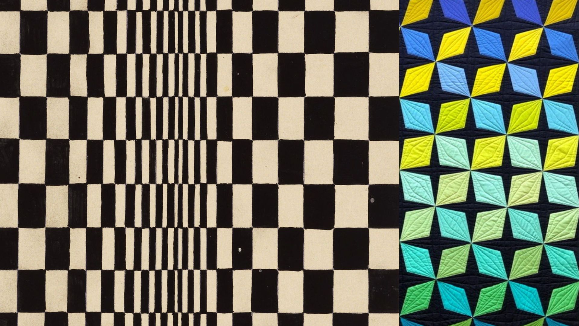
Op Art quilting isn’t a real category anyone teaches, but it should be, because plenty of quilters produce the exact optical effects Op Art artists spent entire careers refining — usually without knowing there’s a whole movement built around what they just did with a chevron block or a stack of half-square triangles. If a repeated pattern in your quilt has ever seemed to shimmer, vibrate, or pull the eye across the surface in a way you didn’t fully plan, you’ve already made an Op Art discovery. It’s worth understanding the mechanism behind it, because once you can name it, you can use it on purpose.
The Movement That Started With a Zebra
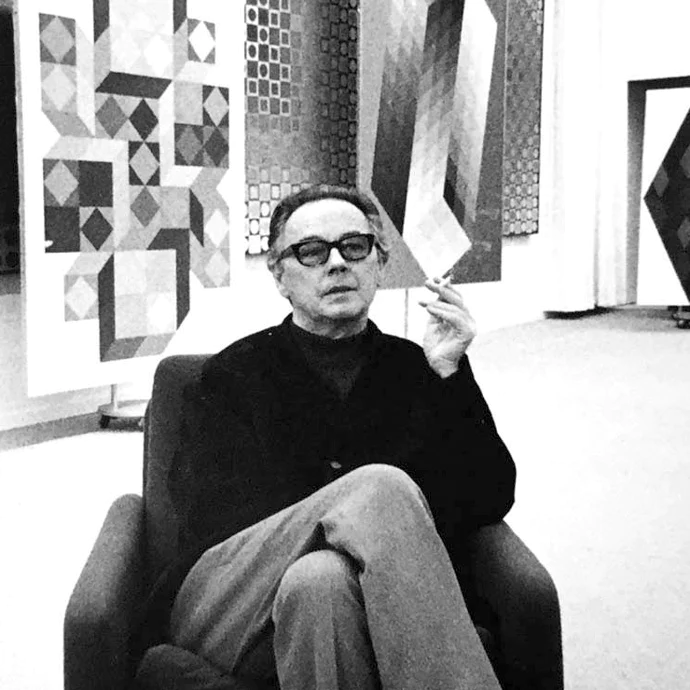
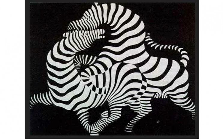
Victor Vasarely, widely credited as the movement’s founding figure, made one of the earliest true Op Art works almost by accident in 1937: a painting called Zebra, in which two intertwined animals are rendered entirely through undulating black and white stripes, with no outlines at all. The stripes alone generate the entire sense of form, volume, and movement. Vasarely had trained at a Budapest art school modeled directly on Bauhaus principles, and he spent the following decades developing an increasingly systematic visual language — a fixed set of geometric shapes and colors he called his “plastic alphabet,” which he and assistants used to generate seemingly endless permutations of optical distortion, most famously in his Vega series, where a flat grid appears to swell and bulge as if under real physical pressure.
The Painter Who Made It a Movement
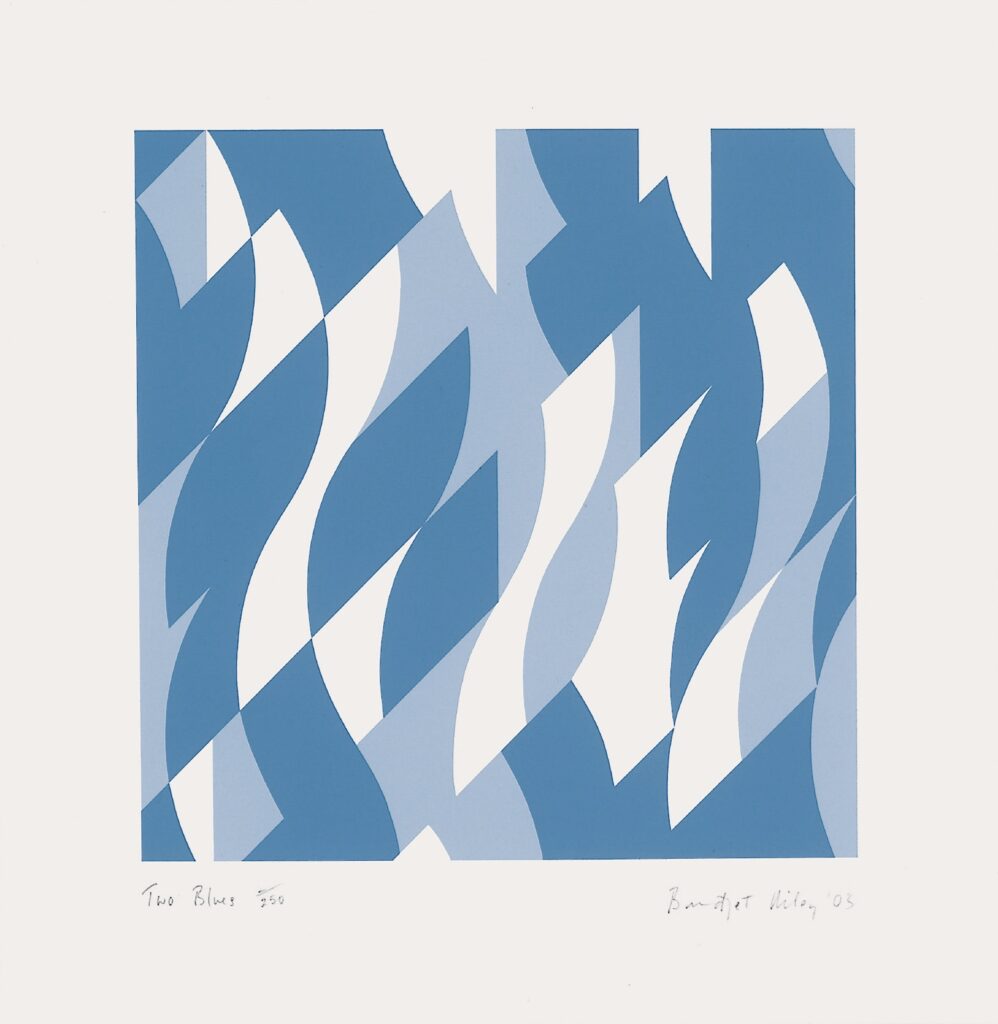
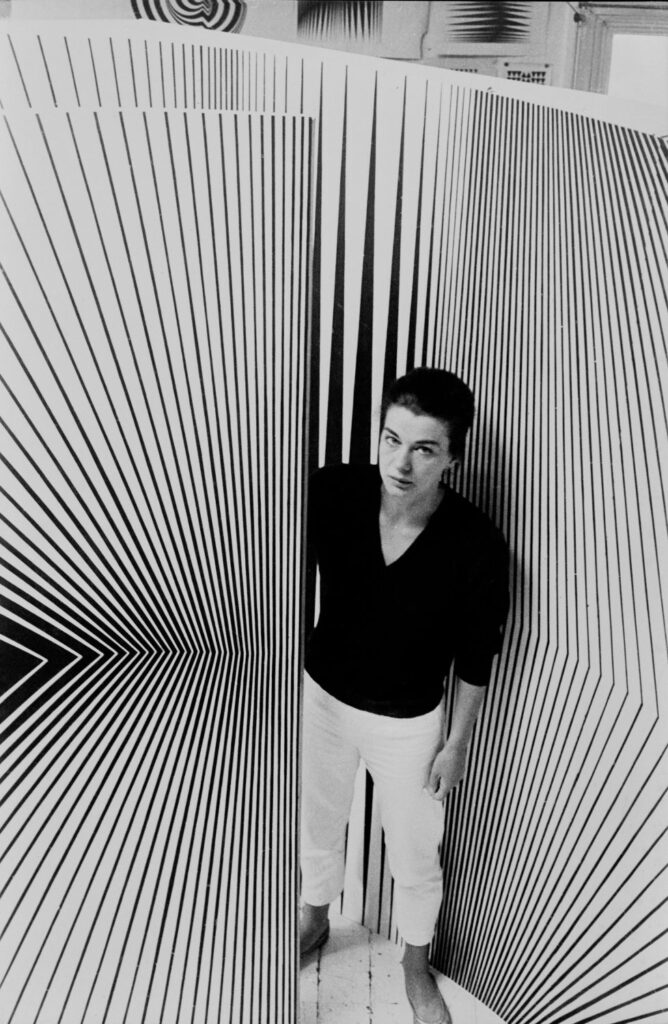
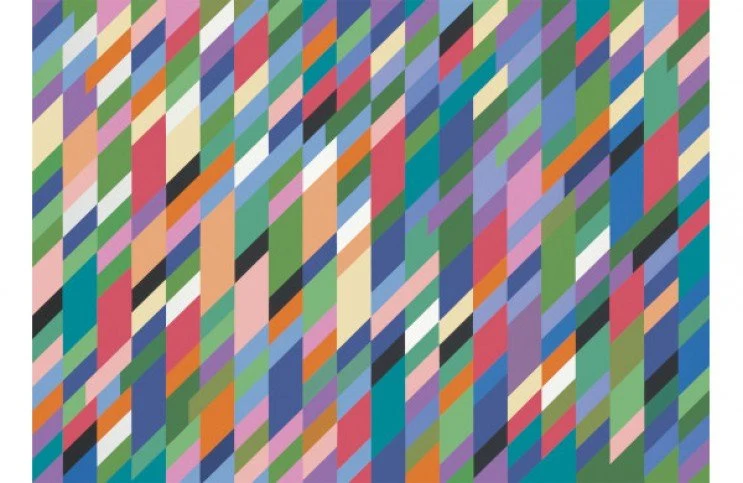
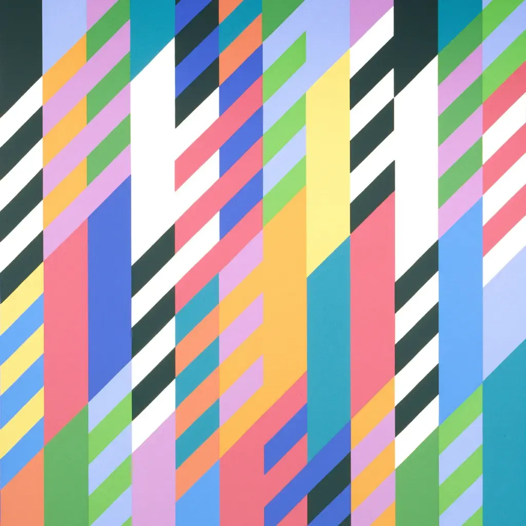
Bridget Riley arrived at similar territory independently, working almost entirely in black, white, and gray through the early 1960s. According to Art UK, Riley built her early compositions from the simplest possible vocabulary — squares, lines, ovals — arranged with such precision that the static canvas seemed to pulse and shift as the eye moved across it. She credited her understanding of color interaction partly to two years spent copying Georges Seurat’s pointillist paintings, learning how tightly placed marks could generate an effect the individual marks never contained on their own. Riley has always resisted the idea that her work was a mere visual trick; she considered it a serious investigation into how human perception actually operates; the “op” in Op Art never sat entirely comfortably with her, since she saw her project as closer to psychology than novelty. Her first solo show, at Gallery One in London in 1962, was a modest affair by later standards — but within three years she’d become, by some accounts, the movement’s most recognizable face internationally.
Both artists reached a wider public in 1965 at The Responsive Eye, a landmark exhibition at the Museum of Modern Art that also included work by Josef Albers — a tidy reminder that the Bauhaus color lineage and the Op Art movement weren’t separate stories, but overlapping ones, converging in the same gallery at the same moment.
What Actually Creates the Effect
Strip away the art history and the mechanism is fairly simple, and it maps directly onto piecing decisions you’re already making.
High value contrast is the primary engine. Op Art rarely works in muted, close-value palettes. Vasarely and Riley both relied heavily on black against white, or later, saturated complements, because the eye needs a sharp value jump to register the flicker and afterimage effects that make the surface feel alive. A quilt built from close, gentle values reads as calm no matter how busy the piecing gets. A quilt built from sharp value contrast reads as active even in a fairly simple layout.
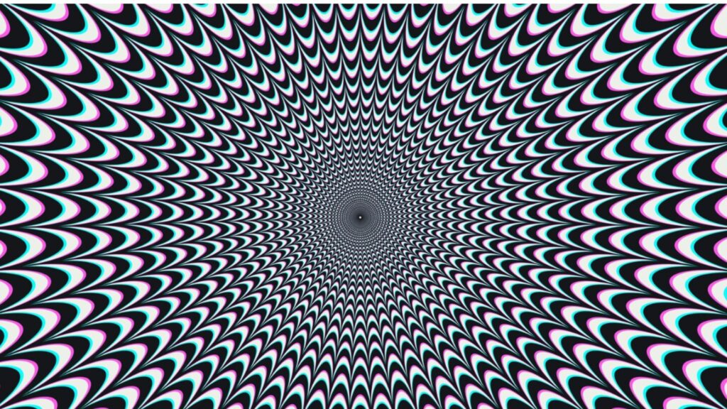
Repetition with a controlled variable does the rest. Neither artist relied on randomness. The movement comes from a unit repeated with total consistency, except for one variable — spacing, angle, or width — that shifts gradually across the surface. The eye reads the consistency as a baseline and then can’t stop noticing the shift, which is exactly what produces the sensation of motion in a perfectly static, flat object. And the eye completes what isn’t actually there, which is the part that connects most directly to figure-ground and Gestalt theory. Op Art doesn’t paint movement. It sets up a perceptual condition and lets the viewer’s own visual system generate the sensation of movement, the same way Gestalt principles describe the mind completing a shape from incomplete information. The artist isn’t creating the illusion directly.
They’re creating the conditions under which your own eye creates it for you.
Where This Already Lives in Quilting
You don’t have to invent this from scratch. Several piecing structures that already exist in the quilting world are functionally Op Art, whether or not anyone’s called them that:
• Half-square triangle grids in high value contrast create exactly the kind of flicker Riley was after in her early black-and-white work— the diagonal repetition reads as movement even though every unit is identical.
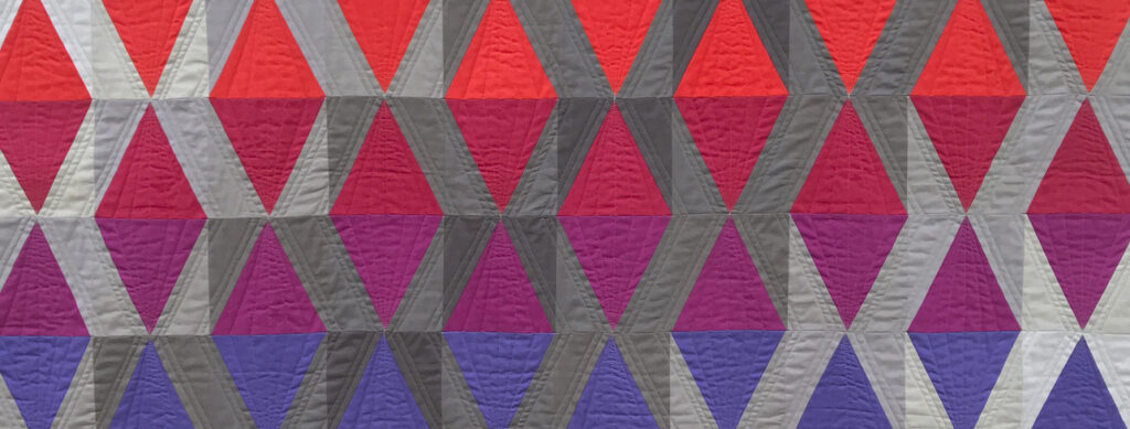
• Chevron and herringbone piecing uses the “controlled variable” mechanism directly: a consistent angle, repeated, with only position shifting across the surface.
•Improvisational curved piecing, worked in a limited palette with strong value shifts, can generate a Vasarely-style bulge or swell effect if the curves compress and expand rhythmically across the piece rather than staying uniform. This is the exact territory my Creative and Colorful Improv Piecing class works through in depth.
• Stripe piecing at varying widths is close to Riley’s own stripe paintings from the late 1960s — width becomes the controlled variable, and the eye reads the changing rhythm as motion.
My Own Homage
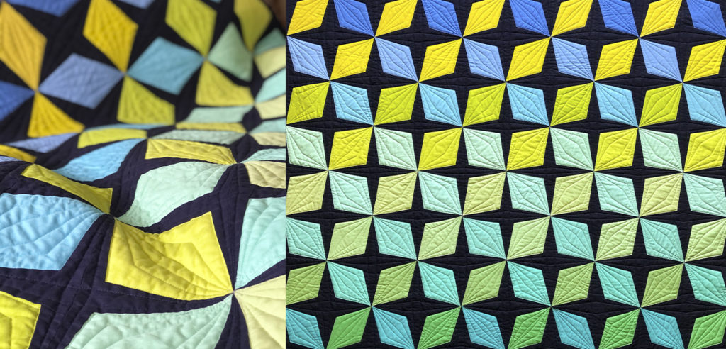
I made this connection explicit in a quilt I called VictorV, a direct nod to Vasarely. The piece is built from kite-shaped diamonds arranged around a grid of intersections, each cluster of four forming a small pinwheel against a dark navy ground — a controlled unit, repeated with total consistency, the same structural discipline Vasarely relied on in his own grid-based work. The one variable that shifts is color: the palette sweeps diagonally from indigo and gold at one corner through greens and teals at the other, echoing the way his Vega series let color drift gradually across an otherwise fixed geometric grid rather than changing the grid itself.
The quilting reinforces the effect rather than sitting apart from it. Straight lines radiate outward from each grid intersection like a burst of light, adding directional energy that pulls the eye from one cluster to the next across the whole surface — the exact repetition-with-consistency mechanism that makes Op Art read as movement instead of static pattern.
This piece is actually still available — it’s one of the few I’ve decided to let go of. You can see more photos and the full details in my shop.
Using It With Intention, Not Just by Accident
The difference between an Op Art effect that reads as intentional and one that just reads as visually exhausting usually comes down to value control and a clear organizing rule. A few things worth deciding before you start:
• Decide your value contrast level on purpose. If you want real optical vibration, commit to real high contrast — near-black against near-white, or fully saturated complements. Half-measures produce visual noise without the payoff of real movement. If value is the piece you find hardest to control on purpose, that’s exactly what Playing With Color Value is built to fix.
• Pick one variable to control, not several. Riley and Vasarely both worked from an almost stubbornly narrow set of choices. If spacing, angle, and color are all shifting at once, the eye has nothing consistent to read against, and the movement effect collapses into visual clutter instead.
• Consider where you want the eye to rest. Op Art at full intensity across an entire surface gets genuinely hard to look at for long. A quieter border or a calmer section of your quilt gives the eye somewhere to recover, which paradoxically makes the active area feel more powerful, not less.
• Test in black and white first, the way Riley did for most of her career before introducing color. If the movement doesn’t work without color to prop it up, value contrast — not hue — is where the real problem lives.
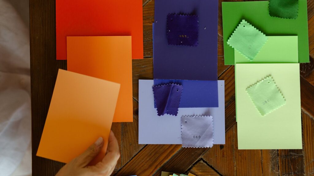
Decide your value contrast level on purpose. If you want real optical vibration, commit to real high contrast — near-black against near-white, or fully saturated complements. Half-measures produce visual noise without the payoff of real movement. If value is the piece you find hardest to control on purpose, that’s exactly what Playing With Color Value is built to fix.
A Movement Worth Borrowing From
Op Art never really left painting and design; it just stopped being called by that name as often. Quilters have been generating its exact effects for decades through grids, chevrons, and stripes, usually discovering the mechanism by trial and error rather than by studying Vasarely’s plastic alphabet or Riley’s preparatory studies. Knowing the history doesn’t make the effect any more magical, but it does make it repeatable, which is the whole difference between a happy accident and a design decision you can make again on purpose.
VictorV wasn’t my first quilt to do this by accident before I understood why. It was just the first one where I named it on purpose. I’d bet you have one in your own pile that did the same thing, whether you noticedat the time or not.
I’m also currently running a sale on my Color Confidence class bundles — everything I use to make these value and contrast decisions on purpose, not by accident. Color Confidence covers the fundamentals; Color Confidence Complete goes further. Both are discounted right now.