

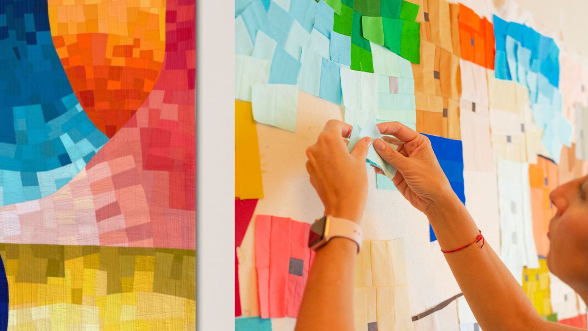
Watercolor quilting looks, from across a room, like the easiest thing in modern quilting to fall in love with. Soft color drifting into soft color, no hard lines pulling the eye anywhere in particular, something closer to a painting than a pieced object. I started making these quilts because I wanted to take what I’d learned making actual watercolor paintings and see how far I could push fabric toward doing the same thing. What I didn’t expect, going in, was how much harder that translation would turn out to be.
Where the Term Actually Comes From
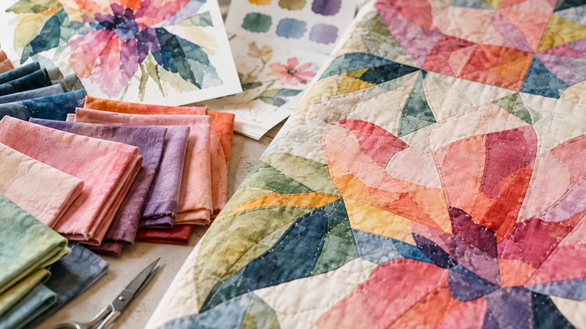
“Watercolor quilting” isn’t a name I made up, and it isn’t new. The design historian’s version of the story starts with the British quiltmaker Deirdre Amsden, who developed an approach in the early 1980s that the International Quilt Museum describes as arranging small, busy printed fabrics in subtle gradations of value and color, so that individual pieces seem to dissolve into their neighbors rather than reading as separate units. She called it colourwash.
A decade later, the American quilters Pat Maixner Magaret and Donna Ingram Slusser published a book that took the idea in a slightly different direction and gave it the name most people actually search for now: Watercolor Quilts, built around small squares of floral fabric arranged to mimic the light and softness of Impressionist painting. That book has reportedly sold more than 170,000 copies, which tells you the appetite for this effect has been there for a long time, well before anyone was calling it a trend.
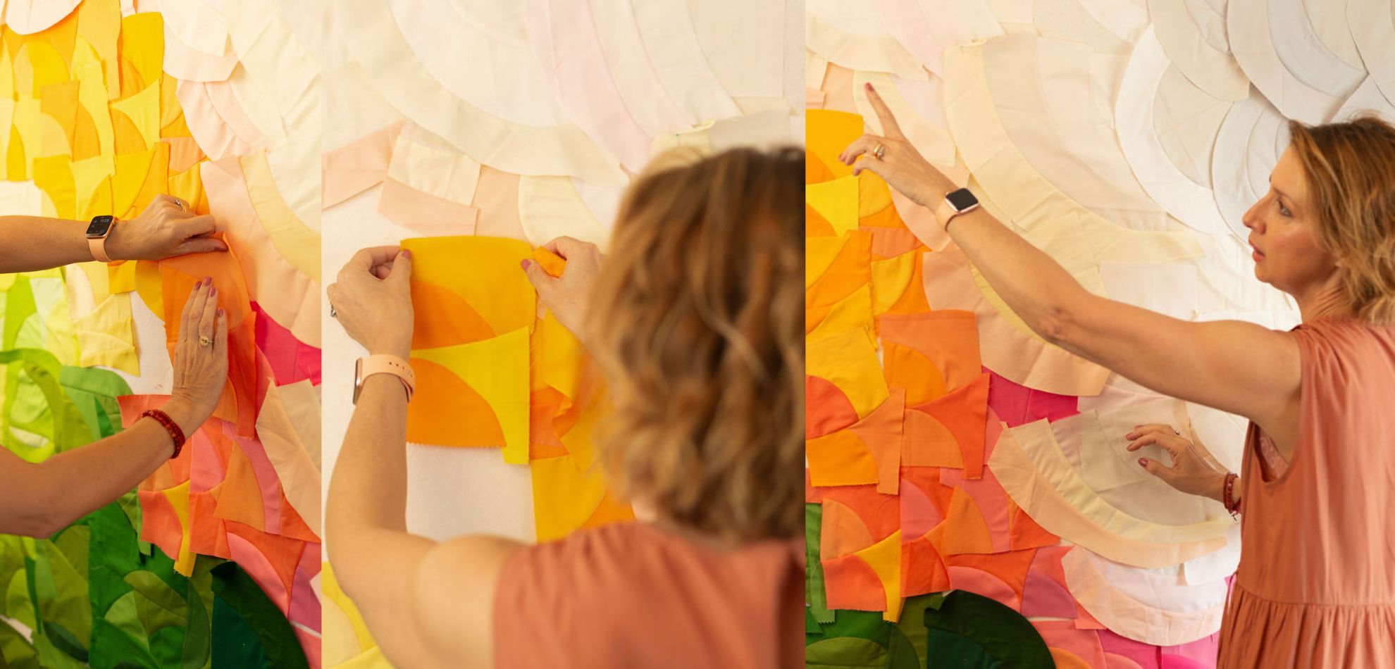
My own approach isn’t either of those, exactly. I work in solids rather than small printed squares, and my piecing is improvisational rather than following a pre-planned grid. But the underlying goal is the same one Amsden and Magaret and Slusser were chasing decades ago: get fabric to behave like paint that hasn’t fully dried yet.
What Makes This Genuinely Difficult
Real watercolor paint has a physical advantage that fabric will never have. When you work wet-on-wet, color bleeds into color on its own — the pigment spreads, blends, and softens its own edges without you doing much beyond deciding where to place it and how wet the paper is. Fabric doesn’t do that. Every color in a pieced quilt sits inside a hard physical edge, and the seam joining it to its neighbor is a real, literal line, whether you want it to read as one or not.
That’s the actual difficulty at the center of this technique, and I don’t think it gets talked about enough. A watercolor quilt has to create the illusion of a seamless gradient using a material that is, by definition, made entirely of seams. Every design decision — which color goes next to which, how much the value shifts from one piece to the next, where the saturation climbs or falls — has to work hard enough that the eye stops registering individual pieces and starts reading a continuous movement instead. When it works, the seams disappear into the color logic around them. When it doesn’t, you can see every piece doing its own separate thing, and the illusion collapses.
The Color Work Is the Real Challenge
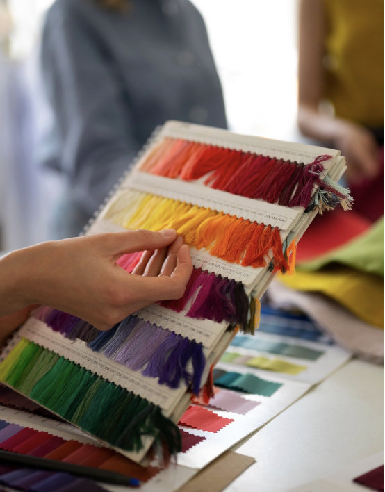
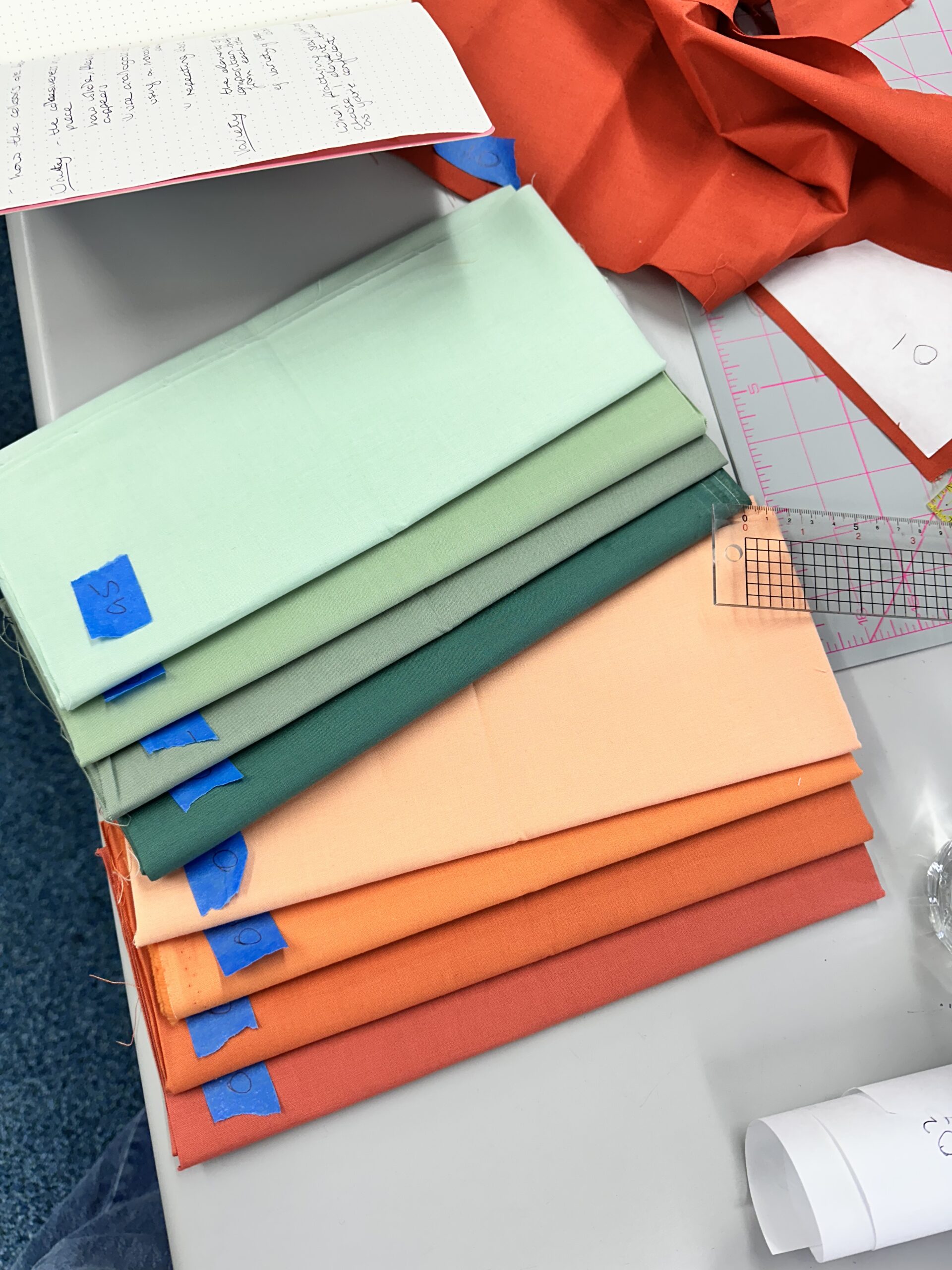
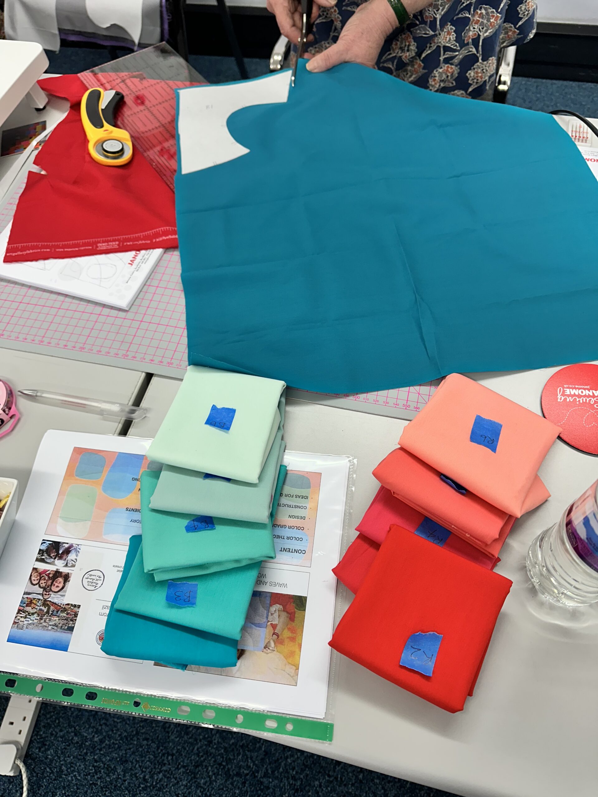
For me, the hardest part was never really the sewing. It was learning to think in terms of the whole chromatic circle at once — hue, value, and saturation moving together — rather than picking colors one at a time because they looked nice next to each other. A single “wrong” value jump between two pieces can break the sense of movement across an entire section, even if every individual fabric is a color you love. It’s less like choosing a palette and more like tracing a path around the color wheel and making sure every step along that path actually connects to the one before it.
This is also, honestly, still something I’m working on every time I start a new piece. I don’t think I’ve ever finished a watercolor quilt without ripping out at least one section because a color transition wasn’t behaving the way I wanted it to. That’s not a failure of the technique, I don’t think. It’s just what the technique actually demands.
Why This Can’t Be Planned on Paper
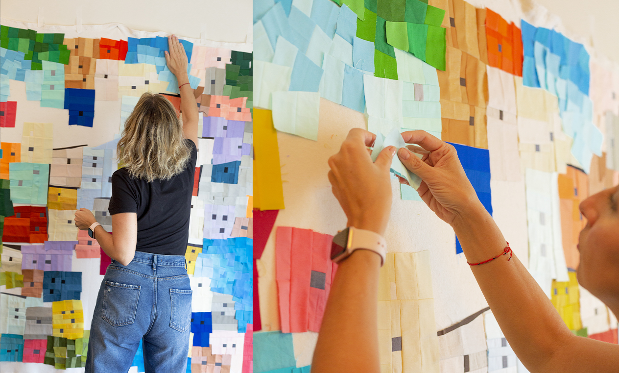
One thing that surprises people about my own process is that there’s no pattern behind any of it. The entire composition gets built directly on the design wall, piece by piece, in real time. I’ve written before about treating a design wall as a composition laboratory rather than just a place to audition fabric, and a watercolor quilt is the clearest example I have of why that distinction matters. You genuinely can’t pre-plan a color transition on paper and expect it to survive contact with actual fabric — the values and saturations you imagine in your head rarely match what the physical fabrics do once they’re sitting next to each other. The composition has to get built and adjusted live, which is part of why this particular technique takes so much longer than it looks like it should from the finished result.
Where This Shows Up in My Own Work
Watercolor III was the piece where I described this most directly: painting with watercolors lets you play with lightness and darkness, mix colors, and build shapes, and that’s the same thing I’m reaching for with fabric instead. It’s since sold, but Watercolor I, the piece that started the series, is still the one currently available if you’re curious about seeing the series up close.
Watercolor II is the piece I actually think about most when I talk about how this series developed. It’s where I stopped relying on rulers and started working in a much more fluid way — letting the piecing itself become improvisational rather than following any predetermined structure. That shift mattered more to how the rest of the series turned out than almost any single color decision I made.
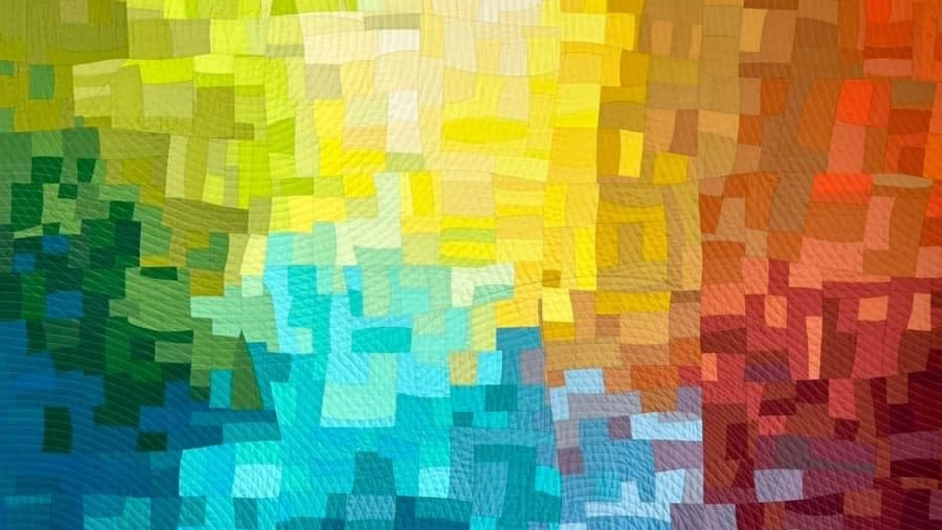
The series ended, at least for now, with One in Every Four— a piece with a small, repeated architectural rhythm running through it that felt different from anything else in the group. Finishing that piece was the moment I felt like I’d actually said what I set out to say with this body of work.
I’ve also written before about how watercolor painting itself can inspire modern quilting more generally, if you want the broader color-theory version of this idea rather than the process story.
If You Want to Actually Learn the Process
Everything above is the why. The how — the actual step-by-step process I use to choose fabrics, build a transition, and keep a whole composition working together on the design wall — is what my Watercolor Quilt class walks through from the beginning: color theory, the chromatic circle, and the three variables of color first, then the full process for designing, cutting, and sewing a watercolor quilt improvisationally. If you’d rather build the color-theory foundation on its own first, The Power of Color Composition covers how hue, value, and saturation work together to create movement and depth, which is really the whole game here.
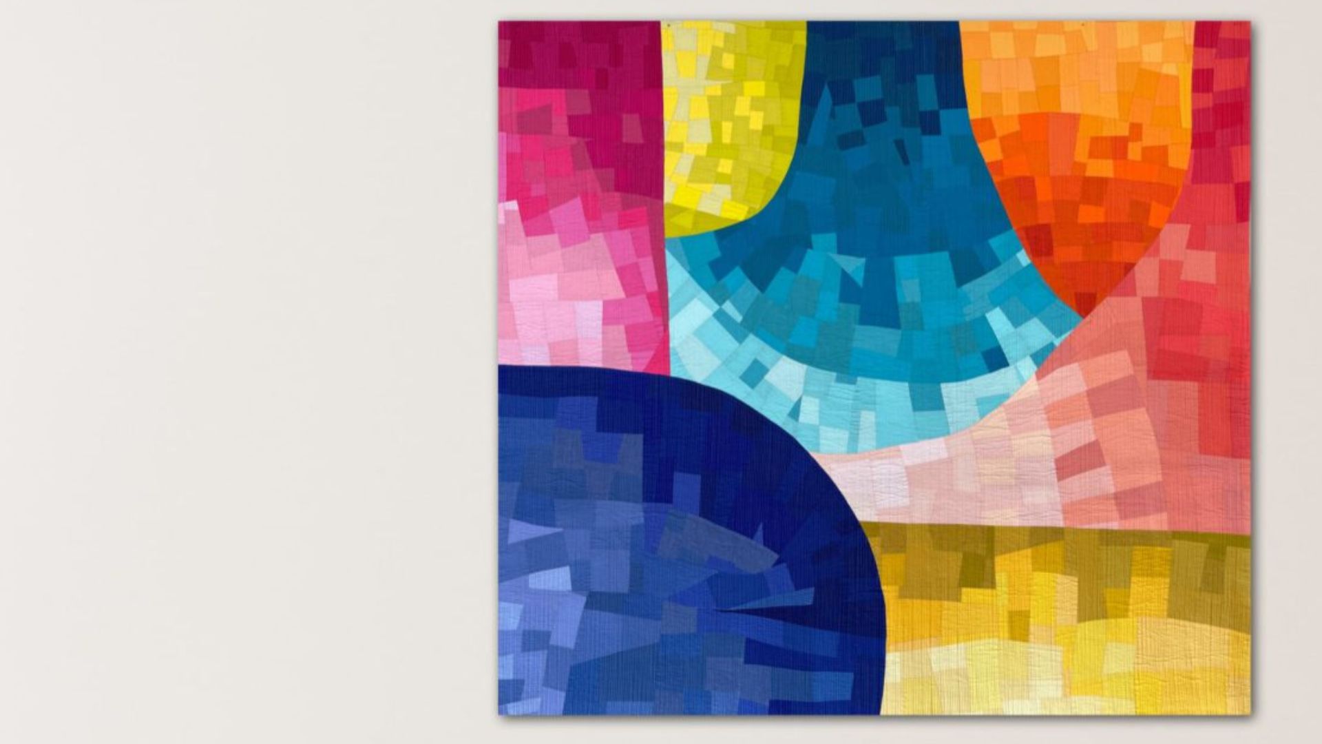
A Series I Feel Done With, For Now
I don’t say that lightly. Most bodies of work I make feel open-ended even after I’ve stopped actively adding to them, but this one feels different. By the time I finished One in Every Four, I felt like I’d actually said what I set out to say when I started trying to translate watercolor painting into fabric. Maybe I’ll come back to it eventually — I wouldn’t rule that out — but right now, this series feels complete to me in a way that’s rare.
If you’ve ever looked at a watercolor quilt and assumed it must have come together easily because the result looks so soft and effortless, I’d gently push back on that. The softness is the part that gets built last, after a lot of decisions that weren’t soft at all — and honestly, I suspect that’s true of most quilts that look effortless from across a room, not just this particular technique.
Have you tried this kind of color-transition piecing before, watercolor-style or otherwise? I’d be curious whether the color decisions were the hard part for you too, or whether it was something else entirely.