


Bauhaus color theory shapes how a lot of us think about color in quilting, whether we’ve ever heard the word “Bauhaus” or not. Most quilters absorb it secondhand, filtered through decades of books and classes that themselves trace back to a design school that operated in Germany for exactly fourteen years, a century ago.
If you’ve read my History of Color Theory series, you already know I like tracing threads like this one back to their source — from Aristotle’s four elements and Newton’s prism in Part I, through the pigments themselves in Part II, through the transparency effects of the ancient world in Part III, and into the Romantic painters working out Goethe’s ideas in Part IV. This is the next chapter, chronologically. But unlike the others, this one isn’t research I did after the fact. It’s a direct, five-person teaching line, person to person, classroom to classroom, from a 1919 studio in Weimar to my own quilting practice today.
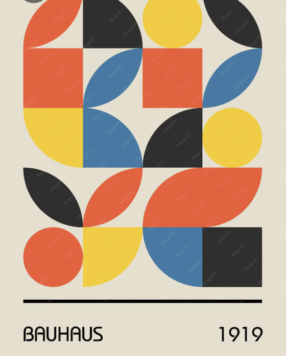
Where It Actually Starts
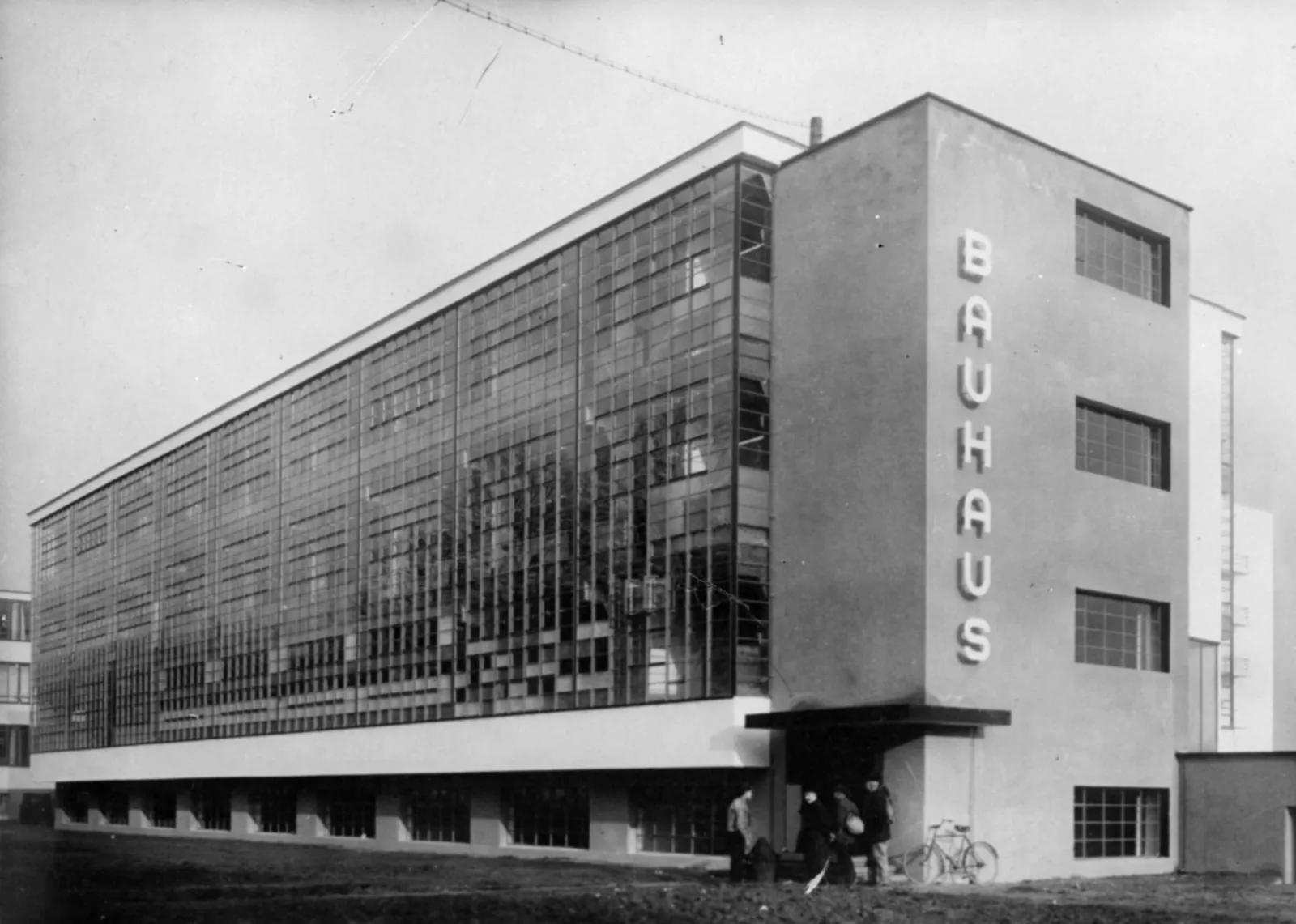
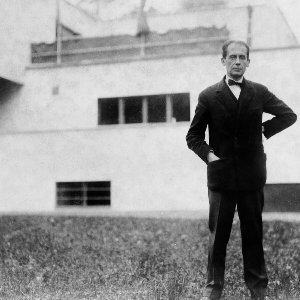
The Bauhaus was founded in Weimar, Germany, in 1919 by the architect Walter Gropius, and it moved through Dessau and Berlin before the Nazi regime forced its closure in 1933. Long before it became famous for chairs and buildings, its most influential export may have been a required first-semester course: the Vorkurs, or preliminary course, developed by the Swiss painter and theorist Johannes Itten between 1919 and 1922. Every incoming student had to pass through it before touching a workshop.
Itten used that course to build a systematic theory of color contrast — a framework of seven distinct kinds of contrast (by hue, by value, by temperature, by complements, simultaneous contrast, by saturation, and by extension) that gave students a genuine vocabulary for talking about what color was doing in a composition, rather than relying on instinct alone. Before Itten, art students were largely expected to develop a “good eye” through practice and imitation. Itten’s contribution was to insist that color relationships could be named, isolated, and taught directly — that a student could learn to see simultaneous contrast the way they’d learn a scale in music, rather than waiting years to stumble onto it by accident. Itten left the Bauhaus in 1923 after disagreements with Gropius over the school’s direction, but the foundation course model he built — teach color and material relationships systematically, before anything else — outlived the disagreement entirely.
-
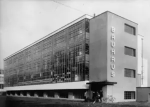
- Exterior of the Bauhaus school of applied at Dessau,
-
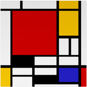
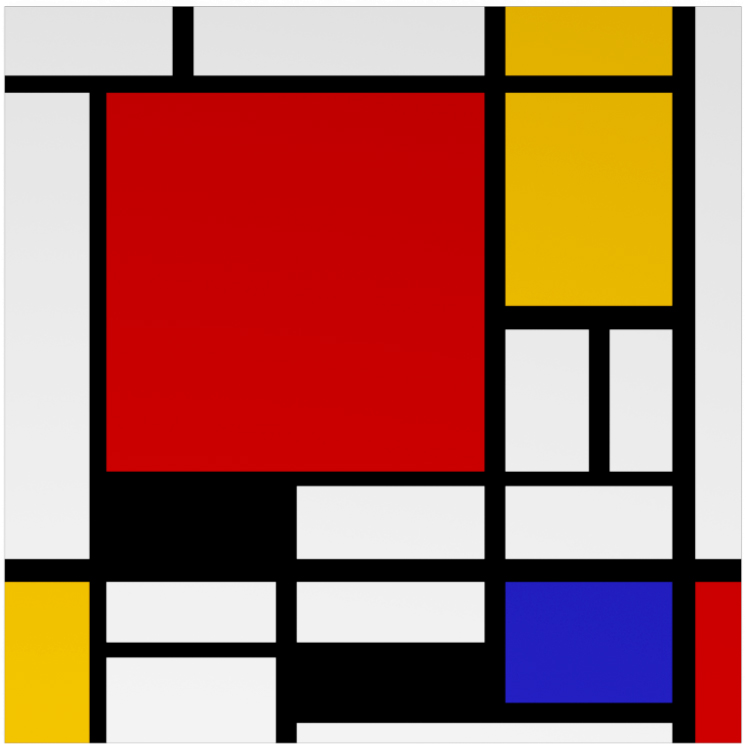
- Piet Mondrian
-
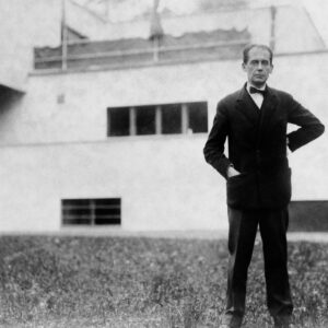
- Walter Gropius, Bauhaus founder
The Student Who Became the Teacher
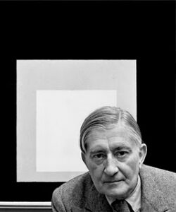
One of the students who passed through Itten’s Vorkurs in 1920 was a young German named Josef Albers. Albers joined the Bauhaus faculty two years later and stayed until the school’s closure in 1933, at which point he and his wife Anni fled Nazi Germany for the United States. He spent the next sixteen years teaching at Black Mountain College in North Carolina, then in 1950 became head of the design department at Yale, where he wrote his own landmark contribution to color pedagogy, Interaction of Color, published in 1963.
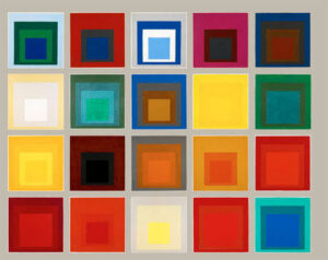
Albers took Itten’s basic premise — that color has to be studied through direct, systematic experience rather than memorized rules — and built his own version of it, famously using flat sheets of colored paper instead of paint, so that hue, value, and saturation could be isolated and studied honestly. Where Itten built the foundation, Albers is largely the reason it survived the Bauhaus’s destruction at all, carrying the pedagogy across an ocean and into a completely different institutional context.
I’ve written before about how value shapes the emotional read of a quilt — that piece leans on Albers directly, because his central claim, that a color’s read depends entirely on what surrounds it, is still the single most useful idea I teach.
An Unlikely Bridge to Chile
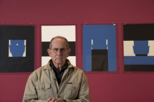
This is where the line gets personal. In the late 1950s, an American academic named Sewell Sillman — Albers’s assistant and disciple at Yale — traveled to Santiago, Chile, as a visiting professor at the Universidad Católica. There, he met a young printmaker named Eduardo Vilches, who was largely self-taught, having built his practical and theoretical knowledge outside formal academic channels rather than through a conventional art degree. Sillman was direct with him: leave Chile, apply for a Fulbright, come study at Yale. It was a genuine long shot — Vilches had no formal art credentials in the usual sense — but he applied anyway and, to the surprise of people on both sides of the application, he was accepted. He spent the 1959–1960 academic year at Yale under Sillman’s direct tutorship, immersed in the same color pedagogy Albers had built out of what he’d learned from Itten three decades earlier.
Vilches returned to Chile in 1961 and, the following year, created the Curso de Color at the Universidad Católica’s Escuela de Arte — an adaptation of Albers’s own Yale course, brought to Santiago. That course is still taught there today, more than sixty years later, essentially unbroken.
Eduardo Vilches
My Own Place in the Line
I studied under Eduardo Vilches. That makes the chain, generation by generation, remarkably short: Itten taught Albers, Albers’s method reached Vilches through his assistant Sillman, and Vilches taught me. Four teachers and roughly forty years separate my own color training from a classroom in 1920s Weimar — which is a strange thing to sit with, given that I’m applying all of it to fabric and a sewing machine rather than paint or colored paper.
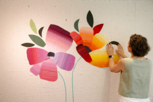
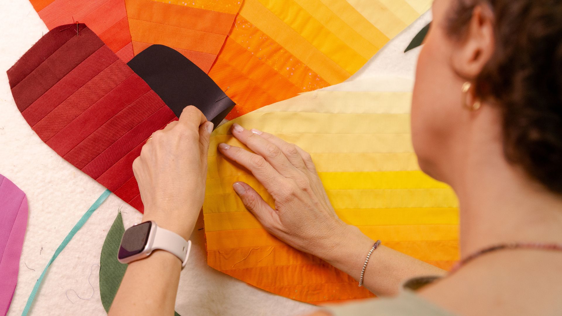
It also explains more about my own practice than I fully appreciated until I traced the line out this directly. My insistence on working almost entirely in solid fabrics is, in a very real sense, Albers’s paper studies translated into cloth — the same instinct to strip away pattern so that hue, value, and saturation can be seen honestly and combined with intention. The contrast of extension I’ve written about, the complementary intensity of yellow against violet — these aren’t ideas I discovered independently. They’re Itten’s framework, passed down through three more teachers, showing up in a medium none of the four of them ever worked in.
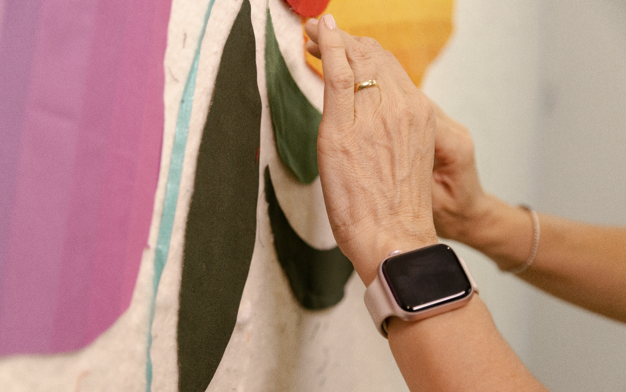
That framework also runs directly through two of the piecing classes I teach. Curves and Transparencies is, structurally, an Albers exercise translated into fabric: layering color so the eye reads depth and light that isn’t literally there. Organic Shapes is the piecing vocabulary — how to actually cut and sew the curved forms — that makes that layering possible once you’ve committed to it in cloth.

Why the Lineage Actually Matters
It would be easy to treat this as trivia — an interesting fact about where some color vocabulary came from. I don’t think that’s quite right. Design pedagogy that survives a school’s forced closure, an ocean crossing, and three more generations of teachers isn’t surviving by accident. It survives because the underlying method actually works: color, studied through direct, structured experience rather than memorized rules, produces artists who can make real decisions instead of guesses. That’s true whether the material in front of you is a sheet of colored paper in a Yale classroom in 1962 or a stack of solid quilting cotton in front of you right now.
It’s also, I think, part of what separates quilting-as-craft from quilting-as-art, when that distinction actually holds up. A quilt made from instinct alone can still be beautiful. A quilt made with an inherited, tested vocabulary for what color is actually doing — extension, temperature, simultaneous contrast — is working with a set of tools that took over a century, four teachers, and one forced emigration to arrive intact.
What This Means for Your Own Practice
If you want the systematic version of what Itten and Albers taught, rather than the history of how it reached me, that’s exactly what my Color Confidence bundle is built to do — the chromatic circle, the three variables of color, and the methodology I use with value, all in the structured, hands-on format this whole lineage was actually designed to be taught in.
And if you help program your guild’s calendar, this same lineage — color theory traced back to its source, not just taught as a set of rules — is one of the talks and workshops I bring on the road.
Did you know any of this before now, that color theory in quilting has a real, traceable lineage rather than just being floating “common knowledge”? I hadn’t fully sat with it myself until I wrote this out. It’s worth tracing your own teachers back a step or two — you might find the line goes further than you’d guess.
If you want more of this kind of thing in your inbox — the next installment of the History of Color Theory series, plus the occasional color tip — you can subscribe on the homepage, and you’ll get a free pattern for joining.
More from the History of Color Theory Series
This piece is the fifth stop in a series tracing color theory from antiquity to today:
- Part I — Aristotle, Newton, and the birth of the color wheel
- Part II — Where historic pigments actually came from
- Part III — Transparency effects, from Egyptian papyrus to modern quilts
- Part IV — Goethe and the Romantic painters
Sources referenced: Metropolitan Museum of Art (metmuseum.org/essays/the-bauhaus-1919-1933) and Tate (tate.org.uk/art/art-terms/b/bauhaus) on Bauhaus history; Wikipedia, Johannes Itten (en.wikipedia.org/wiki/Johannes_Itten) and Wikipedia, Josef Albers (en.wikipedia.org/wiki/Josef_Albers); Pontificia Universidad Católica de Chile (uc.cl/universidad/premios-nacionales/eduardo-vilches-prieto/) on Eduardo Vilches.