
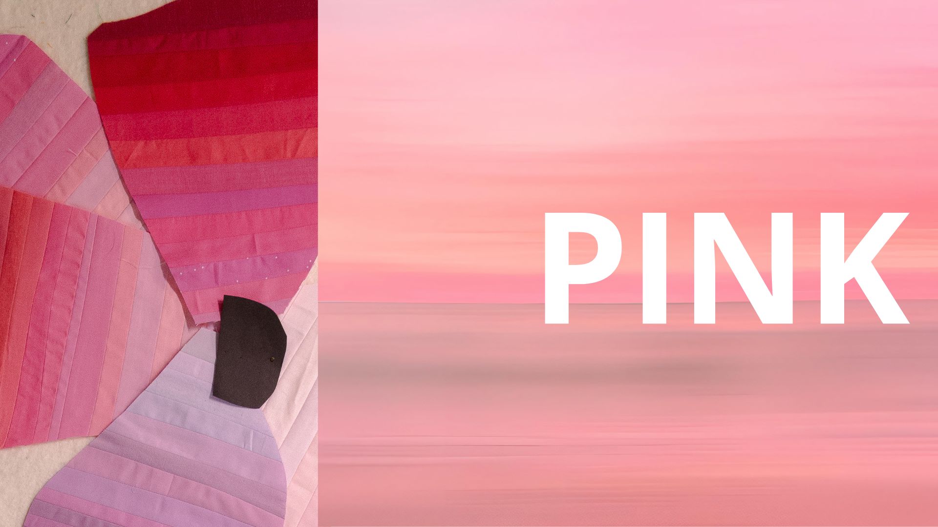
Pink gets dismissed faster than almost any other color on the wheel — treated as a default, a placeholder, “the girly one,” barely worth a real design decision. That reputation doesn’t hold up to even a little scrutiny. Pink has one of the strangest, most contested, most genuinely researched histories of any color available to you, and almost none of that history matches the soft, simple story we’ve assigned it.
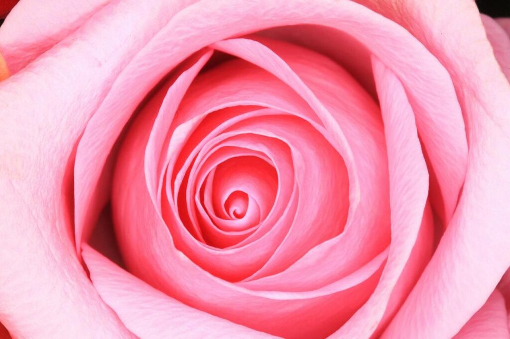
The Color That Can Sap Your Strength
Start with the strangest fact: pink is one of the only colors with a documented physiological effect, measured in a real experiment. In 1979, researcher Alexander Schauss had a Naval correctional facility in Seattle paint a holding cell in a specific shade, later named Baker-Miller Pink after the officers who authorized it. According to Wikipedia’s account, the facility reported no incidents of hostile or erratic behavior in the initial confinement period after the repainting, and Schauss’s follow-up testing found that even brief exposure to the color could measurably reduce a person’s grip strength.
The color spread fast, into prison intake rooms, psychiatric wards, and even the locker rooms of visiting football teams, who found their opponents oddly sluggish before kickoff. By the mid-1980s, facilities from Arizona to Iowa had repainted their holding cells, and the shade had become enough of a cultural phenomenon that it earned its own nickname: drunk tank pink.
It’s worth being honest about where the science actually stands, though: later controlled studies had real trouble replicating the effect consistently, and some facilities that used the color for extended periods reported inmates growing more agitated, not less, once the initial novelty wore off. Whatever is actually happening — genuine physiology, expectation, or something in between — pink is one of the few colors people have bothered to run a real experiment on at all, which says something about how much power we intuitively suspect it holds.
It’s also a useful reminder that color’s effect on mood isn’t just folklore. I’ve written more broadly about how color psychology plays out in a quilt, for anyone who wants the fuller picture beyond pink’s one strange experiment.
The Gender History Is More Contested Than the Popular Version
You’ve probably heard some version of the story: pink used to be a boy’s color, blue used to be a girl’s color, and the two flipped sometime in the 20th century. A 1918 trade publication is often quoted for exactly this — advising that pink, being the “stronger” color, suited boys, while blue, being “delicate,” suited girls. This version of the story traces back largely to the research of historian Jo Paoletti, and it’s been repeated by the Smithsonian and widely cited since.
What’s less often repeated is that this specific claim — a clean mid-century “reversal” from pink-for-boys to pink-for-girls — has been seriously challenged. A 2017 academic critique found the actual evidence for a consistent pre-1940s “pink is for boys” convention surprisingly thin, arguing that color simply wasn’t a reliable gender marker in children’s clothing at all before the mid-20th century; babies of both sexes mostly wore white, and pastels were a matter of individual preference rather than rule. Wikipedia’s overview of pink’s cultural history reflects this more cautious framing, noting that scholars have linked pink’s decisive turn toward femininity to the arrival of Barbie in 1959, rather than to any earlier, tidier reversal. The honest version of this story isn’t “pink used to mean the opposite of what it means now.” It’s that pink’s gender meaning has always been less fixed, and less agreed-upon, than either popular version suggests.
Pink as a Weapon, Not a Whisper
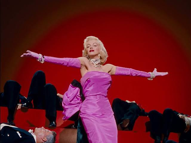
Pink’s psychology is genuinely uncertain and its gender history is legitimately contested. Its use as a deliberate statement of power is neither. In 1937, fashion designer Elsa Schiaparelli made a saturated, electric magenta her signature, naming it Shocking Pink and building an entire perfume and fashion identity around it. She described the color, in her own words, as impudent and undiluted — a deliberate provocation against the muted, restrained palette that dominated fashion at the time. According to the Philadelphia Museum of Art, Schiaparelli built her entire design language in direct opposition to the quiet elegance of contemporaries like Chanel, using bold, unapologetic color as one of her primary tools of artistic rebellion.
Schiaparelli didn’t soften pink. She used its intensity as an argument. That’s worth sitting with if your instinct is to treat pink as automatically gentle — the exact same hue family that gets dismissed as sweet has also been used, deliberately, as a tool of confrontation.
What Pink Actually Is, Technically
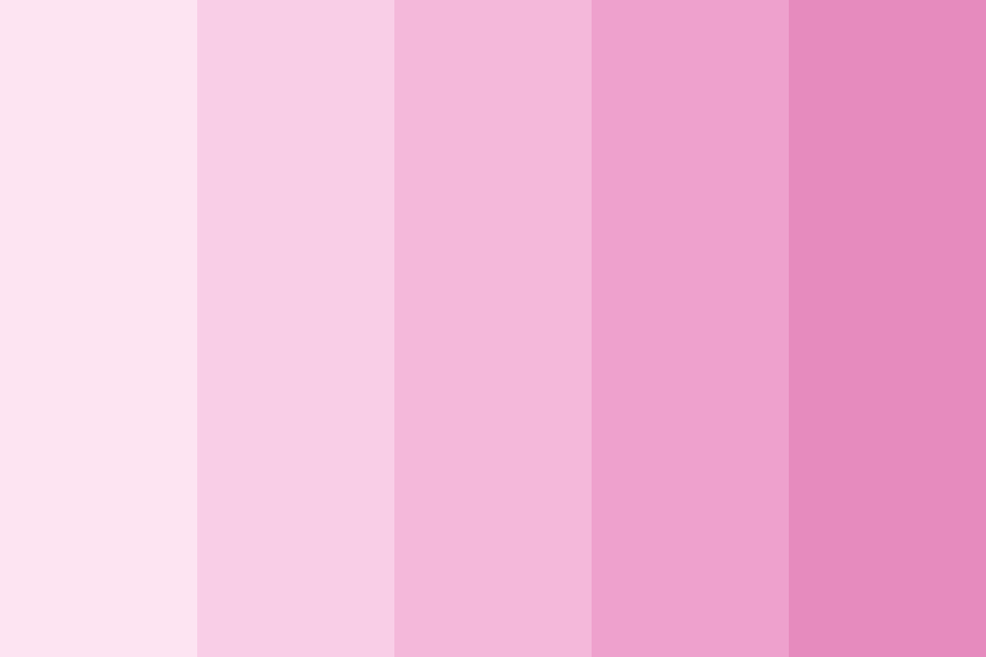
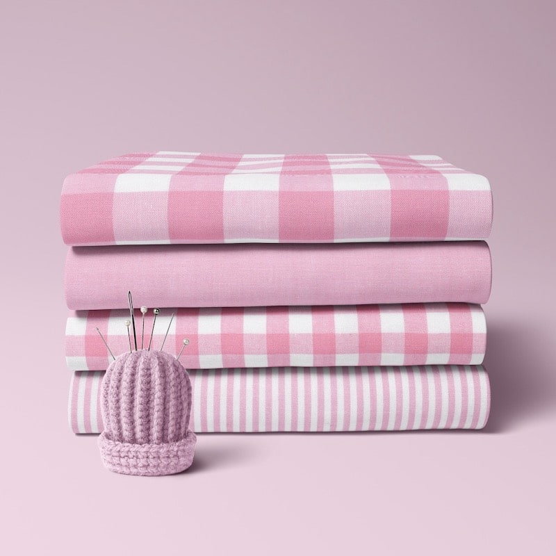
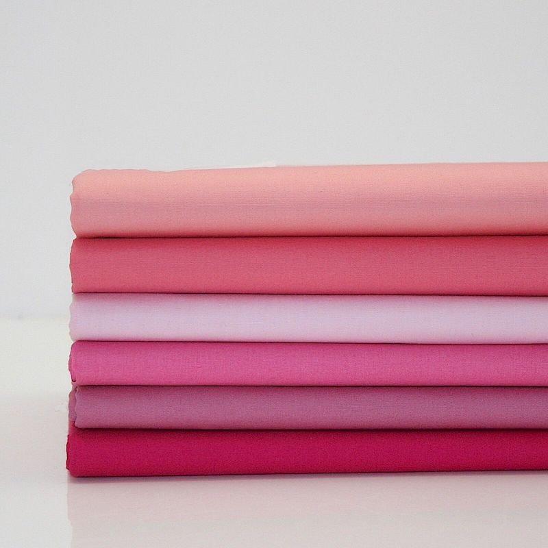
A detail that gets lost in all the cultural noise: pink isn’t really its own hue at all. It’s a tint — red lightened with white — which makes it linguistically unusual. Most tints get a compound name: light blue, pale yellow. Pink is one of the very few tints in English that earned its own standalone word, treated by our language as if it were a fully independent color rather than what it structurally is: red, softened. Linguists who study how color vocabulary develops across cultures note that this is a surprisingly late arrival — words for basic hues like red, green, and blue tend to enter a language long before a language develops a separate word for a tint, and pink is one of the few tints ever to make that leap into its own name at all.
That has a real consequence for how you use it. Because pink is red at its core, it inherits red’s full range of temperature behavior — a coral-leaning pink reads warm and advances, while a magenta or fuchsia leaning toward violet reads cooler and can recede, in exactly the kind of temperature shift I wrote about in the power of purple. Pink is not one decision. It’s a whole temperature range hiding under a single, deceptively simple name.
Using Pink With the Seriousness It Deserves
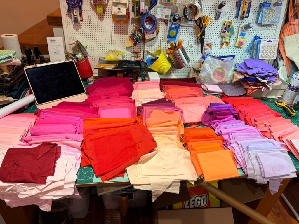
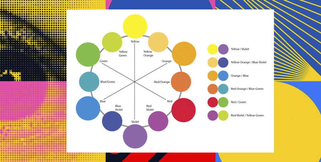
A few practical starting points, given everything above. Choose your pink’s temperature on purpose — before you pull fabric, decide whether you want it to behave like red, advancing, warm, assertive, or drift cooler and quieter. The name “pink” tells you almost nothing about which one you’re getting. Saturation is your real design lever: a pale blush and a saturated magenta share a hue family and almost nothing else in terms of how they’ll behave in a composition — the same value and saturation groundwork I cover in The Power of Contrast applies just as much to pink as to any other hue, so don’t let the word “pink” flatten that range in your planning. Remember its complement, too — because pink is fundamentally a tint of red, it shares red’s relationship with green, a pairing that can feel vibrant and contemporary rather than saccharine at higher saturation. And decide, honestly, whether you’re using pink to soften or to provoke. Both are legitimate, historically grounded uses of the same color family. Just know which one you’re reaching for before you commit fabric to it.
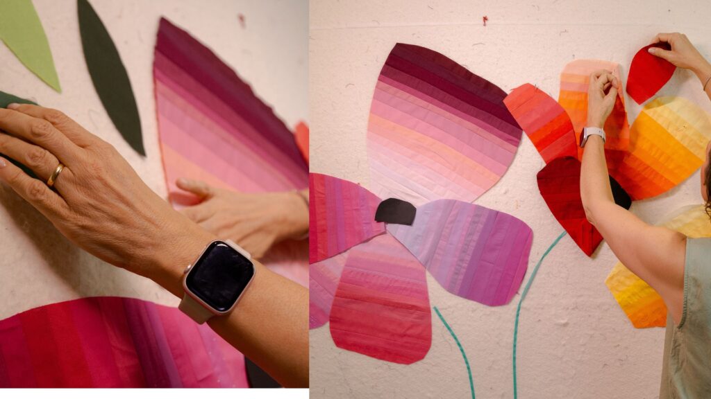
Closing the Color Wheel
This piece closes out a color series that’s taken me through blue, red, yellow, green, orange, neutrals, and purple, and pink turned out to be a fitting color to end on, precisely because it resists the simple story every other post in this series had to work to get past. Pink has never been just one thing. It’s been a scientific curiosity, a contested gender marker, a rebellion, and a tint of red doing double duty as its own independent word. That’s a lot of history sitting quietly in your fabric stash, waiting to be used with actual intention.
Purple turned out to be the color I avoid without thinking. I’m still working out whether pink is the opposite for me, or whether it’s hiding its own blind spot I just haven’t noticed yet.
If you want a structured way to build this kind of judgment across the whole wheel, not just pink, that’s exactly what my Color Confidence bundle walks you through — hue, value, saturation, and temperature, and how to choose a color on purpose instead of by default.
And if this is the kind of series your guild would want as a talk rather than seven blog posts, color theory — including the parts people usually get wrong, like pink’s gender history — is one of the talks and workshops I bring on the road.
If you want the next color deep-dive landing in your inbox before it’s live on the blog, you can subscribe on the homepage — you’ll get a free pattern for joining.
Sources referenced: Wikipedia, Baker–Miller pink (en.wikipedia.org/wiki/Baker–Miller_pink); Smithsonian Magazine (smithsonianmag.com/history/unraveling-the-colorful-history-of-why-girls-wear-pink-and-boys-wear-blue-1370097/) and Wikipedia, Pink (en.wikipedia.org/wiki/Pink) on the history of pink and gender; Philadelphia Museum of Art (legacyweb.philamuseum.org/doc_downloads/education/ex_resources/schiaparelli.pdf) on Elsa Schiaparelli.