

There is a word that gets attached to white, gray and black in quilting conversations that I find deeply unfair. That word is safe. As if choosing to work with neutrals means you have run out of courage, or ideas, or both. As if these colors are where bold design goes to rest.
I want to challenge that idea directly. In my experience — making quilts, teaching color, and studying composition for many years — white, gray and black are among the most powerful design tools available to a quilter. Not because they are quiet. But because of exactly how they are quiet. They hold space. They direct the eye. They create tension, depth, and clarity. They make everything around them more itself.
When I work with neutrals, I am not making a simpler quilt. I am making a more demanding one. Every placement decision becomes visible. Every shape, every edge, every value shift is exposed and examined. Neutrals are not forgiving. They are honest.
The problem is not that neutrals are boring. The problem is that we treat them as backgrounds when they are, in fact, active participants in the composition.
What We Actually Mean When We Say ‘Neutral’
In color theory, white, gray and black are called achromatic — they carry no hue. But achromatic does not mean inactive. It means that these colors communicate through other dimensions: value, temperature, weight, and relationship.
White is not one color. There are warm whites and cool whites, creamy whites and stark whites, whites that open up a composition and whites that close it down. The same is true for gray — from a pale silver that feels almost like light, to a deep charcoal that reads almost like black. And black, used with intention, is one of the most decisive colors a quilter can reach for. It grounds. It defines. It stops the eye.
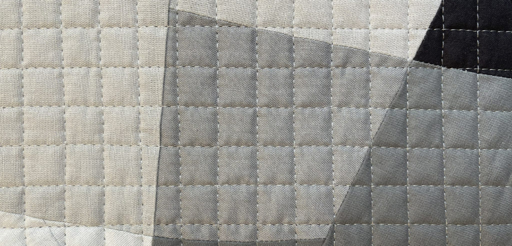
What makes these colors powerful is precisely what makes them seem humble: they do not compete. They do not push forward with their own agenda. And that restraint — that willingness to serve the composition rather than dominate it — is a form of visual intelligence that we should not mistake for timidity.
One of the most instructive things I have discovered, both in my own work and in teaching, is that gray is almost never truly neutral in its relationships. Every gray leans. It whispers its undertone to whatever surrounds it. And once you start to hear those whispers, the whole idea of ‘neutral’ becomes something far more interesting than it sounds.
Chromatic Whispers: When Gray Reveals Its True Colors
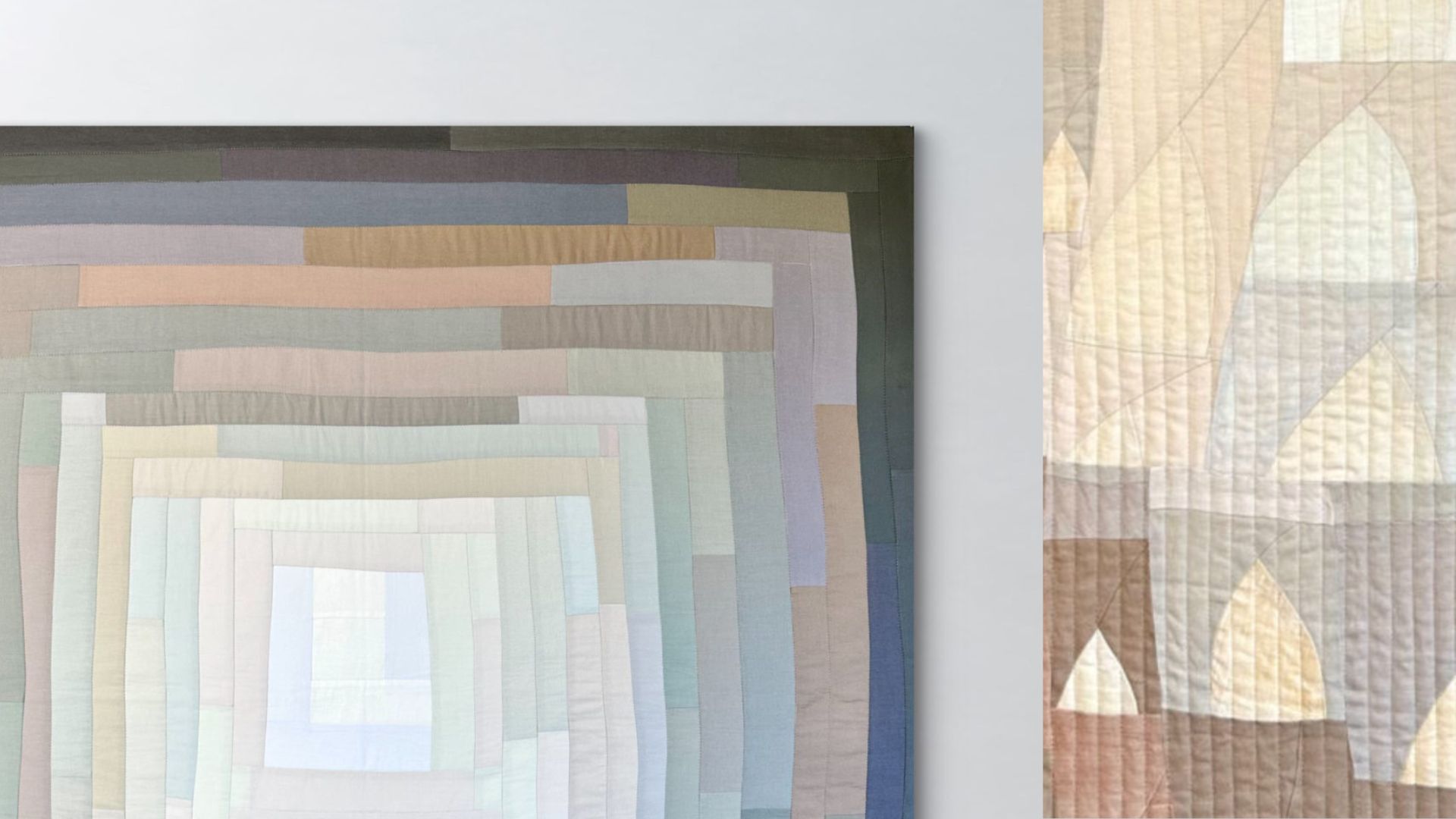
A few years ago I made a large improvisational log cabin quilt that I titled Chromatic Whispers. The process was unlike anything I had done before. I collected every gray fabric I owned and arranged them on my design wall — solid after solid, all supposedly neutral, all supposedly colorless.
What happened next changed how I think about color permanently.
As I stepped back and looked at those grays together, I started to recognize that they were not gray at all. Some read as distinctly blue. Others leaned purple. Several had a warm pink or blush quality. Others were green, or brown, or almost bronze. The grays were carrying entire color worlds inside them — and the design wall was the only place where those worlds became visible, because the grays were talking to each other.
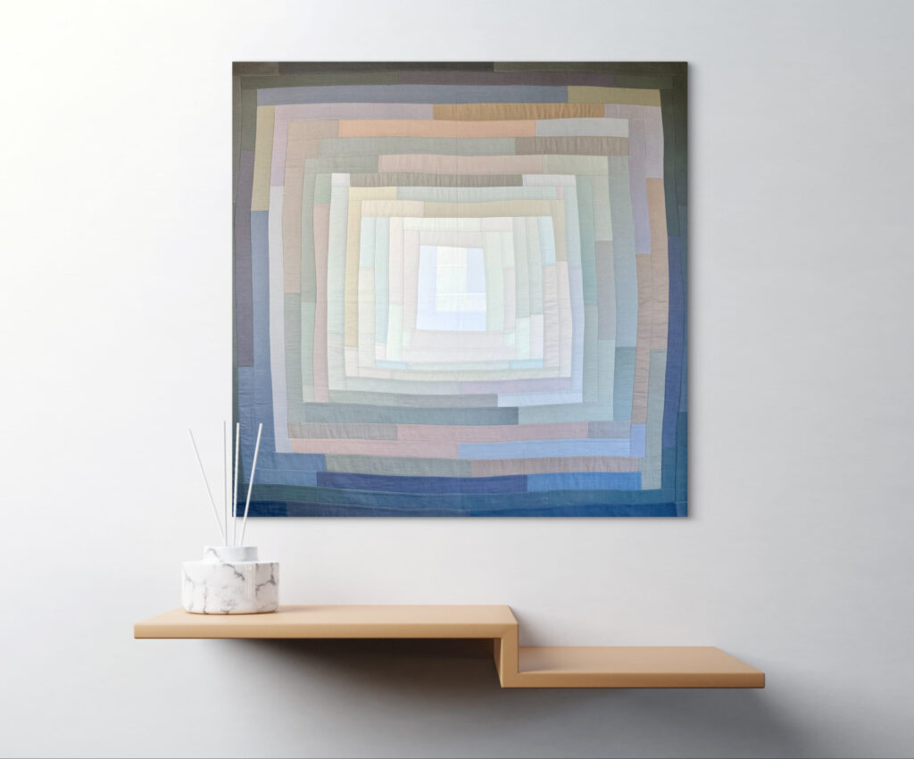
This is exactly what Josef Albers described when he wrote about color relativity. Color is the most relative medium in art — the same color looks entirely different depending on what surrounds it. When I placed a blue-gray next to a pink-gray, both colors became more themselves. The blue got bluer. The pink got warmer. Neither had changed. The context had.
The finished quilt moves from a near-white center outward through concentric rings of gray, each log cabin round built from fabrics chosen for their subtle undertone relationships. What looks like a monochromatic composition from across the room reveals, on closer inspection, an entire chromatic landscape — blues, mauves, sages, taupes — all hiding inside what we casually call ‘gray’.
This is the first lesson neutrals teach: they are not the absence of color. They are color in disguise.
Newton’s Third Law: Black and White as Pure Argument
Displaying work publicly increases emotional intensity. Psychology research on evaluation anxiety shows that public If Chromatic Whispers is about subtlety and discovery, then Newton’s Third Law is about the opposite: absolute clarity, maximum contrast, and the courage to use nothing else.
This quilt works with only two colors — white and black — and asks a single compositional question: what happens when you divide a surface into two equal fields and let them speak directly to each other? The upper half is white with black organic shapes cascading across it. The lower half is black, with white shapes answering back from the dark field. Action and reaction. Every opposite simultaneously true.
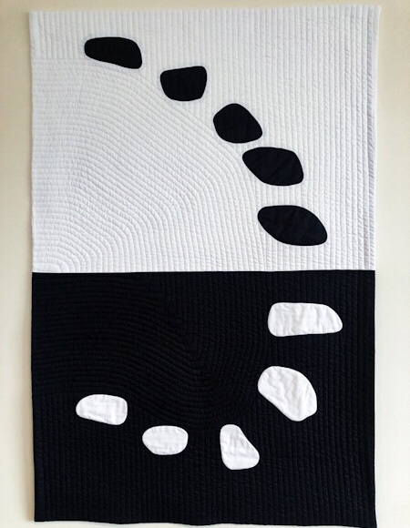
The title is exact. In physics, Newton’s third law states that for every action there is an equal and opposite reaction. In this quilt, the black shapes on white and the white shapes on black are in perfect dialogue — same language, inverted relationship. The shapes themselves are organic, rounded, almost like stones or seeds. Their softness against the absolute hard contrast of black and white creates its own tension.
What makes this quilt work is precisely the decision not to introduce any other color. Negative space is not background filler — it is one of the most active forces in any artwork. In Newton’s Third Law, the white field and the black field are not backgrounds. They are protagonists. Each gives the other its meaning. Without the black, the white would be empty. Without the white, the black would be invisible.
This is what black and white at full contrast can do: reduce a composition to its most essential argument, and make that argument impossible to ignore.
Like in Music: Gray as a Full Register
Rejection is statistically inevitable in juried exhibitions. Research on resilience suggests that adaptive coping strategies Between the subtlety of Chromatic Whispers and the stark opposition of Newton’s Third Law sits a third possibility — and it is perhaps the most compositionally complex of all.
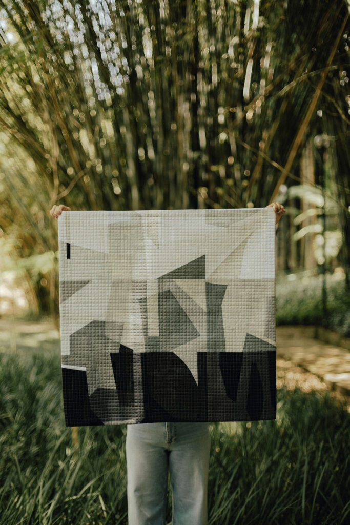
In Like in Music, I worked with white, black, and the full range of grays between them, using angular improvised shapes to create what feels like a visual score. The composition moves from a light upper register — pale grays and whites, sharp geometric shapes breaking into each other — down into a dark lower register of near-black, with the shapes becoming heavier, denser, more grounded as they descend.
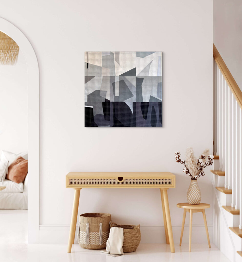
The musical metaphor is deliberate. In music, value keys — the relative lightness or darkness of a passage — carry emotional weight independent of melody or harmony. A passage played pianissimo communicates something entirely different from the same passage played fortissimo, even if the notes are identical. In this quilt, the shift from high values to low values works the same way. The light areas feel open, almost weightless. The dark areas feel heavy, resolved, inevitable.
This is the true expressive range of gray. Value — the lightness or darkness of a color — determines how forms stand out or blend together, shapes balance, and guides the viewer’s eye. In Like in Music, value is the only instrument — and it is enough to compose an entire emotional journey from one edge of the quilt to the other.
The grid quilting that covers the entire surface unifies all these value shifts into a single plane. You feel the composition moving through light and dark, but the hand quilting reminds you that it is all one piece. One surface. One statement.
Like in Music is available in my artwork shop.
Candles: When Neutrals Hold a Warm World
Not all neutral palettes live in the cool, achromatic register of white, gray and black. Some of the most powerful neutral work in quilting happens in the warm range — the beiges, taupes, warm browns and deep charcoals that carry the colors of earth, stone, bark and shadow.
In Candles, I worked almost entirely within this warm neutral family, using pointed arch shapes — like flames, or cathedral windows — repeated across the surface in varying scales and values. The palette is beige, taupe, soft gray-brown, deep brown, near-black. And then, scattered with great care throughout: mustard yellow.
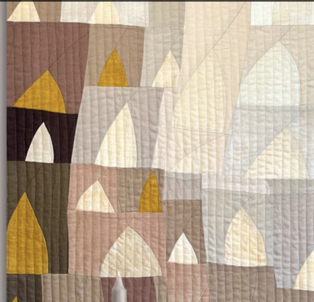
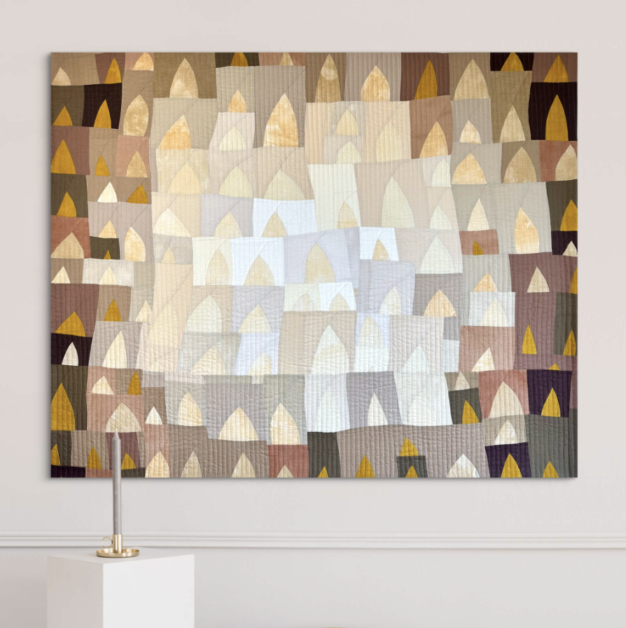
The fabrics themselves are part of the story. Most of Candles is made from linen — some commercial, and some gifted to me by a friend who dyed them herself using natural pigments. That origin gives the quilt a particular warmth and depth that is impossible to manufacture. Natural dyes carry a quality that synthetic color rarely achieves: slight variation, organic richness, a sense of time and process embedded in the material. Every piece of linen in this quilt has a history, and the composition holds all of that.
That mustard yellow is not decoration. It earns every appearance it makes, because everything surrounding it is so restrained. Neutral colors allow other colors to stand out in a design — and in Candles, the warm neutrals do exactly that. The yellow reads as a burst of light, a moment of warmth, a pulse of life. But it only does that because it has been given the right context. Surrounded by vibrantcompeting colors, it would disappear into noise. Surrounded by warm neutrals, it becomes everything.
This quilt also demonstrates something important about how neutrals carry emotion. Warm beiges and browns are not cold or clinical. They are grounded, intimate, and organic. Brown represents something natural, warm and wholesome — and when an entire quilt is built on that register, it communicates those qualities even before the viewer consciously identifies a single color. The emotional tone is set by the neutrals themselves.
Candles is available in my artwork shop.
Value Is the Secret Language of All Composition
What all four of these quilts share — despite their very different approaches — is a deep commitment to value as the primary compositional tool. And this, more than anything, is what working with neutrals teaches.
You can have a beautifully chosen color palette that reads as flat and confusing if the values are all similar. And you can have a quilt built entirely from neutrals that reads as dynamic, layered and emotionally rich if the values are thoughtfully distributed. Colour gets all the credit and value does all the work — and neutrals strip away the distraction of color so that the value structure is completely visible.
Working in solids makes this even clearer. There is no print, no surface interest, no pattern to hide behind. The composition has to earn every visual decision through placement, proportion, and value alone. This is demanding work. But it is also profoundly educational — for me, and for the students I work with.
A simple exercise I often recommend: take a photograph of your design wall and convert it to grayscale. Strip away the color. If your fabrics look like the same shade of gray in the photo, you need more contrast. But if you have a clear range — lights that lift, midtones that connect, darks that anchor — your composition has structure, regardless of what colors you choose.
How to Work with Neutrals Intentionally
Here are a few principles that guide my own practice when working in neutral palettes:
Work in solids. Solids are uncompromising. They reveal the composition with complete clarity, and they make the undertones of your neutrals fully visible in ways that prints can obscure.
Listen to the undertones. Every gray, every white, every beige leans somewhere. Lay your fabrics next to each other and look carefully. Do the cool grays make the warm ones look browner? Does one white make another look yellow? These interactions are the composition.
Use the full value range. Don’t stay in the middle. Reach for your palest lights and your deepest darks. The distance between them is where the composition gains its energy.
Be deliberate with black. Ask what job each piece of black is doing. If you cannot answer that question, the black may not belong there. Black grounds, defines, and stops the eye — and that is a powerful responsibility.
Let one chromatic color earn its place. As in Candles — if you want to introduce a single note of chromatic color, build the neutral foundation first. The color will speak with far more power in that context than it ever could surrounded by competition.
The quilters whose work has moved me most almost always have a sophisticated relationship with neutral color. Not because they avoid it or hide it, but because they understand it deeply and use it with full intention.
White is not empty. Gray is not boring. Black is not decorative. Beige and brown are not conservative. They are the architecture beneath every composition that truly holds together — and sometimes, as in Chromatic Whispers and Candles, they are the entire composition, and that is more than enough.
The next time you reach past the whites and grays in your stash toward something more vivid, pause for a moment. Ask yourself if you are reaching for that color because it is the right choice — or because you are afraid of what happens when you commit to the quiet ones.
Because the quiet ones, used with courage and precision, are anything but safe.
Want to deepen your understanding of color, value and composition? Explore my online courses at carolinaoneto.com — where we work with color as a language, not just a decoration.