
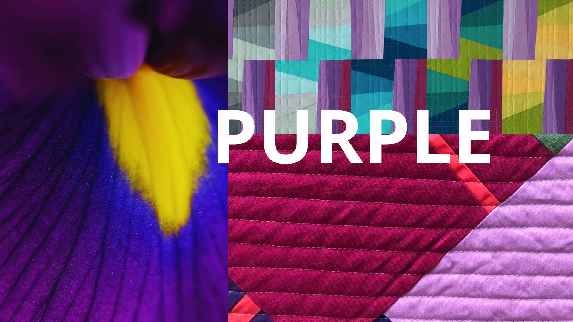
The power of purple in quilting comes from a contradiction: it is the one color on the wheel that refuses to commit. Every other hue has a temperature you can name without hesitating.
Red is warm. Blue is cool. Purple depends entirely on what it’s mixed with, and that instability is exactly why so many quilters — myself included — quietly avoid it. I’ll be honest about where this post is coming from: purple is the color I reach for least. It sits in my stash mostly untouched, and if I’m building a palette and a purple gets pulled by accident, I usually put it back. Writing this meant finally asking myself why, and the answer turned out to be more interesting than “I just don’t like it.” Purple’s refusal to settle into warm or cool is precisely what makes it so hard to place with confidence — and precisely what makes it worth the discomfort.
Why Purple Reads as Royal — and Why That’s an Accident of Economics, Not Emotion
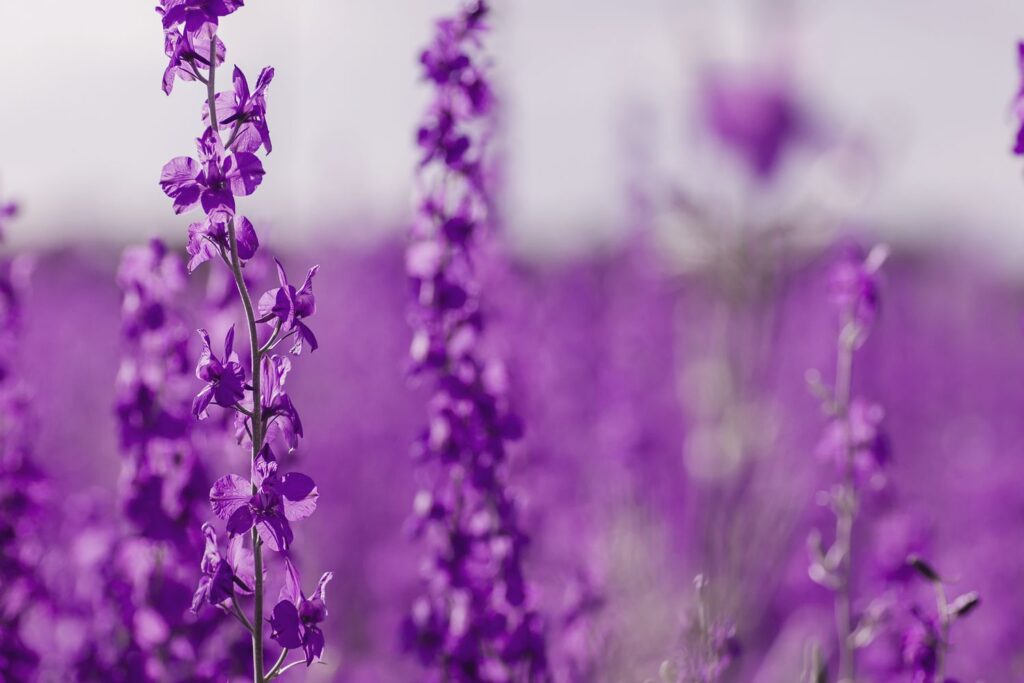
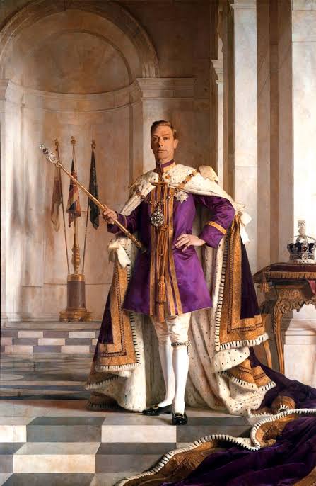
Orange is born from transition. It is neither as aggressive as red nor as luminous as yellow, but it holds qualities of Purple’s association with power and luxury is one of the oldest color stories in humanhistory, and it has nothing to do with anything innate in the color itself. Winsor & Newton traces the story back to Tyrian purple, a dye first produced by the Phoenicians from a species of sea snail, so labor-intensive to extract that only the wealthiest households could. ever afford garments dyed with it. Rulers across Rome, Byzantium, and Persia restricted its use by law, which is how a pigment became a symbol of rank.
That history matters for quilters because it explains something you can feel intuitively when you work with purple: it never quite reads as ordinary. Even in a synthetic, mass-produced solid fabric, purple carries a residue of rarity. You can lean into that — using it sparingly, the way it was historically used, so it retains its sense of significance in a composition — or you can subvert it deliberately, saturating a piece in purple until the scarcity story collapses and something stranger takes over.


From Rarity to Every Fabric Store: The Accident That Changed Purple Forever
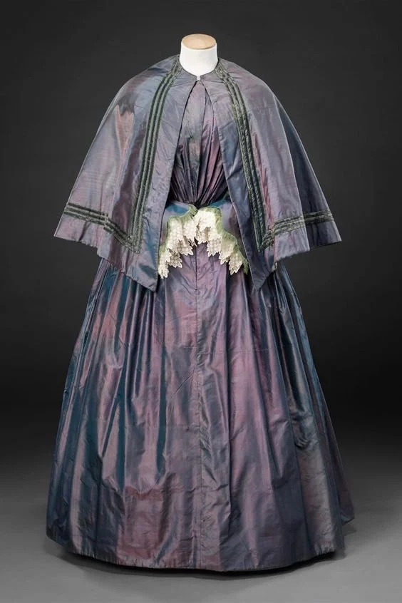
Purple stayed a color of the wealthy for roughly two thousand years — until 1856, when an eighteen-year-old chemistry student accidentally ended that entirely. William Henry Perkin was trying to synthesize quinine from coal tar when his failed experiment left behind a brilliant purple residue. The Science Museum in London holds much of Perkin’s original archive, and its account is clear that he immediately recognized the commercial potential of what he’d made: the world’s first synthetic dye, which he named mauveine.
Within a few years, mauve had become a full-blown fashion craze in London and Paris, worn by Queen Victoria and Empress Eugénie alike, satirized in the press as “the mauve measles.”
For the first time in human history, purple was available to nearly anyone who wanted it. This is worth sitting with as a quilter: every time you reach into a bin of purple fabric without a second thought, you’re standing on the far side of a genuine historical rupture. Scarcity built purple’s meaning. An accident in a home laboratory dismantled it. What’s left is a color that still carries the memory of both.
The Only Color With Two Temperatures
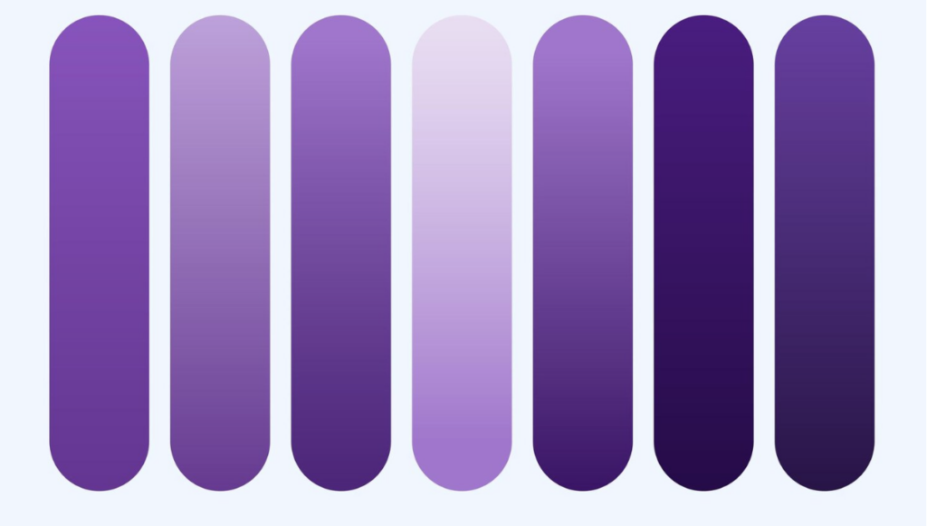
Here is the part of purple that actually matters for your design decisions. Every hue on the color wheel sits on one side of the warm-cool divide — except purple, which straddles it depending on its ratio of red to blue. A red-violet leans warm and advances toward the viewer. A blue-violet leans cool and recedes. This is not true of any other secondary color; green and orange both have a fixed temperature identity, but purple’s identity shifts with its mix.
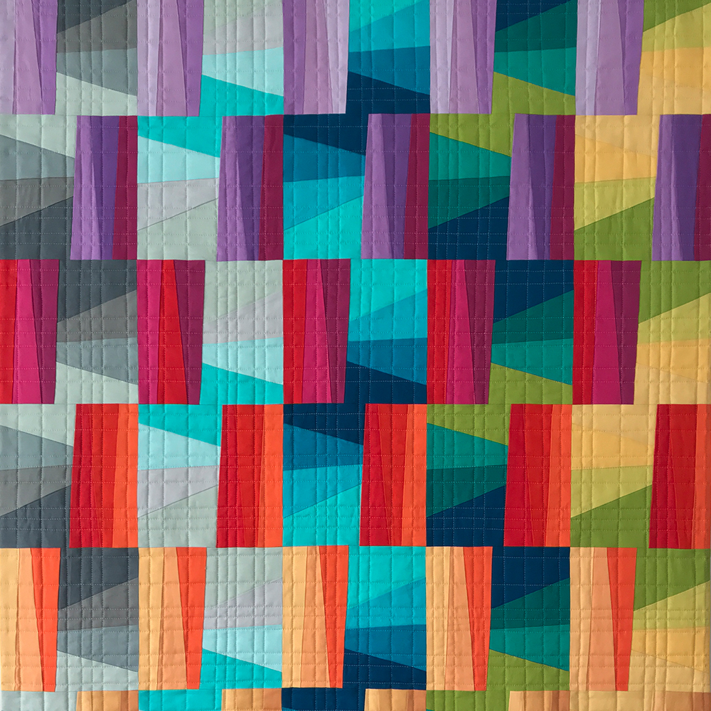
This is why purple is so useful for creating depth within a single family of fabrics — even when you barely use it. In my piece Casagrande, I leaned on exactly this warm-cool principle, with reds and oranges advancing toward the eye against a deep blue and indigo background. Looking back, that background is where a true violet could have done real work, softening the transition between the warm petals and the cool city behind them — and I notice now that I reached for blue instead, which is its own small piece of evidence for how automatically I avoid purple, even when the color logic points toward it. Johannes Itten, the Bauhaus color theorist whose framework still shapes how art schools teach color today, built an entire system around this kind of temperature contrast, and purple is the hinge color that makes it possible to modulate warm and cool within what still reads as one family of color.
Purple and Yellow: The Strongest Contrast You Have
If you want proof of purple’s visual force, look at what happens when you pair it with yellow.
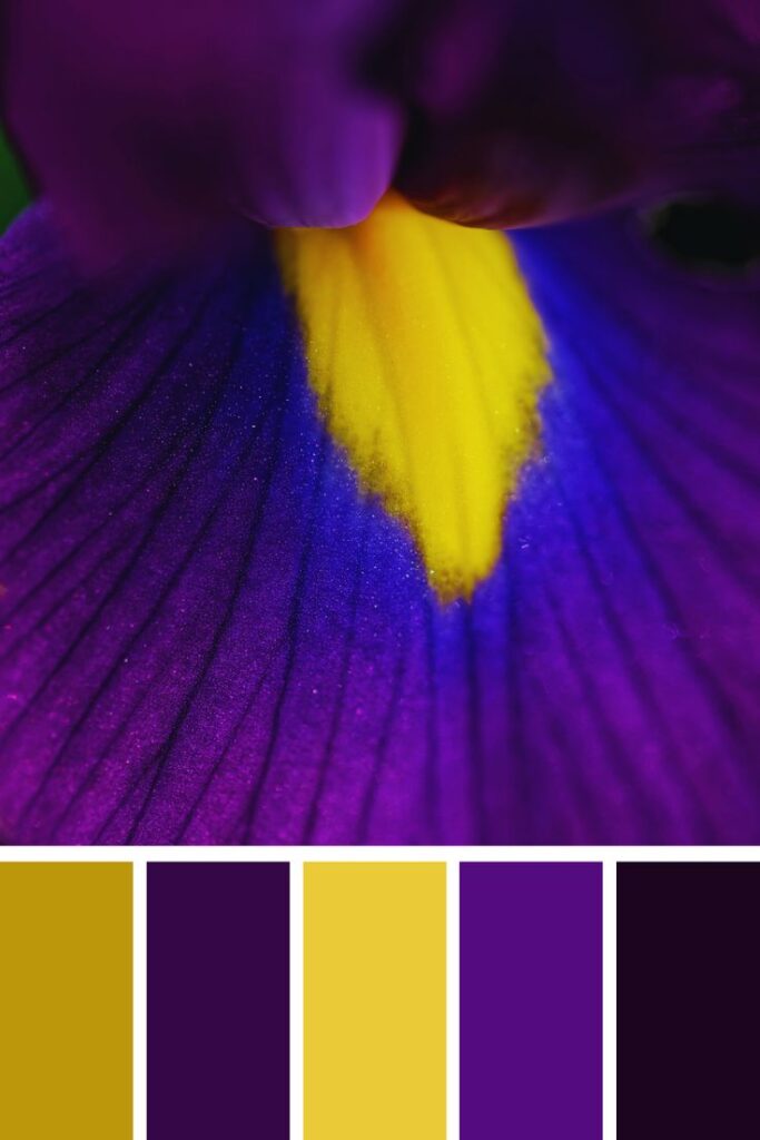
According to Itten’s color theory, yellow and violet form the strongest light-dark contrast of any complementary pair on the wheel, because yellow is the lightest hue in its pure form and violet is the darkest. No other complementary pairing — not red and green, not blue and orange — produces that same extremity of value difference.
Practically, this means a small amount of yellow against a large field of purple will read as an intense focal point almost automatically, without any additional design effort on your part. It also means purple can absorb light the way navy or black does, giving you a genuinely dark value that still carries color and warmth, rather than the flatness that comes from using pure black.
Purple in Contemporary Art Quilting
Purple has a real, working history in art quilting specifically, not just in general color theory. Studio Art Quilt Associates has featured violet-centered work in its permanent collection and its educational seminars — including pieces built entirely around the color’s connection to mystery and symbol. SAQA’s regional groups have also built full exhibitions around the idea of working in a single hue family, including Prism Play, where artists developed monochromatic art quilts spanning the full spectrum from warm yellow through violet and back to warm yellow again — a structure that treats each color, purple included, as worthy of an entire body of work on its own.
That kind of single-color deep dive is one of the most useful exercises I know for actually understanding a color, rather than just reacting to it. If you’ve never limited an entire quilt to one hue and its tints and shades, purple is a genuinely rewarding place to start, precisely because its instability forces you to make deliberate choices about temperature at every step.
How I’m Going to Use Purple With Intention (Starting Now)
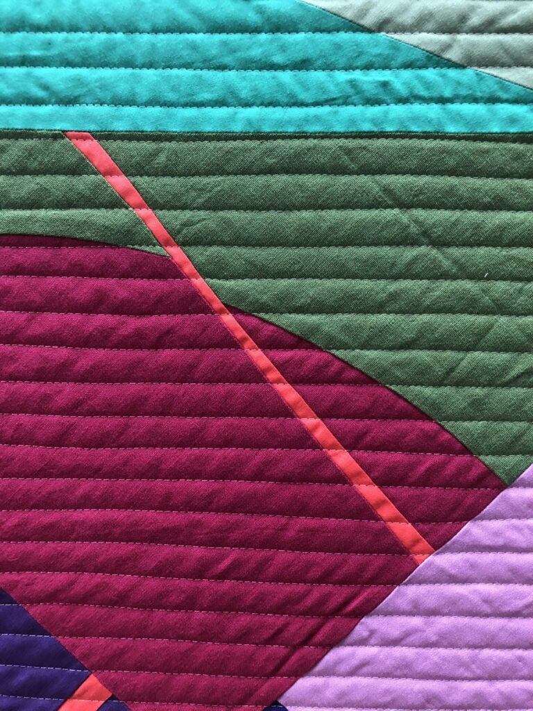
A few practical starting points, based on what purple actually does structurally in a composition — this is as much a plan for myself as it is advice for you: Use it as a shadow color, not just a hue. Because blue-violet reads as cool and recessive, it works beautifully in the shaded areas of an improvisational or curved design — the places where you want the eye to settle back rather than come forward.
Pair it with warm neutrals to soften its formality. Purple next to a stark white can feel ceremonial, almost heraldic. Purple next to a warm off-white or a soft gray — the kind of grounding I wrote about in neutral color composition — feels contemporary and lived-in instead.
Decide its temperature on purpose. Before you pull fabric, decide whether this purple needs to advance or recede in your composition, then choose a red-violet or blue-violet accordingly. Don’t let the fabric store decide for you — and don’t let avoidance decide for you either, which is my own habit to break.
Use small amounts against yellow for maximum contrast. If you want a single unmissable focal point, a small yellow accent inside a purple field will do more work than almost any other combination on the wheel.
Try a monochromatic purple study. Limiting an entire small piece to tints and shades of violet — the way SAQA’s Prism Play participants did — is one of the fastest ways to build real fluency with a difficult color. It’s the exercise I’m setting for myself after writing this.
Purple Completes the Conversation
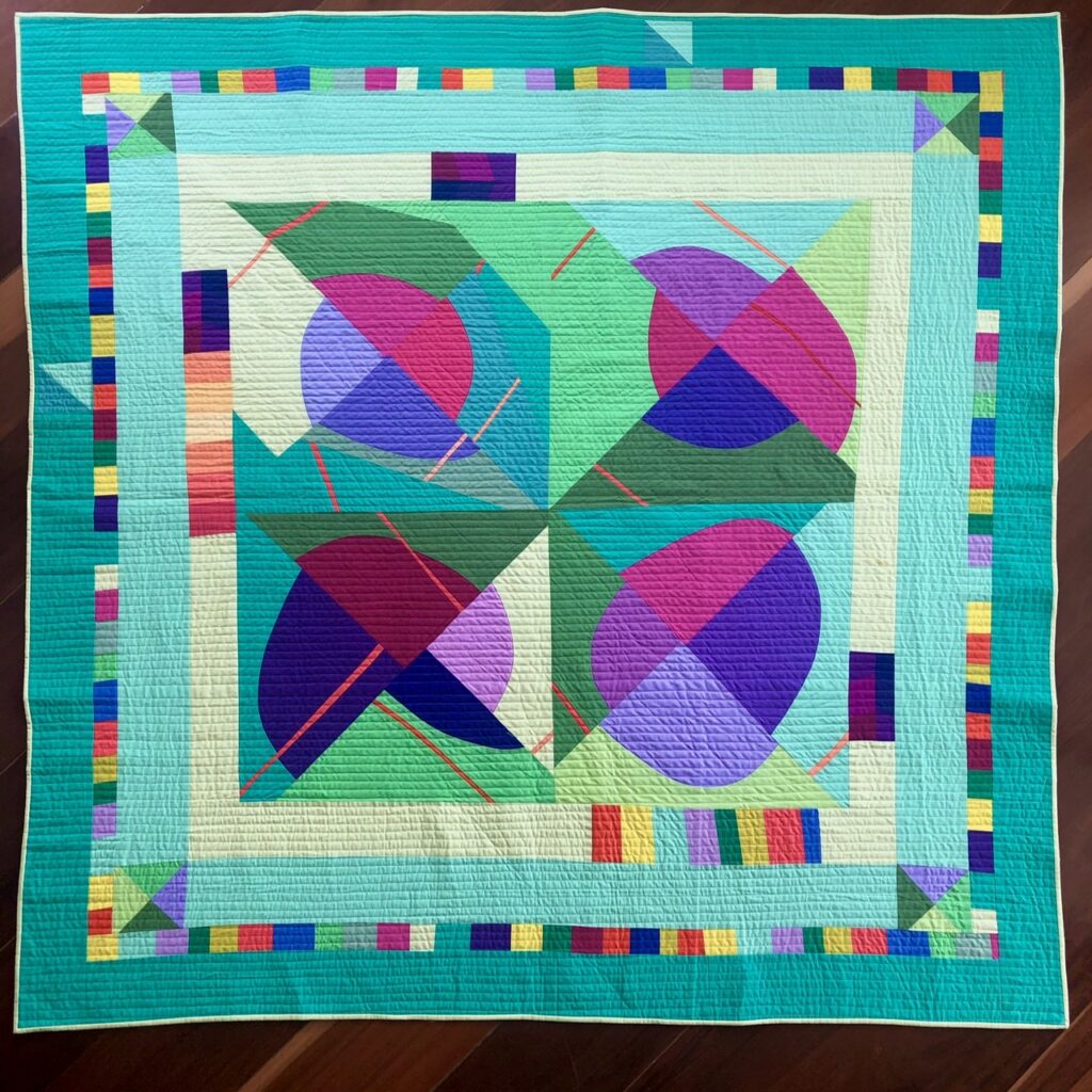
Color, for me, is never just decoration — it’s intentional communication, which means avoiding a color isn’t a neutral choice either. It says something. I’ve written before about the color you’re afraid to use in a general sense; writing this piece is the first time I’ve admitted, in public, exactly which color that is for me. Purple asks you to decide, fabric by fabric, whether you’re speaking in a warm voice or a cool one — and I think that decision is exactly what I’ve been avoiding.
If you’ve been building out a color vocabulary alongside me, this piece closes out the primary and secondary hues: purple joins my earlier explorations of orange, green, and neutrals on the blog. Together they’re the closest thing I have to a written color course — worth reading as a set if you’re working through your own palette right now.
Is there a color sitting untouched in your stash, the one you always put back? I’d love to know what it is, and whether you’ve ever asked yourself why.Sources referenced: Winsor & Newton, Science Museum, London, Johannes Itten, The Art of Color (1961), Studio Art Quilt Associates (SAQA).