

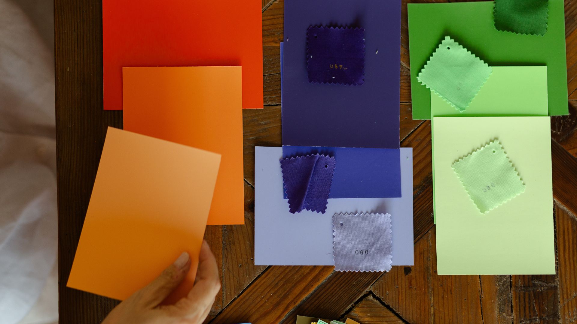
There is a moment every quilter knows. You stand in front of your fabric stash — or worse, in the middle of a quilt shop — and suddenly the abundance of choice feels less like freedom and more like paralysis. Forty shades of blue. Dozens of warm oranges. Neutrals in every temperature. Where do you begin? What goes with what? And why, after pulling thirty fabrics, does the whole thing feel muddy and unclear?
Here is something I have learned after years of making quilts and teaching color: more options rarely produce bolder work. Fewer options almost always do.
This idea is counterintuitive. We tend to believe that more color equals more creativity. But when I look at the quilts that have moved me most — the ones with real visual impact, the ones that stop you in your tracks — they almost never come from sprawling, rainbow-everything palettes. They come from quilters who made a clear, intentional choice to stay within a tightly defined range of color and then went very, very deep into it.
The Paradox of Choice — and Why It Applies to Fabric
In 2000, psychologists Sheena Iyengar and Mark Lepper ran a now-famous experiment with jars of jam. Shoppers were more drawn to a display of 24 flavors — but ten times more people actually bought jam from the table with only 6 options (source). More choice created more hesitation. Less choice created more action.
The same dynamic operates in our studios. When you sit down to design a quilt with an unlimited palette, your brain is constantly pulled between options. Is this the right blue? Should I add a warm accent? What if I tried that green instead? The cognitive weight of those open questions exhausts your creative energy before you ever make your first cut.
When you limit your palette to three, four, or five carefully chosen fabrics, something shifts. The decisions get smaller and more precise. You stop asking what color should this be and start asking what does this piece need. That is a much more powerful question — and the quilts that come from it show it.
What Happens to Color When You Restrict It
One of the most important lessons I have ever encountered about color came from Josef Albers. His book Interaction of Color (1963) remains one of the most radical and precise explorations of how colors behave when placed next to each other. Albers argued that color is the most relative medium in art — that the same color looks entirely different depending on what surrounds it. A small square of gray placed on a dark background will appear lighter. The same gray on a pale background will appear darker. The color itself has not changed. The context has.
This principle has profound implications for how we build quilts. When you use many colors simultaneously, you fracture this relational dynamic. Colors compete for attention. Harmonies become accidental. But when you work within a limited palette, every color in your piece is naturally harmonious because it derives from the same foundational tones. The relationships become intentional. And intentional color relationships are what produce visual power.
This is also why I was so deeply shaped by my studies of color interaction with Eduardo Vilches at Universidad Católica in Santiago. Vilches understood what Albers understood: that you cannot fully perceive what a color does until you remove the noise of competing hues. Limitation is not deprivation. It is focus.
Value, Temperature, and the Richness of Restraint
A common fear about working with fewer colors is that the result will feel flat or monotonous. This fear is understandable — but it misunderstands what a limited palette actually contains.
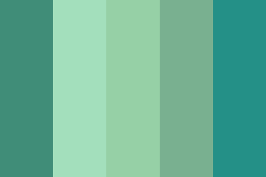
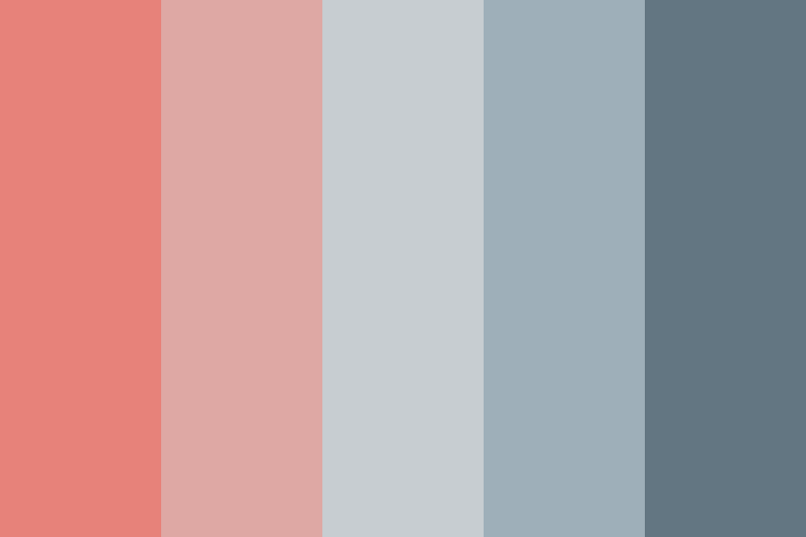
Even a palette built from two or three hues holds an enormous range of possibility once you begin working with value (how light or dark a color is) and temperature (how warm or cool it reads).
Working with just three to five colors can completely shift your process in the best way. With a limited palette, subtle shifts in warm versus cool tones become the primary expressive tool. You stop relying on hue to carry the work and start understanding how value and temperature alone can create depth, movement, and emotion.
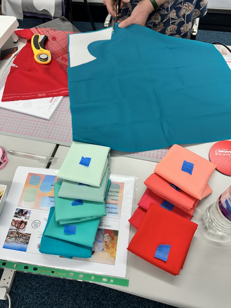
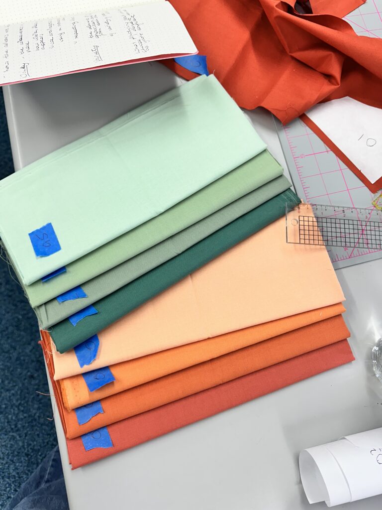
I see this constantly when working with my students. A quilter who initially resists restricting their palette will often, after one exercise with just three fabrics, discover relationships between colors they had never noticed before. A pale blush placed next to a deep burgundy suddenly reveals its warmth. A cool gray next to ivory becomes almost blue. These are discoveries that only become possible when you slow down enough to truly look — and limitation forces you to slow down.
When color choices are simplified, your brain shifts to other powerful tools: contrast, structure, movement, and storytelling. In quilting terms, this means composition becomes more important, not less. The arrangement of shapes, the rhythm of light and dark, the tension between curves and straight lines — all of these elements come forward when they are no longer competing with a riot of different hues.
Constraints Are Not the Enemy of Creativity — They Are Its Engine
I trained as an industrial engineer before I became a quilter and an artist. And one thing that engineering teaches you very clearly is that constraints are not problems to be solved — they are parameters that define the space where real design happens. A bridge built without material constraints would not be a bridge. It would be a fantasy.
Learning to succeed in the face of limitations always teaches you to be clever. This is not a quilting insight. It is a universal principle of design.
Psychological research backs up the idea that constraints boost creativity. When you reduce your options, you don’t reduce your creativity — you redirect it. Instead of spreading creative energy across an unlimited field of decisions, you concentrate it. You go deeper rather than wider. And depth is where interesting things happen.
When you reduce your color options, you’re reducing noise and allowing creative connections to fire more freely. Fewer inputs mean greater engagement with the inputs that remain. Your eye becomes more educated. Your hand becomes more decisive.
Bruno Munari said: “To complicate is easy. To simplify is difficult.” Every quilter who has tried to work with a limited palette knows exactly what he meant.
How to Begin: Practical Steps
If you want to try this approach, here are a few ways to start:
Trust the discomfort. When a limited palette feels boring in the first stages of a project, stay with it. Some artists are instantly recognizable precisely because of the consistency of the palettes they use. That recognition develops through repetition and commitment — not through using more colors, but through using fewer ones with deeper intention.
Start with two, not twelve. Choose one dominant color and one accent. Build your entire quilt around that relationship — varying value, scale, and placement, but not adding more hues until you have truly exhausted what those two have to offer.
Pull from a single source of inspiration. A photograph of morning light on a wall, a particular flower, a piece of architecture. Notice how nature and good design almost always work within a limited range of color and let that restraint guide your pulls.
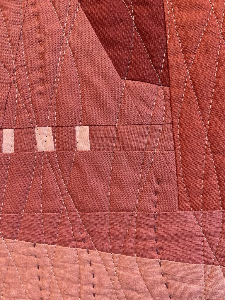
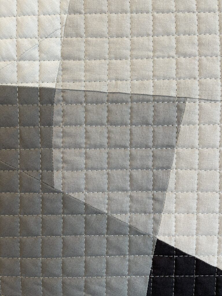
Work with value as your primary contrast. Aim to have three values — light, medium, and dark — in your palette to create depth and dimension. You can do extraordinary things with a single hue when you truly explore its full value range.
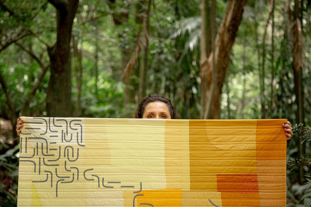
This is the insight that changes everything for quilters who are afraid of a color: the problem was never the color itself. The problem was the context in which they were imagining it. Understanding how colors interact gives you confidence to step beyond your comfort zone and build richer, more varied palettes that still feel like you.
We live in a time of overwhelming abundance — in fabric, in color options, in creative inspiration. And abundance is a gift. But in my experience, the quilts that truly resonate — the ones that communicate something, that feel emotionally complete — almost always come from a place of deliberate restraint.
A limited palette is not a cage. It is a container. And within a carefully chosen palette, creativity finds its truest expression. Less is not a compromise. Less is a decision. And in quilting, as in so much of life, the clearest decisions make the boldest work.
My tagline has always been: WE ARE ALL CREATIVE. I believe that completely. And I believe that one of the most direct paths into your own creative voice is exactly this: choose less. Go deeper. See what happens.