

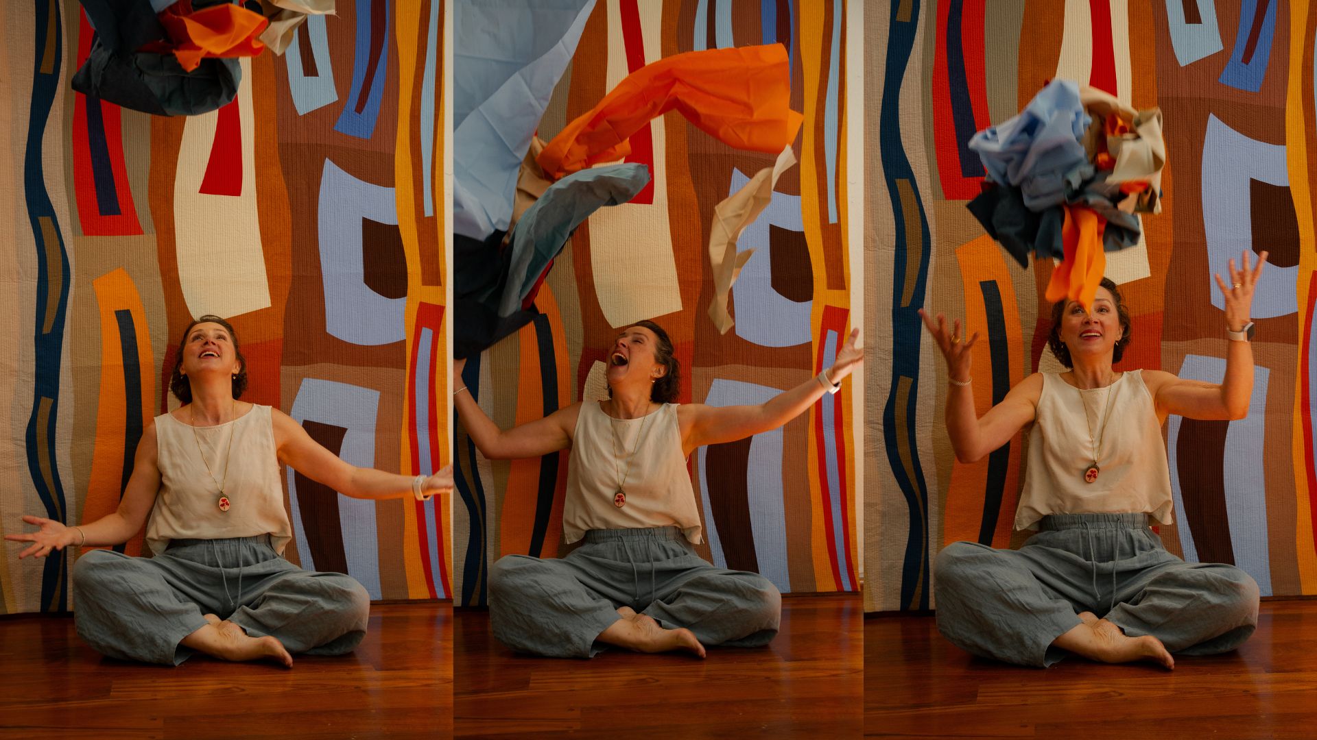
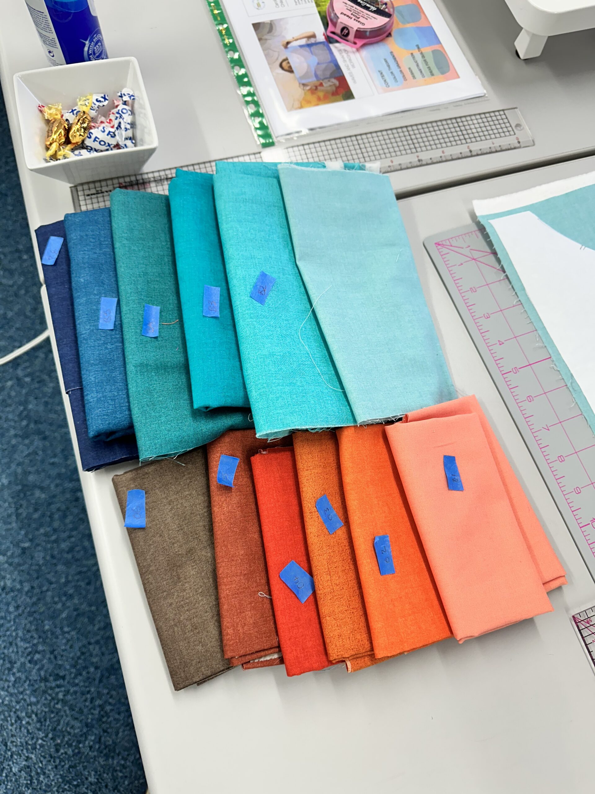
Quilting with solid fabrics has been my near-total practice since almost the beginning of my quilting life, and it wasn’t a stylistic decision so much as a practical one: from the start, I thought of my fabric as my paint. About 99% of what I use has no print, no pattern, no texture printed onto the surface — just color, flat and true. That single choice has shaped almost everything else about how I design.
Why I Never Really Started With Prints
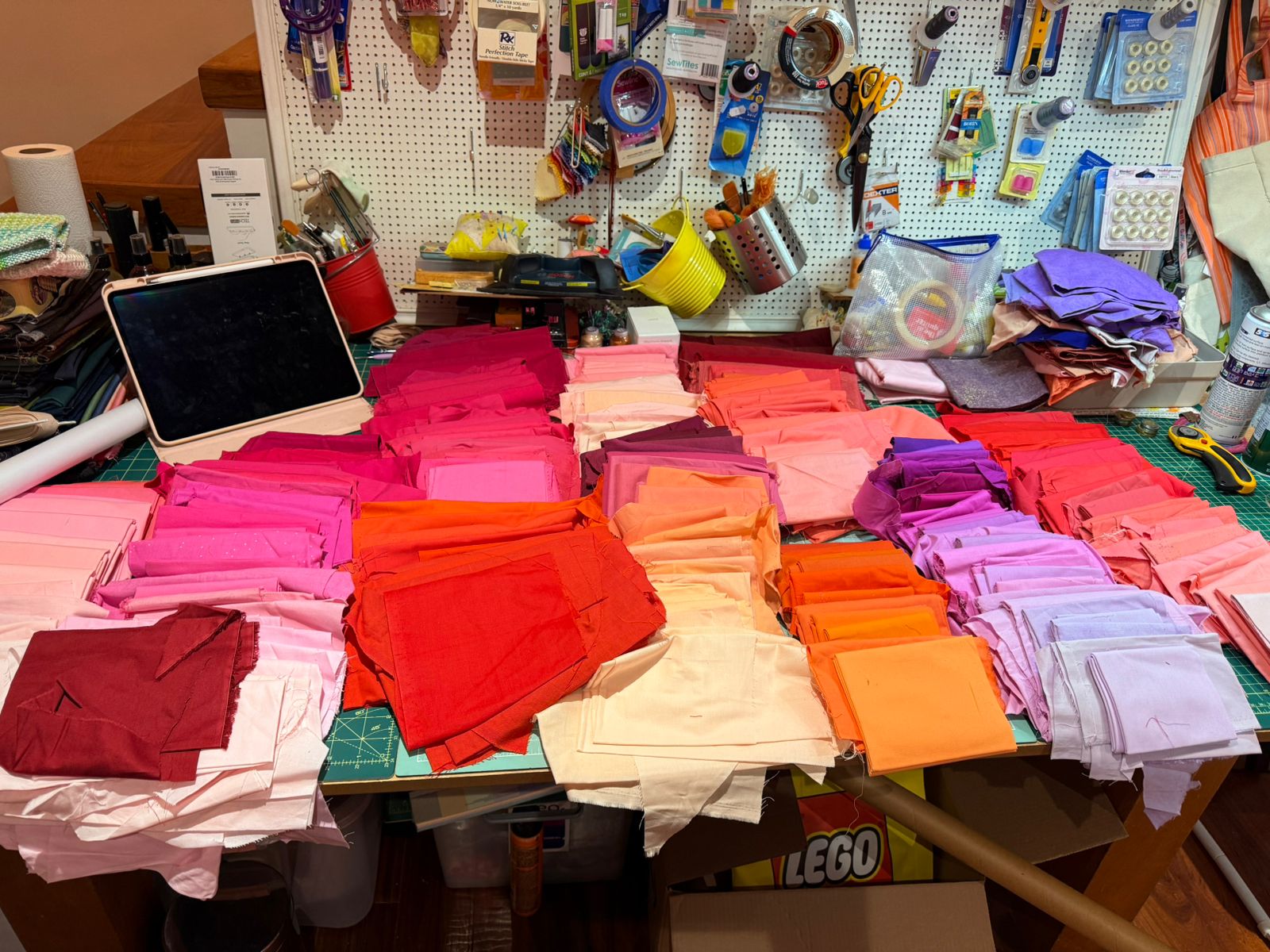
Most quilters I know built their stash the way most quilters are taught to: fat quarter bundles, curated fabric collections, prints chosen for how well they play together. I never really went down that road. From the first pieces I made, I was thinking about fabric the way a painter thinks about a tube of paint — as a single, controllable unit of color with three variables I needed to be able to see clearly: hue, value, and saturation. A print doesn’t let you see those variables cleanly. It adds a fourth variable — pattern — that competes with the other three for the eye’s attention, and often hides exactly the information I need in order to make a real decision.
If I pick up two prints, I can’t always tell you, at a glance, which one is actually lighter in value, or which one is more saturated, because the pattern is doing visual work that has nothing to do with those underlying qualities. If I pick up two solids, I can tell instantly. That clarity is the entire reason I work this way. It’s not a rule about taste. It’s a rule about being able to see what I’m doing.
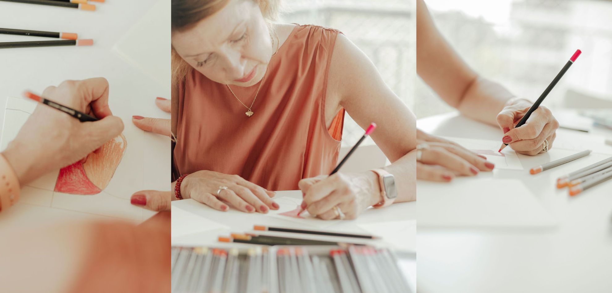
There’s one honest exception worth naming: on occasion, I create my own fabric with hand-painted or printed color transitions built in. I don’t consider that a contradiction of this practice — a fabric I’ve made myself, where I control the exact gradient of hue and value from one edge to the other, is still functioning as a single, known unit of color information to me. It’s a controlled tool, not a busy pattern hiding what’s underneath. The prints I avoid are the commercial kind: motifs, florals, novelty patterns — anything where the surface design competes with the color itself for the eye’s attention.
The Historical Company This Choice Keeps
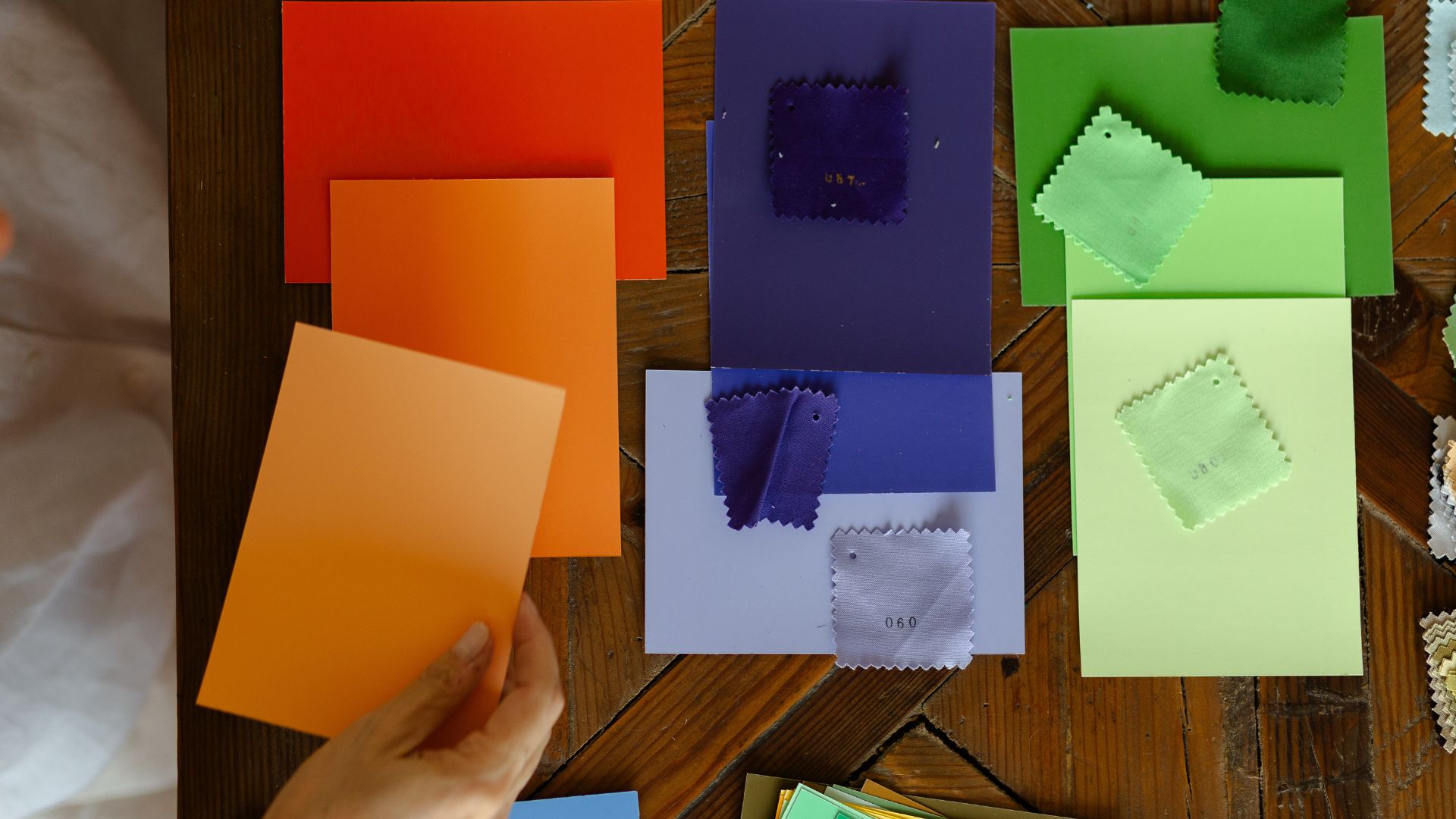
I didn’t invent this reasoning, and I’m in serious company. Josef Albers, the Bauhaus-trained color theorist who later ran the design department at Yale, built his landmark book Interaction of Color almost entirely around exercises using flat sheets of colored paper — never printed or patterned material — for exactly the reason I just described. Albers insisted on working with pure, uniform color specifically so that hue, value, and saturation could be isolated and studied honestly, and his students explored a range of color illusions that only become visible when pattern is removed from the equation entirely. My own transparency work, which I teach separately as its own class, grew out of that same territory — solids are what make it possible at all.
I’ve traced that lineage in more detail elsewhere — Itten to Albers to my own teacher, Eduardo Vilches — in The Bauhaus Legacy, if you want the fuller genealogy of where this way of thinking about color actually comes from.
There’s an even more direct quilting precedent. Classic Amish quilts from Lancaster County, Pennsylvania — made almost entirely from solid, saturated wool, for religious reasons that had nothing to do with contemporary art — were the centerpiece of Abstract Design in American Quilts, the landmark 1971 exhibition at the Whitney Museum of American Art that first got quilts taken seriously as fine art. According to the International Quilt Museum, collectors and critics were drawn specifically to the solid-colored fabrics and bold geometry of these quilts, comparing them directly to the color-field paintings of Mark Rothko and Barnett Newman. Collectors Sandra Pilgrim and Julie Roy, who studied both quilts and Albers’s theories closely, have written about how directly the saturated color fields in Amish quilts echo Albers’s own thinking about color perception. None of those Amish quiltmakers had ever read Interaction of Color. They arrived at the same visual power through the same underlying logic: strip away pattern, and color has to do all the work on its own.
What You Actually Gain
Working exclusively in solids costs you something: the built-in visual complexity a good print can offer for free, and the shortcut of letting a busy fabric disguise a design decision you haven’t fully made. What you gain instead is control, and for me, control is what makes intention possible.
Value — how light or dark a color is — is the single most important factor in whether a composition reads clearly from across a room, and prints actively work against it. A medium-value print can trick your eye into reading it as lighter or darker than it actually is, depending on how dense the pattern is. A solid never lies to you this way. I go deeper on why value carries so much of a quilt’s visual weight in The Power of Contrast.
Solids are also what make transparency and gradient effects possible in the first place — the illusion of one color glowing through another, a technique I go into in full inside my curves and transparencies class. A print would break that illusion before it could ever start.
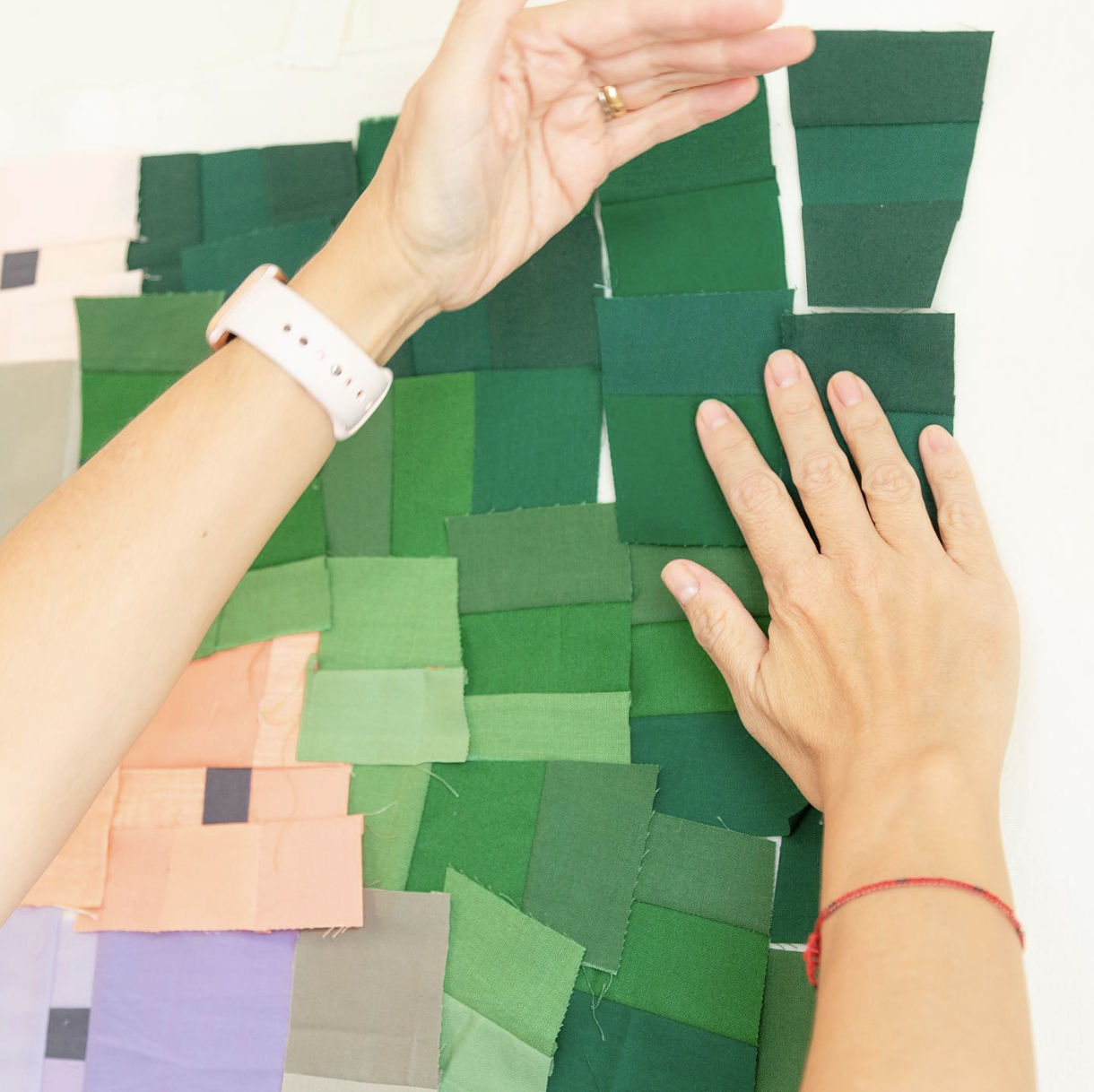
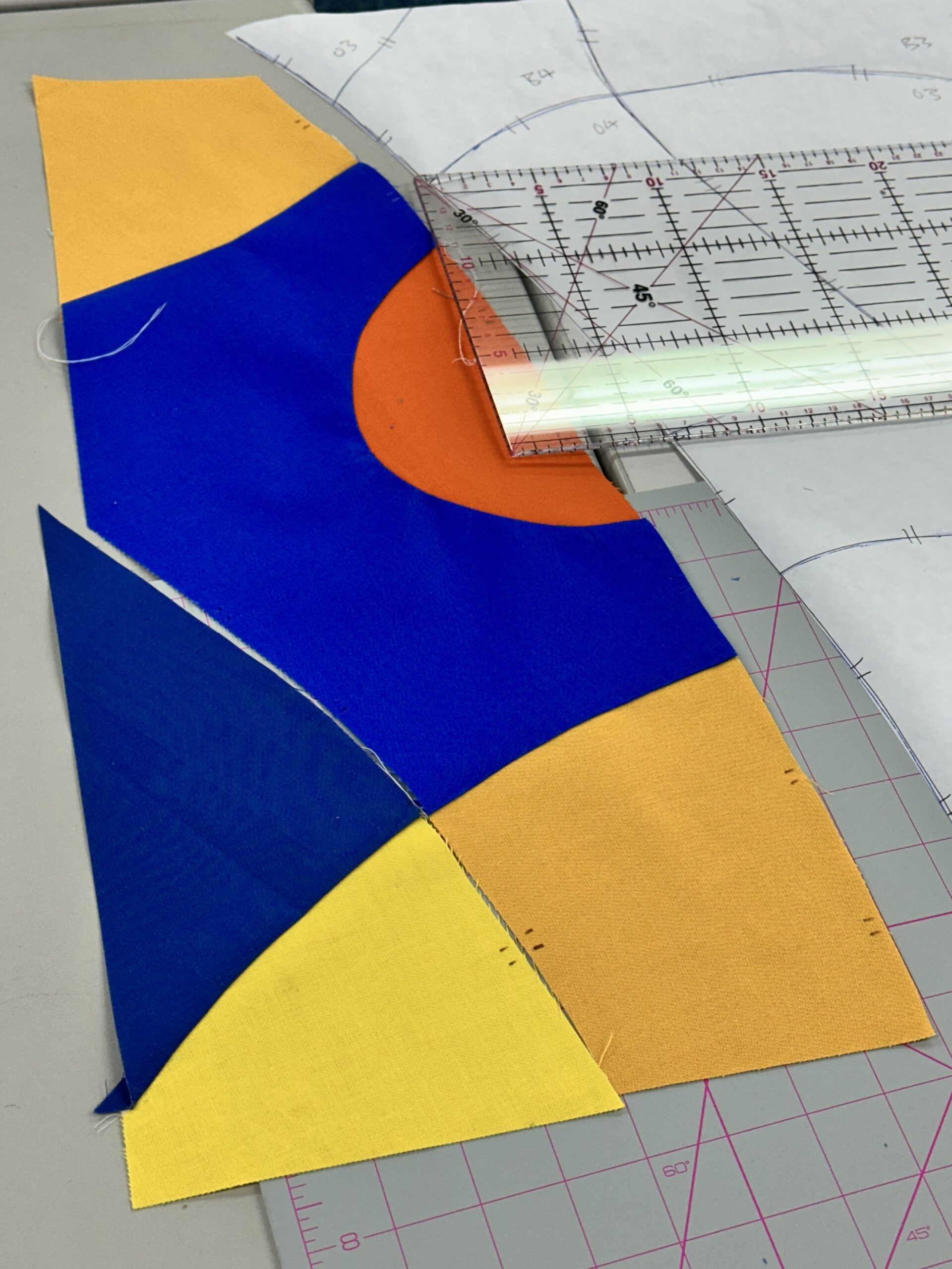
Then there’s texture. With no printed pattern doing the work of visual interest, it has to come from somewhere else, and for me that’s the quilting line itself. Every bit of surface complexity in my work is something I put there on purpose, not something the fabric handed me for free.
And it clarifies figure-ground almost instantly. In my post on figure-ground and Gestalt theory, I wrote about how the eye decides what’s subject and what’s background. Solids make that decision legible right away, because there’s no competing pattern pulling attention away from the actual shape relationships doing the work.
This Is a Constraint, Not a Rule for Everyone
I want to be clear that this isn’t a claim that prints are lesser — plenty of extraordinary quilters build entire careers on masterful print combination, and that’s its own serious skill. This is, quite literally, the structured freedom I’ve written about before: a self-imposed limit, chosen on purpose, that forces a specific kind of attention. Working only in solids doesn’t restrict what I can say with color. If anything, it’s the reason I can say anything precise with it at all. And it’s exactly the kind of constraint that only reveals what it’s good for once you’ve actually lived inside it for a while, rather than trying it for a single project and moving on.
Try It, Even Briefly
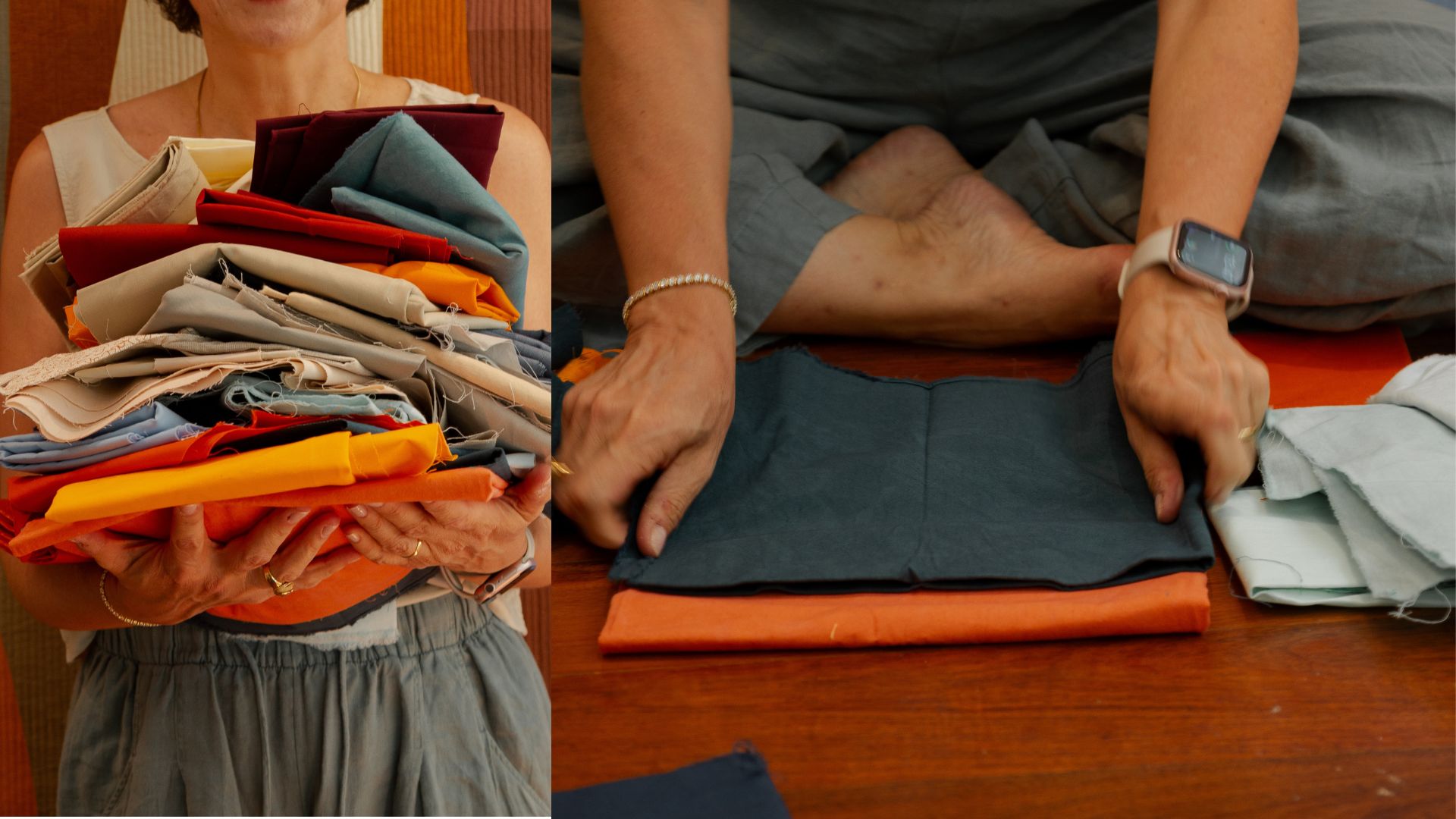
You don’t need to give up prints permanently to feel what this does. A few ways to test it: make one small piece, a mini quilt or a single block, using only solids, and notice how much faster your value and saturation decisions come when pattern isn’t competing for your attention. Sort your solids stash by value before you sort by hue — you’ll likely find gaps you didn’t know you had, plenty of mid-tones and not enough true darks or lights. Pay attention to what happens where two solids meet; placing flat colors edge to edge does something a print never will, and it’s worth simply noticing before you go further. And ask which fabric in your current project is doing the work of hiding a decision. If a print feels necessary, ask honestly whether it’s adding something a solid couldn’t, or covering for a color choice you haven’t fully committed to.
Fabric as paint is still the whole philosophy for me, more than a decade into this practice. Solids are simply the version of that paint I trust to tell me the truth.
I’m curious where you land on this one — solids, prints, a mix, and whether it’s ever felt like an actual decision rather than just a habit you fell into.
If you want a structured way to train your eye for hue, value, and saturation — the exact three variables this whole practice depends on seeing clearly — that’s what my Color Confidence bundle is built to do.
And if solids-only, Albers, and this way of seeing color is something your guild would want as a lecture rather than a blog post, it’s one of the talks and workshops I bring on the road.
If you want more of this kind of thing in your inbox, you can subscribe on the homepage — you’ll get a free pattern for joining.
Sources referenced: Josef Albers, Interaction of Color (1963); International Quilt Museum (internationalquiltmuseum.org/exhibition/amish-quilts); Incollect / Pilgrim-Roy Collection (incollect.com/articles/quilts-and-color-the-pilgrim-roy-collection) on Amish quilts and color theory.